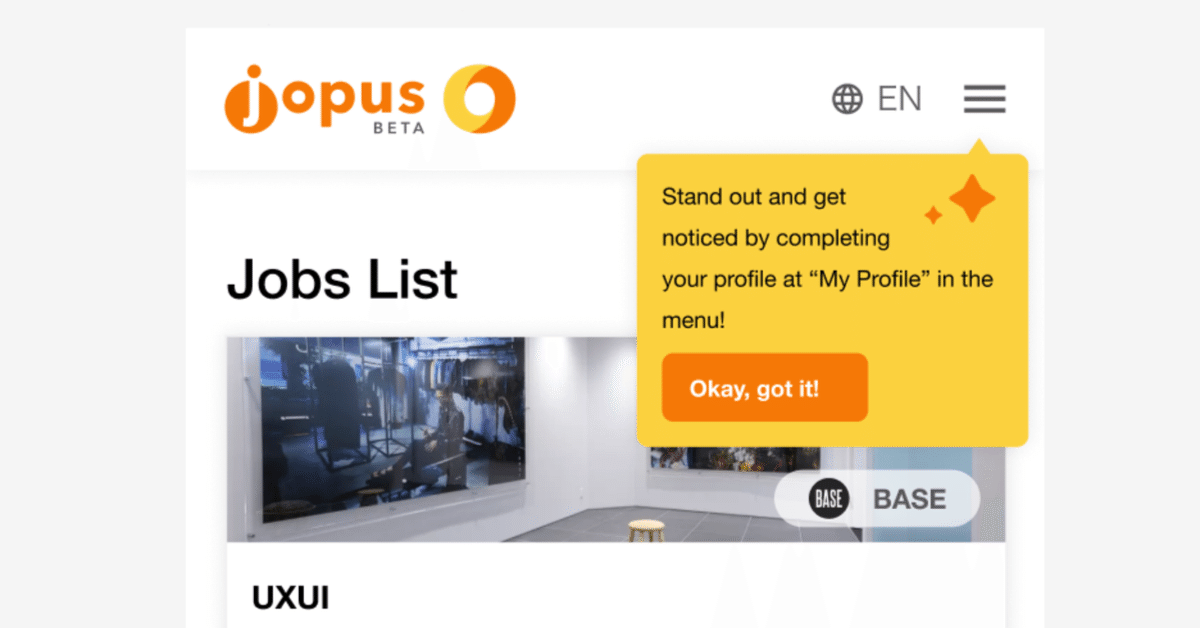
Jopus Connecter - walkthrough - How to get users complete their profiles to 100%!
In continuance of the registration process update from last month, where we talked about the thinking process and the changes we made and were able increase the registration rate with over 200% (You can read more about that here: https://note.com/zwan/n/nf94ebbca5a94 )
Besides updating the registration process, we reduced the amount of questions and required entry from the users.
This worked by simplifying the registration process, however, in order to support both, the candidates and client sides, the more sufficient data, the more efficient we could be connecting candidates to companies, and vise versa.
So simplifying the registration process was one part of the puzzle, we also had to figure out a way how the users would enter their data in order to help them.
Asking ourselves questions with the perspective of the user in mind, is a good way to start.
By questions such as; How does this service/system work? Why would “I” (as user) want to input my data?
You have a base to work on and ask further questions to get closer answers to the problems you need a solution for.
In our example, with a closed system where it is difficult for the users to see what comes after registration.
It was a part of various factors that need to work coherent with each other to answer the questions the users might have.
Parts like; The landing page, the registration process and service ui are ways to inform and show the user what they can expect from the service.
But often times we want to give many information. This can become overwhelming and there is information that doesn’t have to be shared just yet.
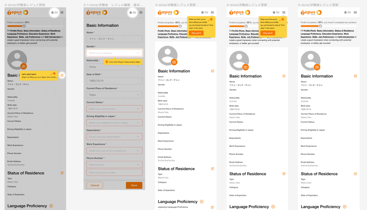
How to make changes in your profile is one example that we tried to address once the users registered with the service.
This would directly explain how the user interface works and the user would have more information shared that would help to increase the chance to get connected.
Also it would show where all the major parts are that the users would be using in an intuitive manner.
How did we solve the problem that users would not continue to fill in their information?
By explaining to the user in an encouraging way the benefits having more information they would increase the chance to get connected.
Since the users already know how it works by now and know where everything is, the users can enter more information in their own convenience.
In the example here you can see a couple screenshots of the various stages.

There was a concern from the business site, that users wouldn’t enter enough information, how ever what we learned from the data was that users would eagerly enter all the information to make their profile reach 100%!
Seeing things workout as planned is not always the case, but this time it worked out great! But for those moments that it doesn’t work out, in the planning stage there should be points implemented that would provide data that can be used to learn from so that improvements can be made based on data so there are points to focus on instead of wondering around what to change could lead to sitting in a car without wheels…it goes nowhere, no matter how much energy is being used(wasted)….but that is for another time.
Happy holidays and happy new year!
Job hunting made easy, Jopus Connecter
Learn more here ->
For candidates: https://connecter.jopus.net/en/
For companies: https://connecter.jopus.net/company/ (Japanese)
