
React Native のコアコンポーネントの一覧

「React Native」のコアコンポーネントの一覧をまとめました。
前回
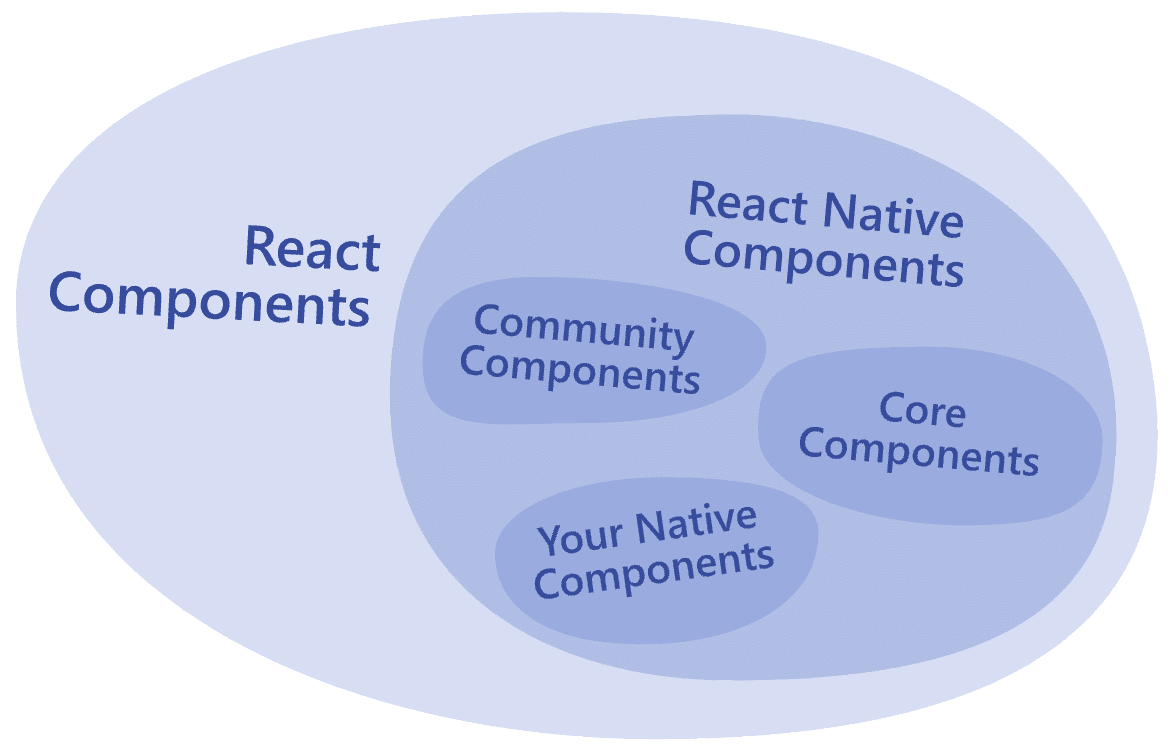
1. コアコンポーネント
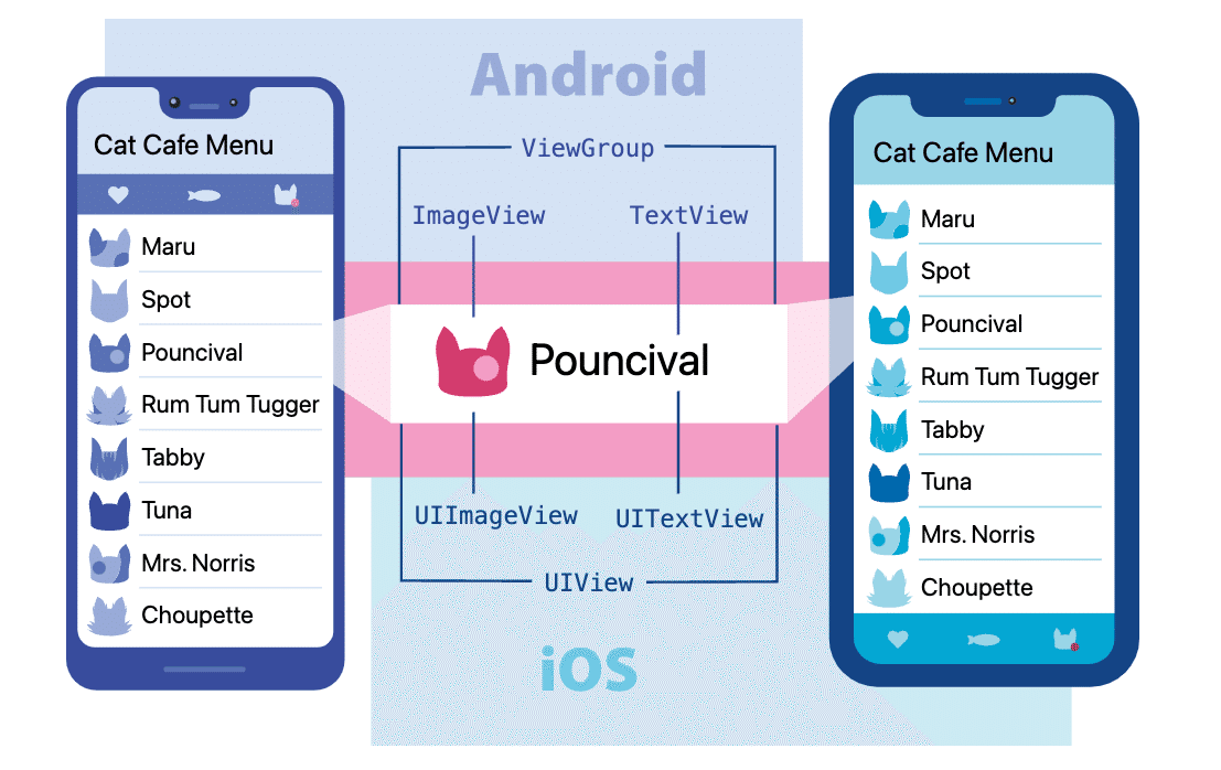
「React Native」は、「React」とアプリプラットフォームのネイティブ機能を使用して Android および iOS アプリを構築するためのオープンソースフレームワークです。JavaScriptでプラットフォームのAPIにアクセスし、「コンポーネント」でUIの外観と動作を記述します。
「React Native」では実行時に、「コンポーネント」に対応する「Android・iOSコンポーネント」を作成します。これによって、ネイティブアプリと同様の操作体験が可能になります。
2. 基本コンポーネント
・View : レイアウトやスタイルを設定するための基本コンテナ
・Text : テキストを表示するためのコンポーネント
・Image : 画像を表示するためのコンポーネント
・TextInput : ユーザーがテキストを入力できる入力フィールド
・ScrollView : スクロール可能なコンテナ
・StyleSheet : コンポーネントに適用するスタイルを管理するAPI
2-1. View
import React from 'react';
import {View, Text} from 'react-native';

// アプリ
const App = () => {
  // UI
  return (
    <View
      style={{
        flexDirection: 'row',
        height: 100,
        padding: 20,
      }}>
      <View style={{backgroundColor: 'blue', flex: 0.3}} />
      <View style={{backgroundColor: 'red', flex: 0.5}} />
      <Text>Hello World!</Text>
    </View>
  );
};

export default App;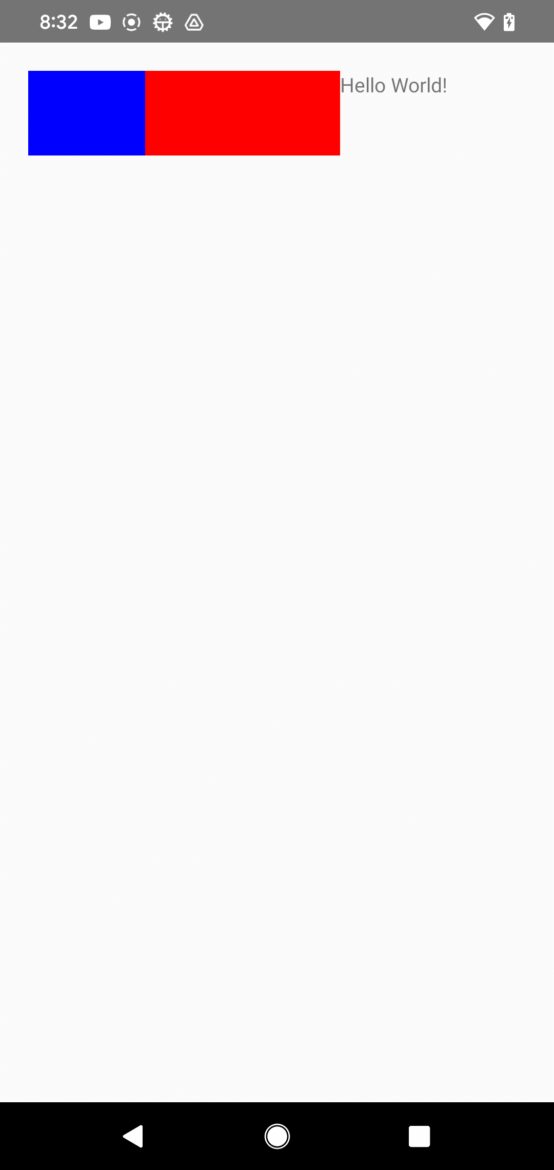
2-2. Text
import React, {useState} from 'react';
import {Text} from 'react-native';

// アプリ
const App = () => {
  const [titleText, setTitleText] = useState("Bird's Nest");
  const bodyText = 'This is not really a bird nest.';

  // タイトル押下時に呼ばれる
  const onPressTitle = () => {
    setTitleText("Bird's Nest [pressed]");
  };

  // UI
  return (
    <Text style={{ fontFamily: 'Cochin' }}>
      <Text style={{ fontSize: 20, fontWeight: 'bold' }} onPress={onPressTitle}>
        {titleText}
        {'\n'}
        {'\n'}
      </Text>
      <Text numberOfLines={5}>{bodyText}</Text>
    </Text>
  );
};

export default App;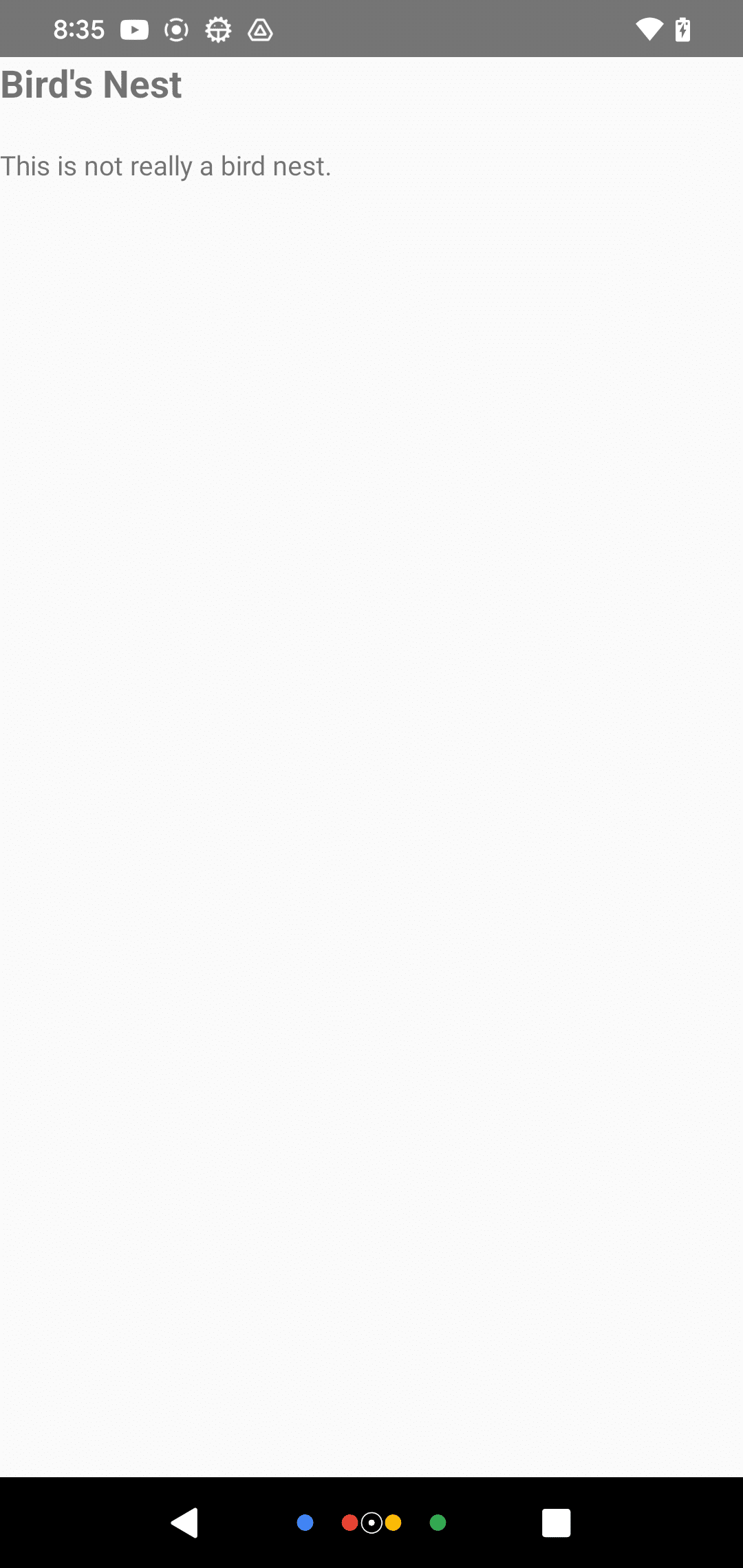
2-3. Image
import React from 'react';
import {View, Image} from 'react-native';

// アプリ
const App = () => {
  // UI
  return (
    <View style={{ paddingTop: 50 }}>
      <Image
        style={{ width: 50, height: 50 }}
        source={require('./sample.png')}
      />
      <Image
        style={{ width: 50, height: 50 }}
        source={{
          uri: 'https://reactnative.dev/img/tiny_logo.png',
        }}
      />
      <Image
        style={{ width: 66, height: 58 }}
        source={{
          uri: 'data:image/png;base64,iVBORw0KGgoAAAANSUhEUgAAADMAAAAzCAYAAAA6oTAqAAAAEXRFWHRTb2Z0d2FyZQBwbmdjcnVzaEB1SfMAAABQSURBVGje7dSxCQBACARB+2/ab8BEeQNhFi6WSYzYLYudDQYGBgYGBgYGBgYGBgYGBgZmcvDqYGBgmhivGQYGBgYGBgYGBgYGBgYGBgbmQw+P/eMrC5UTVAAAAABJRU5ErkJggg==',
        }}
      />
    </View>
  );
};

export default App;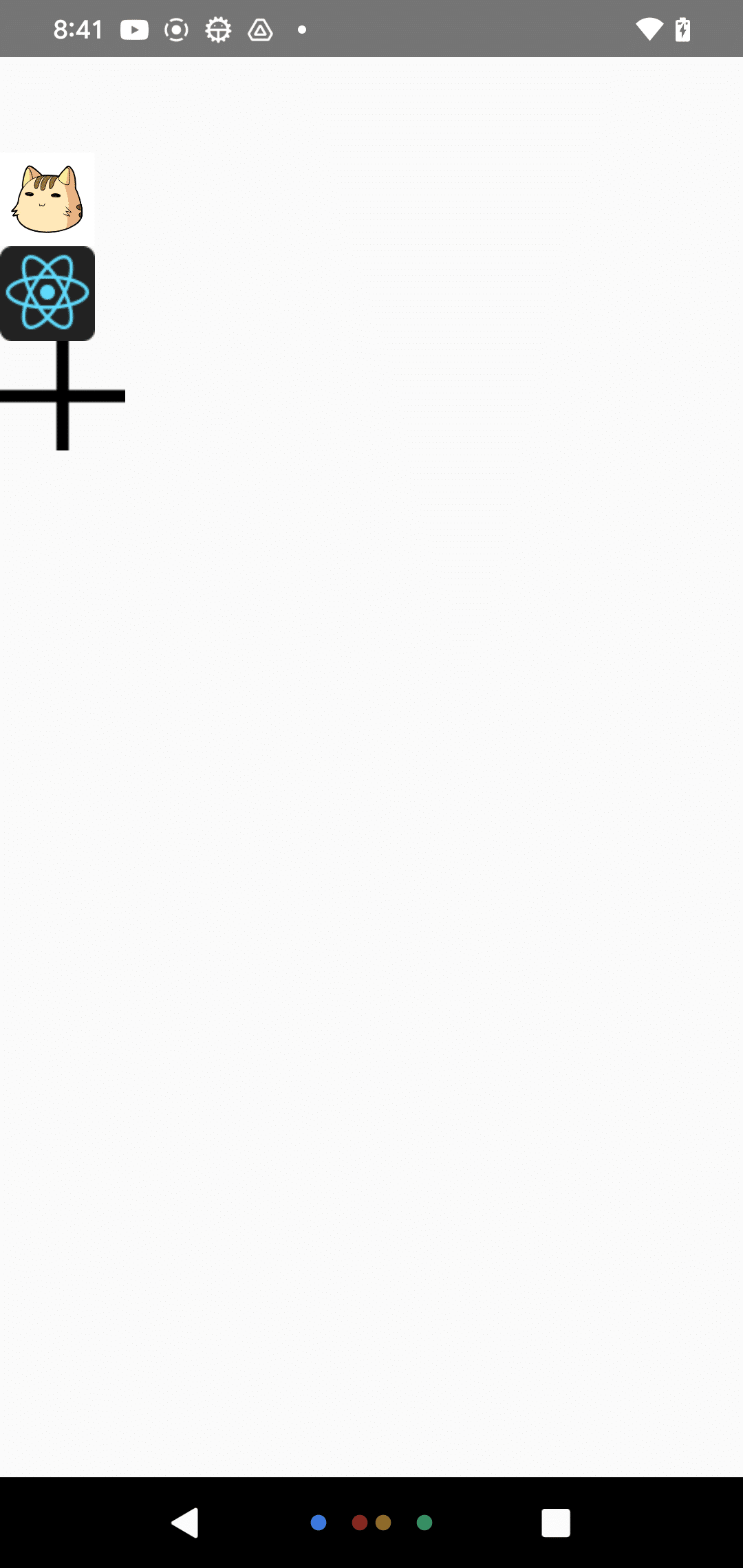
2-4. TextInput
import React from 'react';
import {SafeAreaView, TextInput} from 'react-native';

// アプリ
const App = () => {
  const [text, onChangeText] = React.useState('Useless Text');
  const [number, onChangeNumber] = React.useState('');

  // UI
  return (
    <SafeAreaView>
      <TextInput
        style={{ height: 40, margin: 12, borderWidth: 1, padding: 10 }}
        onChangeText={onChangeText}
        value={text}
      />
      <TextInput
        style={{ height: 40, margin: 12, borderWidth: 1, padding: 10 }}
        onChangeText={onChangeNumber}
        value={number}
        placeholder="useless placeholder"
        keyboardType="numeric"
      />
    </SafeAreaView>
  );
};

export default App;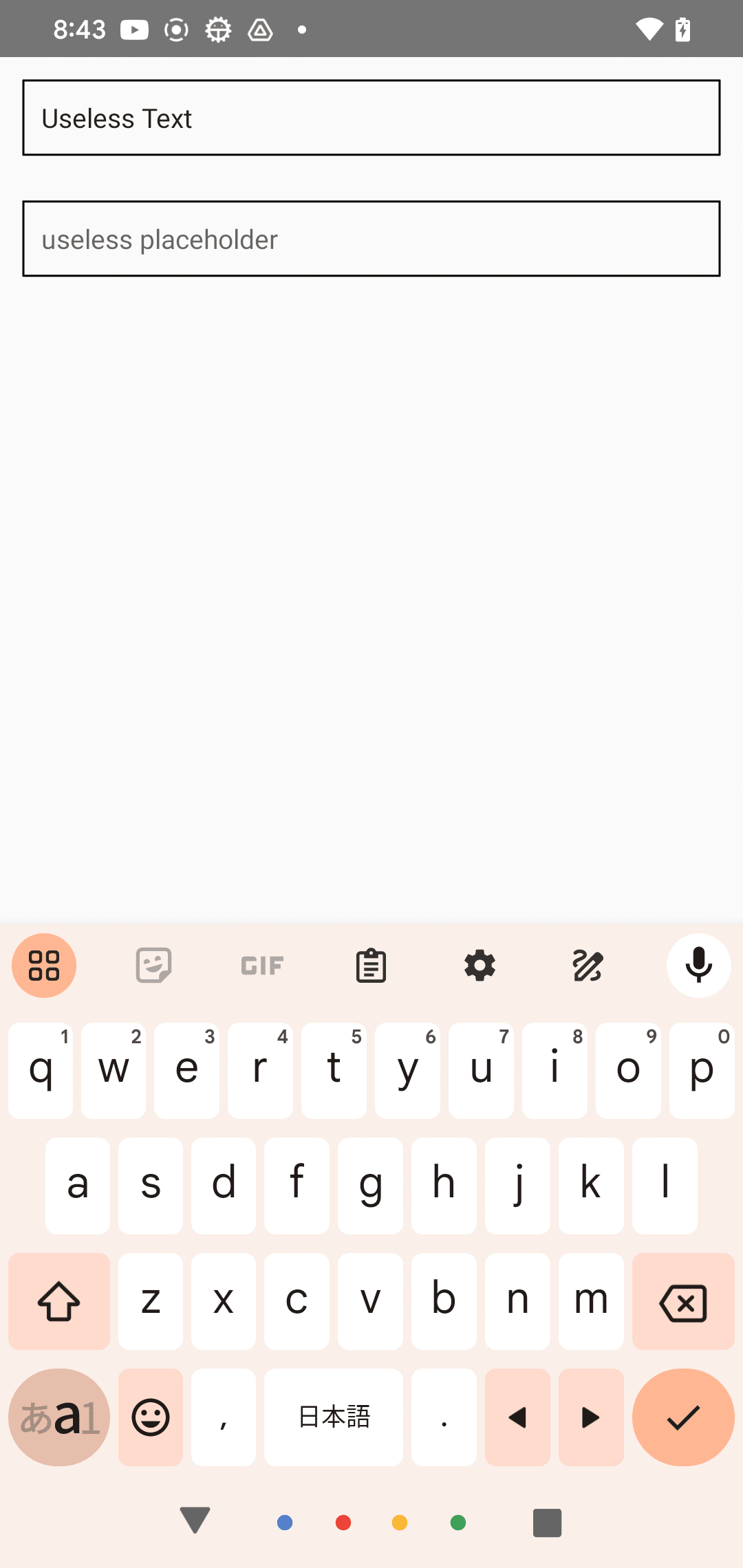
2-5. ScrollView
import React from 'react';
import {
  Text,
  SafeAreaView,
  ScrollView,
  StatusBar,
} from 'react-native';

// アプリ
const App = () => {
  // UI
  return (
    <SafeAreaView style={{ flex: 1, paddingTop: StatusBar.currentHeight }}>
      <ScrollView style={{ backgroundColor: 'pink', marginHorizontal: 20 }}>
        <Text style={{ fontSize: 42 }}>
          Lorem ipsum dolor sit amet, consectetur adipiscing elit, sed do
          eiusmod tempor incididunt ut labore et dolore magna aliqua. Ut enim ad
          minim veniam, quis nostrud exercitation ullamco laboris nisi ut
          aliquip ex ea commodo consequat. Duis aute irure dolor in
          reprehenderit in voluptate velit esse cillum dolore eu fugiat nulla
          pariatur. Excepteur sint occaecat cupidatat non proident, sunt in
          culpa qui officia deserunt mollit anim id est laborum.
        </Text>
      </ScrollView>
    </SafeAreaView>
  );
};

export default App;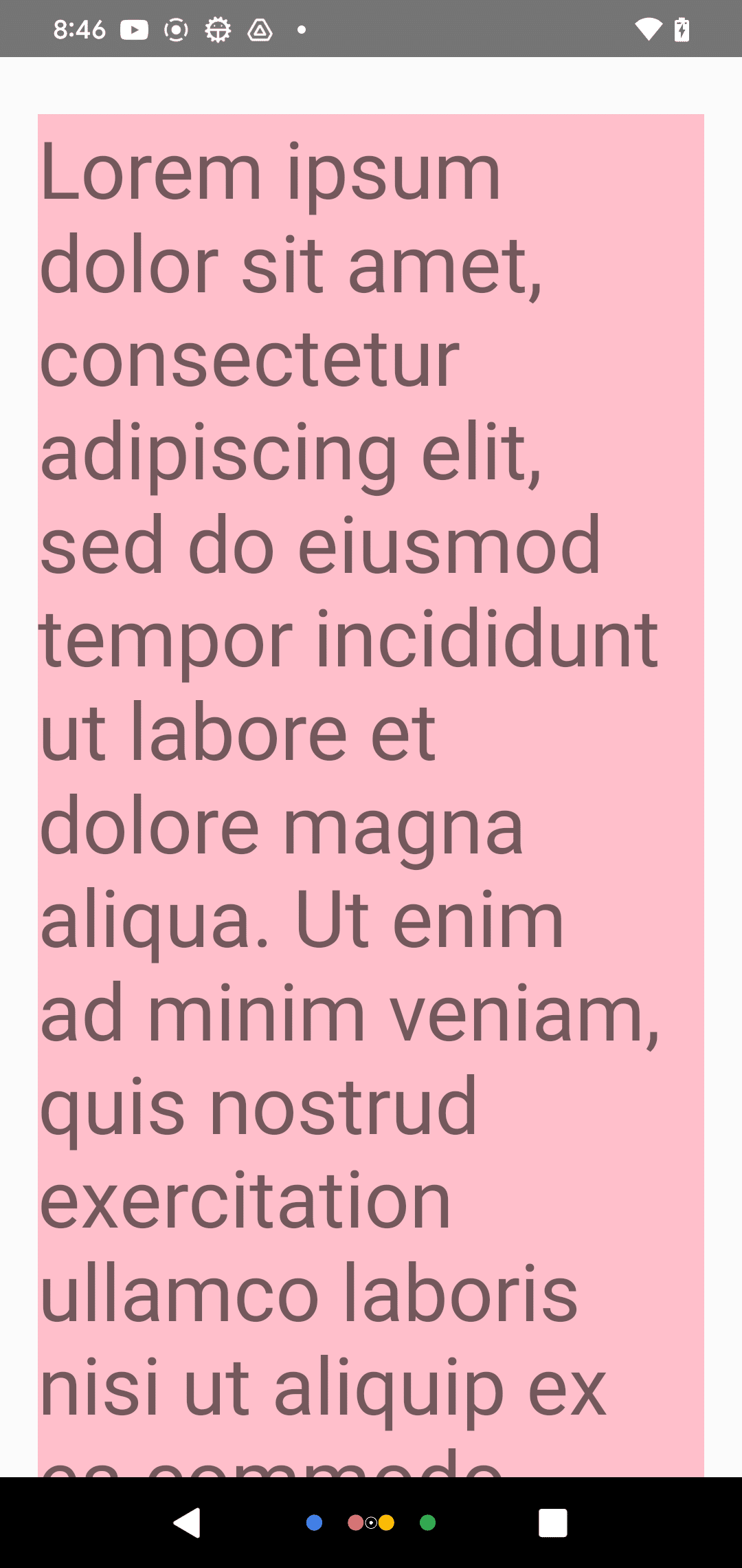
2-6. StyleSheet
import React from 'react';
import {StyleSheet, Text, View} from 'react-native';

// アプリ
const App = () => (
  <View style={styles.container}>
    <Text style={styles.title}>React Native</Text>
  </View>
);

// スタイルシート
const styles = StyleSheet.create({
  container: {
    flex: 1,
    padding: 24,
    backgroundColor: '#eaeaea',
  },
  title: {
    marginTop: 16,
    paddingVertical: 8,
    borderWidth: 4,
    borderColor: '#20232a',
    borderRadius: 6,
    backgroundColor: '#61dafb',
    color: '#20232a',
    textAlign: 'center',
    fontSize: 30,
    fontWeight: 'bold',
  },
});

export default App;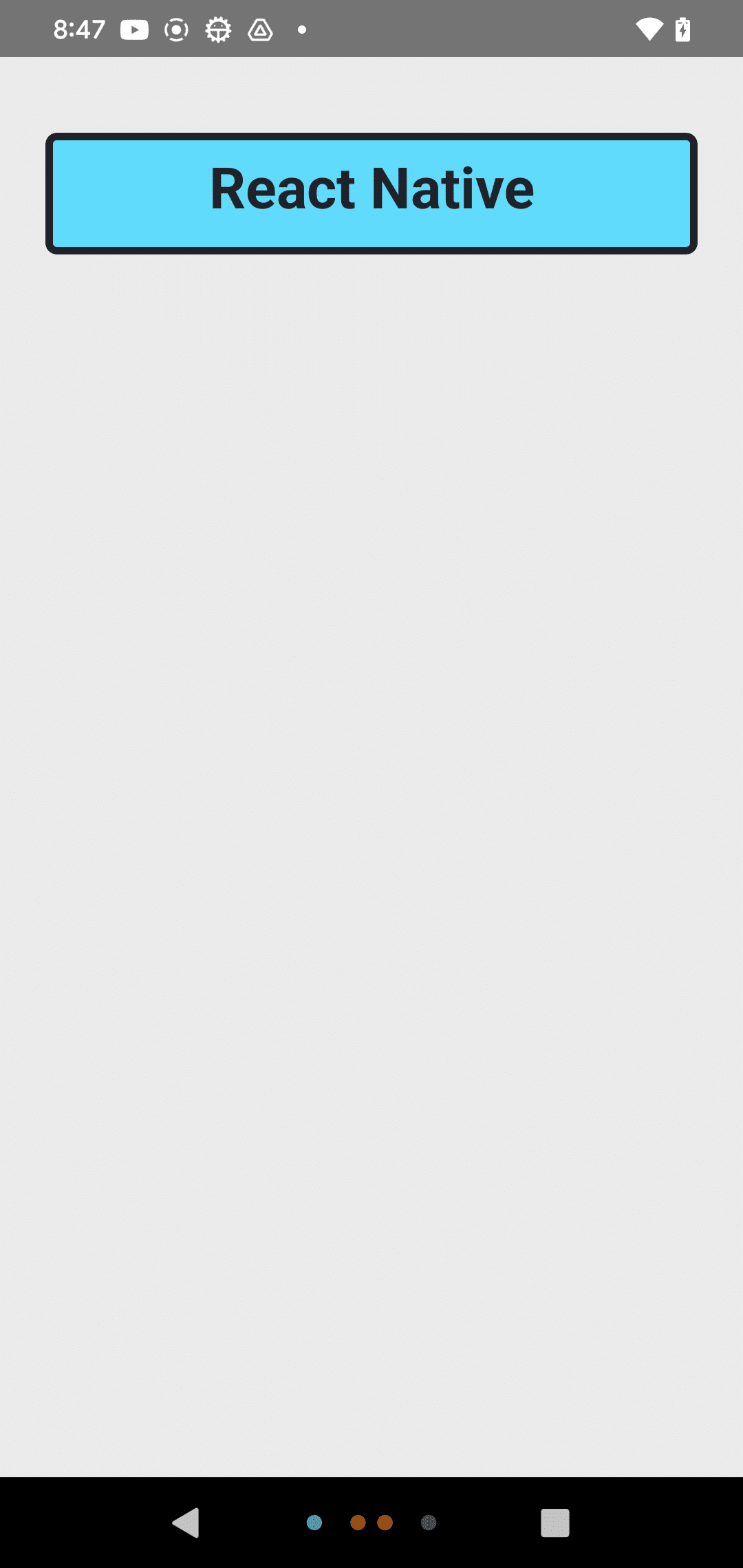
3. ユーザーインターフェース
・Button : 押すことでアクションをトリガーするシンプルなボタン
・Switch : オン・オフの切り替えを行うトグルスイッチ
3-1. Button
import React from 'react';
import {
  StyleSheet,
  Button,
  View,
  SafeAreaView,
  Text,
  Alert,
} from 'react-native';

// セパレーター
const Separator = () => <View style={{ marginVertical: 8, borderBottomColor: '#737373', borderBottomWidth: StyleSheet.hairlineWidth }} />;

// アプリ
const App = () => (
  <SafeAreaView style={{ flex: 1, justifyContent: 'center', marginHorizontal: 16 }}>
    <View>
      <Text style={{ textAlign: 'center', marginVertical: 8 }}>
        The title and onPress handler are required. It is recommended to set
        accessibilityLabel to help make your app usable by everyone.
      </Text>
      <Button
        title="Press me"
        onPress={() => Alert.alert('Simple Button pressed')}
      />
    </View>
    <Separator />
    <View>
      <Text style={{ textAlign: 'center', marginVertical: 8 }}>
        Adjust the color in a way that looks standard on each platform. On iOS,
        the color prop controls the color of the text. On Android, the color
        adjusts the background color of the button.
      </Text>
      <Button
        title="Press me"
        color="#f194ff"
        onPress={() => Alert.alert('Button with adjusted color pressed')}
      />
    </View>
    <Separator />
    <View>
      <Text style={{ textAlign: 'center', marginVertical: 8 }}>
        All interaction for the component are disabled.
      </Text>
      <Button
        title="Press me"
        disabled
        onPress={() => Alert.alert('Cannot press this one')}
      />
    </View>
    <Separator />
    <View>
      <Text style={{ textAlign: 'center', marginVertical: 8 }}>
        This layout strategy lets the title define the width of the button.
      </Text>
      <View style={{ flexDirection: 'row', justifyContent: 'space-between' }}>
        <Button
          title="Left button"
          onPress={() => Alert.alert('Left button pressed')}
        />
        <Button
          title="Right button"
          onPress={() => Alert.alert('Right button pressed')}
        />
      </View>
    </View>
  </SafeAreaView>
);

export default App;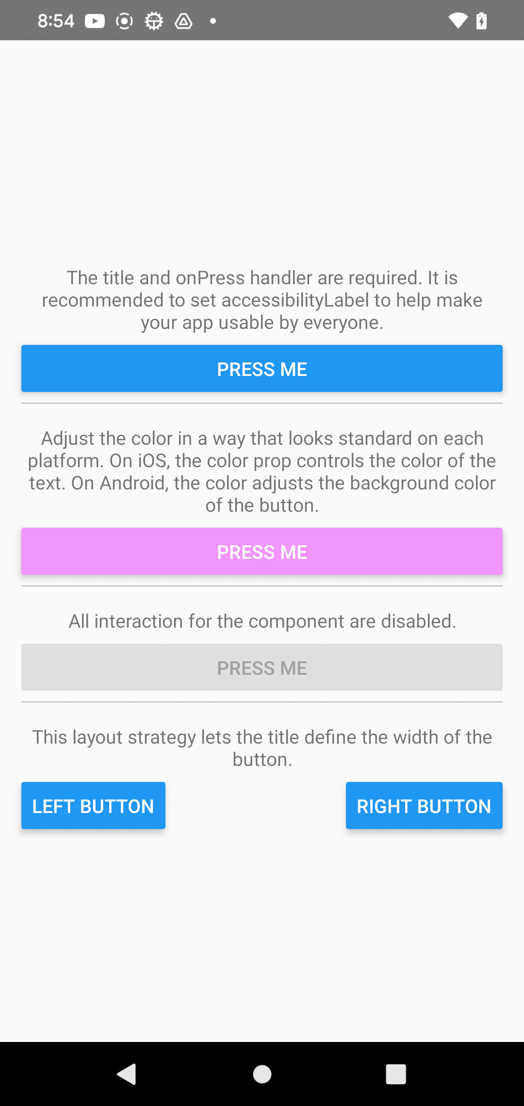
3-2. Switch
import React, {useState} from 'react';
import {View, Switch, StyleSheet} from 'react-native';

// アプリ
const App = () => {
  const [isEnabled, setIsEnabled] = useState(false);
  const toggleSwitch = () => setIsEnabled(previousState => !previousState);

  // UI
  return (
    <View style={{ flex: 1, alignItems: 'center', justifyContent: 'center' }}>
      <Switch
        trackColor={{false: '#767577', true: '#81b0ff'}}
        thumbColor={isEnabled ? '#f5dd4b' : '#f4f3f4'}
        ios_backgroundColor="#3e3e3e"
        onValueChange={toggleSwitch}
        value={isEnabled}
      />
    </View>
  );
};

export default App;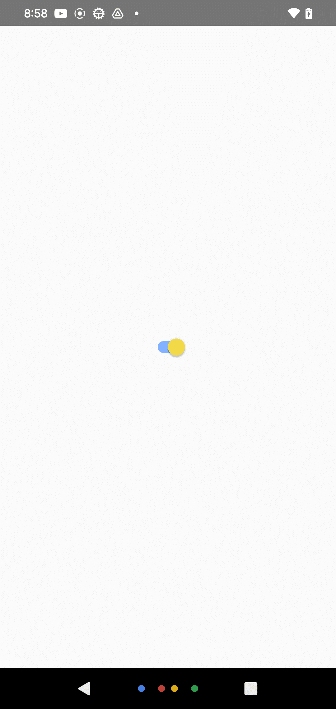
4. リストビュー
・FlatList : 大量のデータを効率的に表示するためのリストコンポーネント
・SectionList : セクションごとにデータをグループ化して表示するリストコンポーネント
4-1. FlatList
import React from 'react';
import { Text, FlatList, TouchableOpacity } from 'react-native';

// アイテム型
type Item = {
  id: string;
  title: string;
};

// アイテムリスト
const DATA: Item[] = [
  { id: '0', title: 'Item0' },
  { id: '1', title: 'Item1' },
  { id: '2', title: 'Item2' },
  { id: '3', title: 'Item3' },
  { id: '4', title: 'Item4' },
  { id: '5', title: 'Item5' },
  { id: '6', title: 'Item6' },
  { id: '7', title: 'Item7' },
  { id: '8', title: 'Item8' },
  { id: '9', title: 'Item9' },
  { id: '10', title: 'Item10' },
  { id: '11', title: 'Item11' },
  { id: '12', title: 'Item12' },
  { id: '13', title: 'Item13' },
  { id: '14', title: 'Item14' },
  { id: '15', title: 'Item15' },
  { id: '16', title: 'Item16' },
  { id: '17', title: 'Item17' },
  { id: '18', title: 'Item18' },
  { id: '19', title: 'Item19' },
];

// アプリ
const App = () => {
  // ボタン押下時に呼ばれる
  const handlePress = (title: string) => {
    console.log(`Button pressed: ${title}`);
  };

  // アイテムの描画
  const renderItem = ({ item }: { item: Item }) => (
    <TouchableOpacity onPress={() => handlePress(item.title)} style={{ padding: 20 }}>
      <Text style={{ fontSize: 32 }}>{item.title}</Text>
    </TouchableOpacity>
  );

  // UI
  return (
    <FlatList
      data={DATA}
      renderItem={renderItem}
      keyExtractor={(item) => item.id}
    />
  );
};

export default App;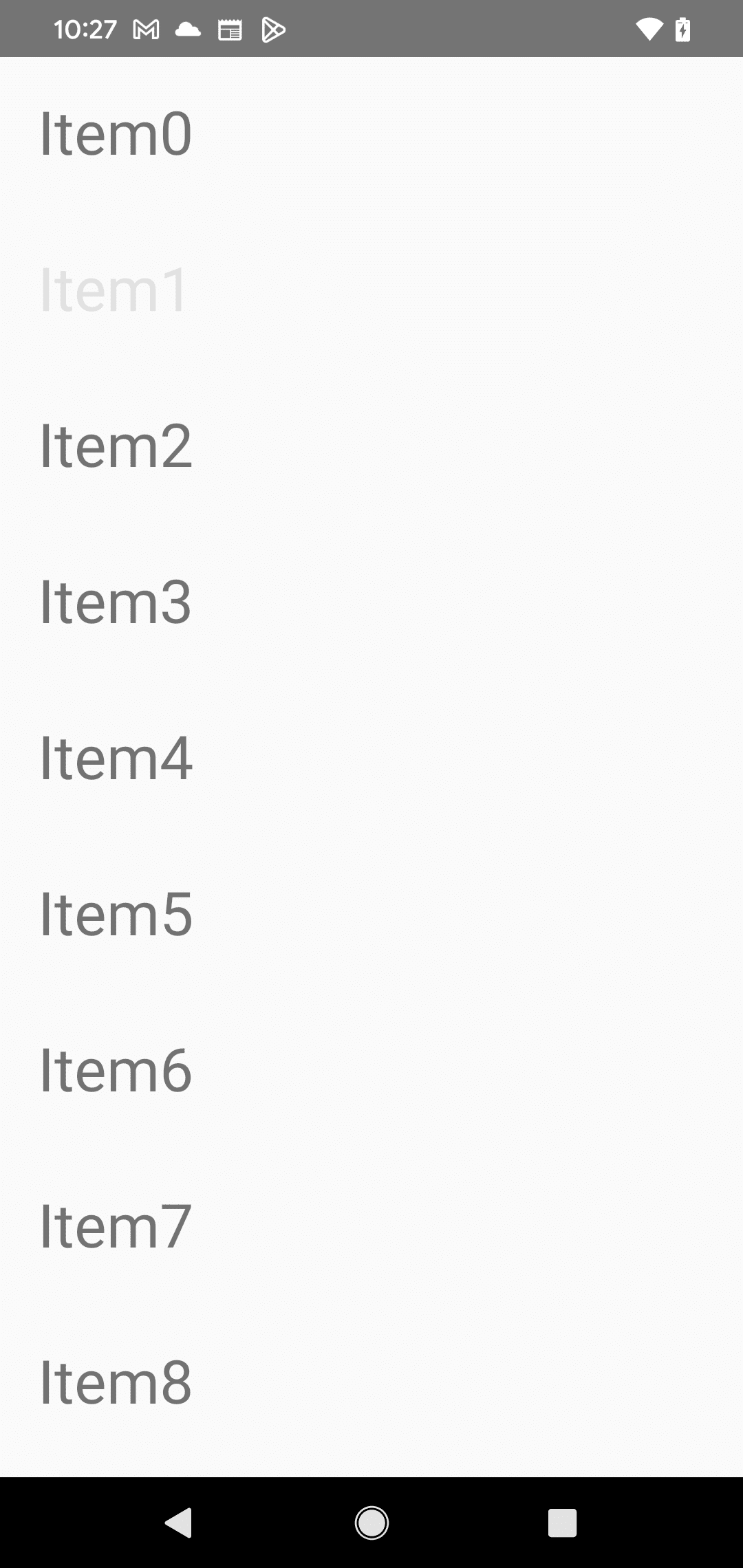
4-2. SectionList
import React from 'react';
import { View, Text, SectionList, TouchableOpacity } from 'react-native';

// アイテム型
type Item = {
  id: string;
  title: string;
};

// セクション型
type Section = {
  title: string;
  data: Item[];
};

// セクションリスト
const DATA: Section[] = [
  {
    title: "Section0",
    data: [
      { id: '0', title: 'Item0' },
      { id: '1', title: 'Item1' },
      { id: '2', title: 'Item2' },
      { id: '3', title: 'Item3' },
      { id: '4', title: 'Item4' }
    ]
  },
  {
    title: "Section1",
    data: [
      { id: '5', title: 'Item5' },
      { id: '6', title: 'Item6' },
      { id: '7', title: 'Item7' },
      { id: '8', title: 'Item8' },
      { id: '9', title: 'Item9' }
    ]
  },
  {
    title: "Section2",
    data: [
      { id: '10', title: 'Item10' },
      { id: '11', title: 'Item11' },
      { id: '12', title: 'Item12' },
      { id: '13', title: 'Item13' },
      { id: '14', title: 'Item14' }
    ]
  },
  {
    title: "Section3",
    data: [
      { id: '15', title: 'Item15' },
      { id: '16', title: 'Item16' },
      { id: '17', title: 'Item17' },
      { id: '18', title: 'Item18' },
      { id: '19', title: 'Item19' }
    ]
  }
];

// アプリ
const App = () => {
  // ボタン押下時に呼ばれる
  const handlePress = (title: string) => {
    console.log(`Button pressed: ${title}`);
  };

  // アイテムの描画
  const renderItem = ({ item }: { item: Item }) => (
    <TouchableOpacity onPress={() => handlePress(item.title)} style={{ padding: 20 }}>
      <Text style={{ fontSize: 32 }}>{item.title}</Text>
    </TouchableOpacity>
  );

  // セクションヘッダの描画
  const renderSectionHeader = ({ section }: { section: Section }) => (
    <View style={{ padding: 10 }}>
      <Text style={{ fontSize: 24, fontWeight: 'bold' }}>{section.title}</Text>
    </View>
  );

  // UI
  return (
    <SectionList
      sections={DATA}
      renderItem={renderItem}
      renderSectionHeader={renderSectionHeader}
      keyExtractor={(item) => item.id}
    />
  );
};

export default App;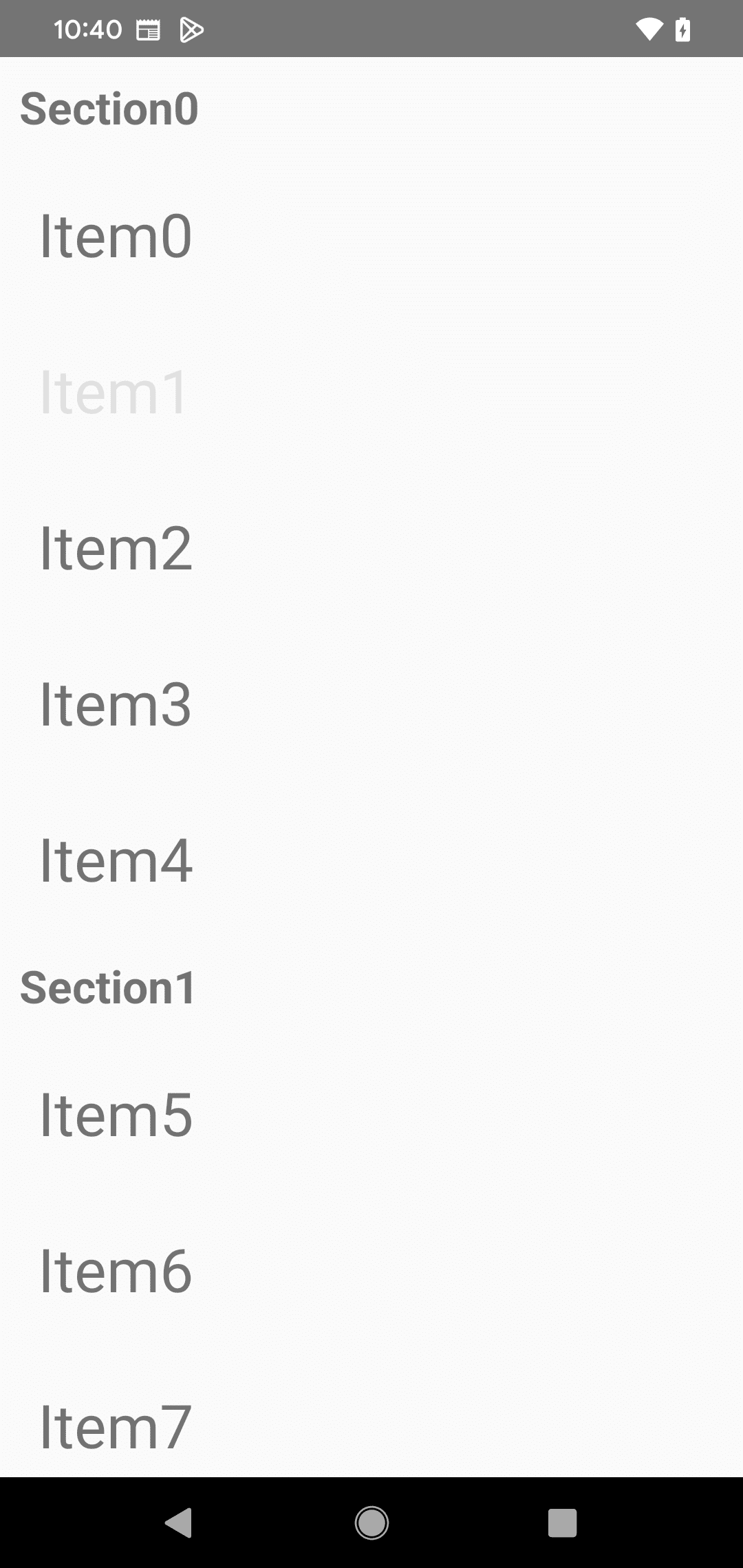
5. Android 専用
・BackHandler : AndroidのBackボタンのイベントを制御するハンドラ
・DrawerLayoutAndroid : スライディングドロワー
・PermissionsAndroid : Androidの実行時権限の要求および確認
・ToastAndroid : トースト通知
6. iOS 専用
・ActionSheetIOS : アクションシート
7. その他
・Activity Indicator : ローディングインジケータ
・Alert : アラートを表示するAPI
・Animated : ビューをアニメーションさせるAPI
・Dimensions : デバイスの画面サイズや向きの取得するAPI
・KeyboardAvoidingView : キーボード表示時に自動的調整するビュー
・Linking : 外部URLを開く
・Modal : モーダルダイアログ
・PixelRatio : デバイスのピクセル密度を操作するAPI
・RefreshControl : ScrollViewに引っ張って更新
・StatusBar : ステータスバーの外観を設定するAPI
7-1. Activity Indicator
import React from 'react';
import {ActivityIndicator, View} from 'react-native';

// アプリ
const App = () => (
  <View style={[
    { flex: 1, justifyContent: 'center' },
    { flexDirection: 'row', justifyContent: 'space-around', padding: 10 }
  ]}>
    <ActivityIndicator />
    <ActivityIndicator size="large" />
    <ActivityIndicator size="small" color="#0000ff" />
    <ActivityIndicator size="large" color="#00ff00" />
  </View>
);

export default App;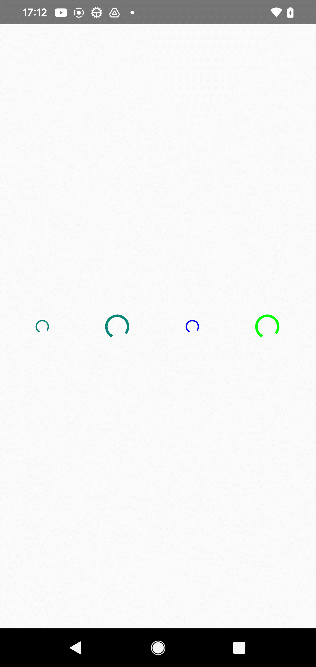
7-2. Alert
import React from 'react';
import {View, StyleSheet, Button, Alert} from 'react-native';

// アプリ
const App = () => {
  // 2ボタンアラートの生成
  const createTwoButtonAlert = () =>
    Alert.alert('Alert Title', 'My Alert Msg', [
      {
        text: 'Cancel',
        onPress: () => console.log('Cancel Pressed'),
        style: 'cancel',
      },
      {text: 'OK', onPress: () => console.log('OK Pressed')},
    ]);

  // 3ボタンアラートの生成
  const createThreeButtonAlert = () =>
    Alert.alert('Alert Title', 'My Alert Msg', [
      {
        text: 'Ask me later',
        onPress: () => console.log('Ask me later pressed'),
      },
      {
        text: 'Cancel',
        onPress: () => console.log('Cancel Pressed'),
        style: 'cancel',
      },
      {text: 'OK', onPress: () => console.log('OK Pressed')},
    ]);

  // UI
  return (
    <View style={{ flex: 1, justifyContent: 'space-around', alignItems: 'center' }}>
      <Button title={'2-Button Alert'} onPress={createTwoButtonAlert} />
      <Button title={'3-Button Alert'} onPress={createThreeButtonAlert} />
    </View>
  );
};

export default App;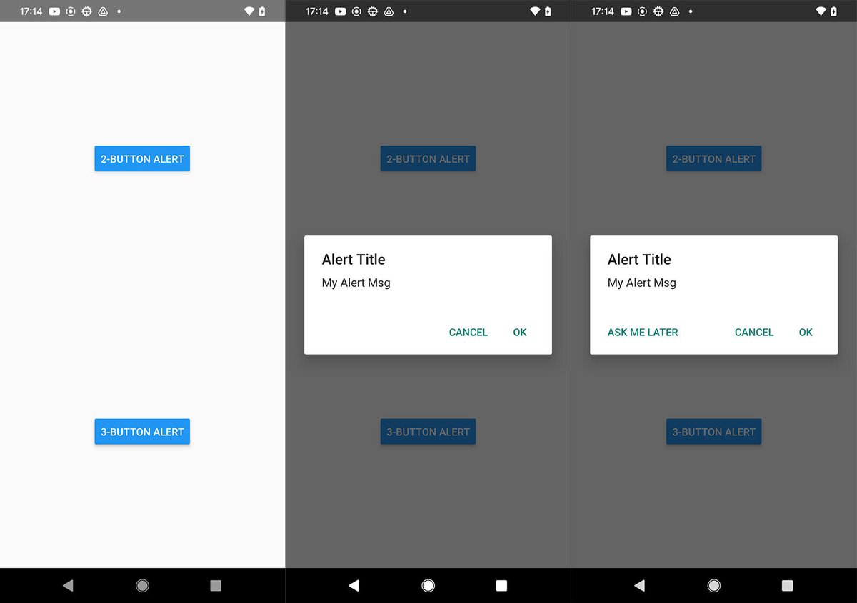
7-3. Animated
import React, {useRef} from 'react';
import { Animated, Text, View, Button, SafeAreaView } from 'react-native';

// アプリ
const App = () => {
  const fadeAnim = useRef(new Animated.Value(0)).current; // 不透明値 (初期値:0)

  // フェードイン
  const fadeIn = () => {
    // 1秒後にfadeAnimの値を1に変更
    Animated.timing(fadeAnim, {
      toValue: 1,
      duration: 1000,
      useNativeDriver: true,
    }).start();
  };

  // フェードアウト
  const fadeOut = () => {
    // 1秒後にfadeAnim値を0に変更
    Animated.timing(fadeAnim, {
      toValue: 0,
      duration: 1000,
      useNativeDriver: true,
    }).start();
  };

  // UI
  return (
    <SafeAreaView style={{ flex: 1, alignItems: 'center', justifyContent: 'center' }}>
      <Animated.View
        style={[
          { padding: 20, backgroundColor: 'powderblue' },
          { opacity: fadeAnim }, // 不透明度をアニメーション値にバインド
        ]}>
        <Text style={{ fontSize: 28 }}>Fading View!</Text>
      </Animated.View>
      <View style={{ flexBasis: 100, justifyContent: 'space-evenly', marginVertical: 16 }}>
        <Button title="Fade In View" onPress={fadeIn} />
        <Button title="Fade Out View" onPress={fadeOut} />
      </View>
    </SafeAreaView>
  );
};

export default App;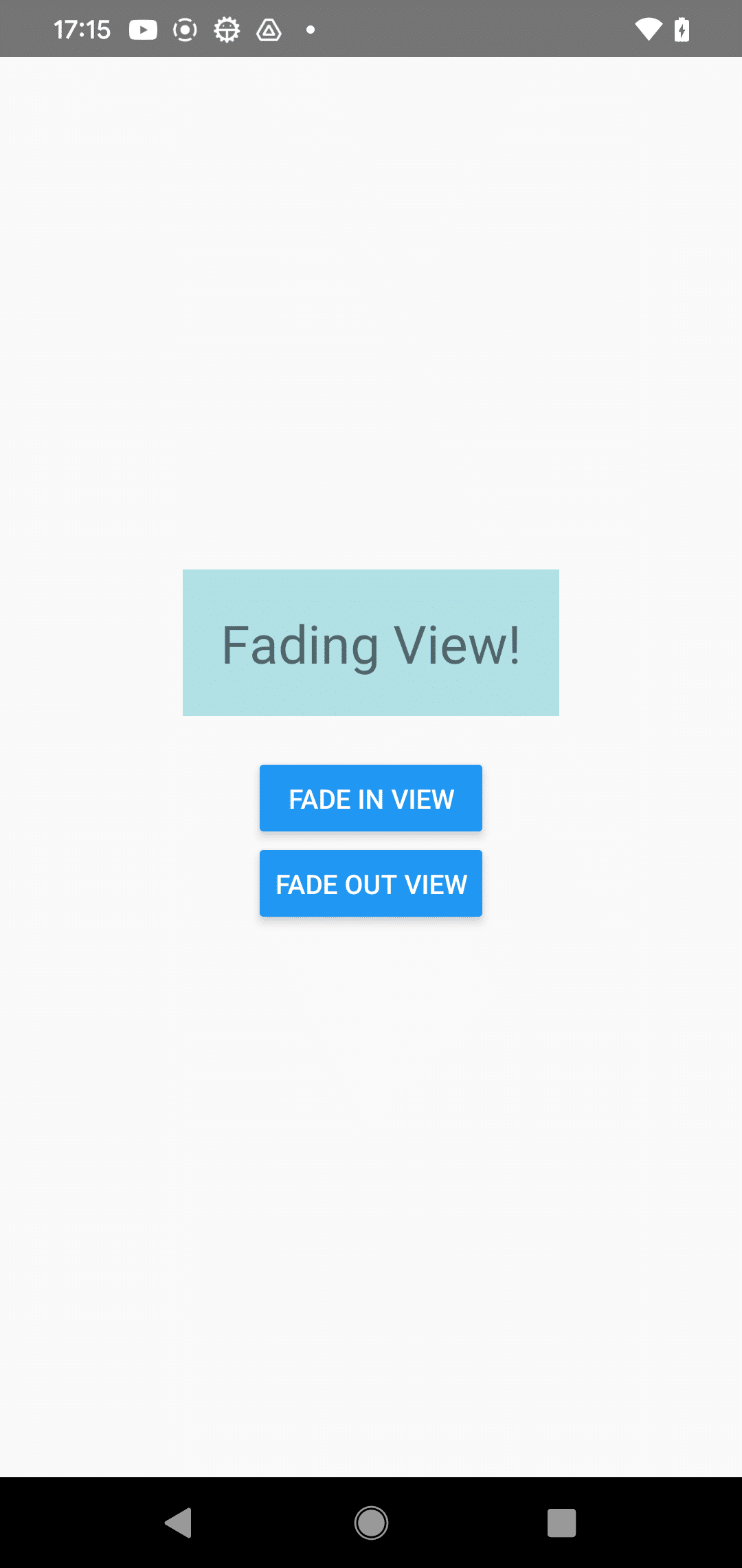
7-4. Dimensions
import React, {useState, useEffect} from 'react';
import {View, Text, Dimensions} from 'react-native';

// ウィンドウサイズとスクリーンサイズの取得
const windowDimensions = Dimensions.get('window');
const screenDimensions = Dimensions.get('screen');

// アプリ
const App = () => {
  const [dimensions, setDimensions] = useState({
    window: windowDimensions,
    screen: screenDimensions,
  });

  // 初期化
  useEffect(() => {
    const subscription = Dimensions.addEventListener(
      'change',
      ({window, screen}) => {
        setDimensions({window, screen});
      },
    );
    return () => subscription?.remove();
  });

  // UI
  return (
    <View style={{ flex: 1, justifyContent: 'center', alignItems: 'center' }}>
      <Text style={{ fontSize: 16, marginVertical: 10 }}>Window Dimensions</Text>
      {Object.entries(dimensions.window).map(([key, value]) => (
        <Text>
          {key} - {value}
        </Text>
      ))}
      <Text style={{ fontSize: 16, marginVertical: 10 }}>Screen Dimensions</Text>
      {Object.entries(dimensions.screen).map(([key, value]) => (
        <Text>
          {key} - {value}
        </Text>
      ))}
    </View>
  );
};

export default App;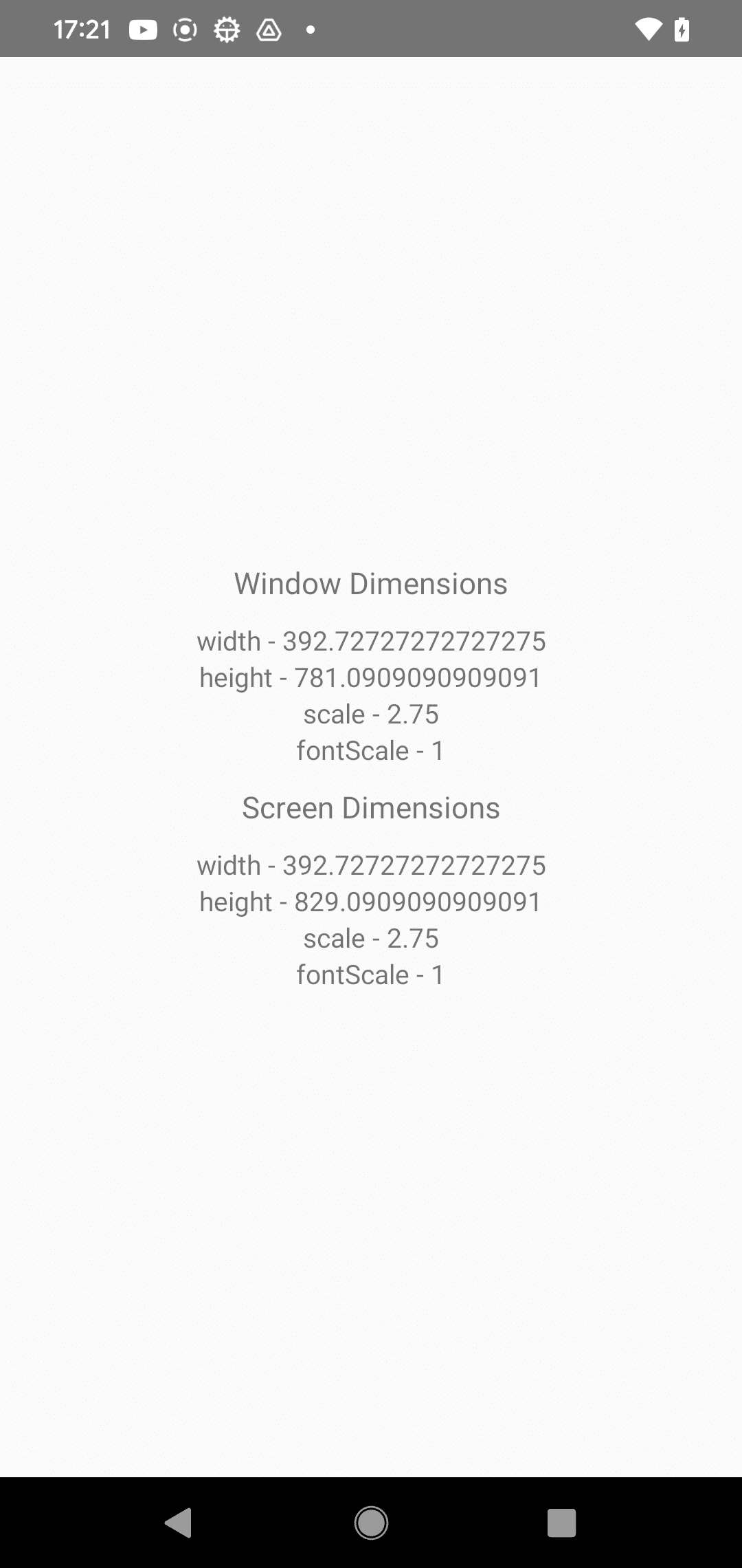
7-5. KeyboardAvoidingView
import React from 'react';
import { View, KeyboardAvoidingView, TextInput, Text, Platform, TouchableWithoutFeedback, Button, Keyboard } from 'react-native';

// アプリ
const App = () => {
  // UI
  return (
    <KeyboardAvoidingView
      behavior={Platform.OS === 'ios' ? 'padding' : 'height'}
      style={{ flex: 1 }}>
      <TouchableWithoutFeedback onPress={Keyboard.dismiss}>
        <View style={{ padding: 24, flex: 1, justifyContent: 'space-around' }}>
          <Text style={{ fontSize: 36, marginBottom: 48 }}>Header</Text>
          <TextInput placeholder="Username" style={{ height: 40, borderColor: '#000000', borderBottomWidth: 1, marginBottom: 36 }} />
          <View style={{ backgroundColor: 'white', marginTop: 12 }}>
            <Button title="Submit" onPress={() => null} />
          </View>
        </View>
      </TouchableWithoutFeedback>
    </KeyboardAvoidingView>
  );
};

export default App;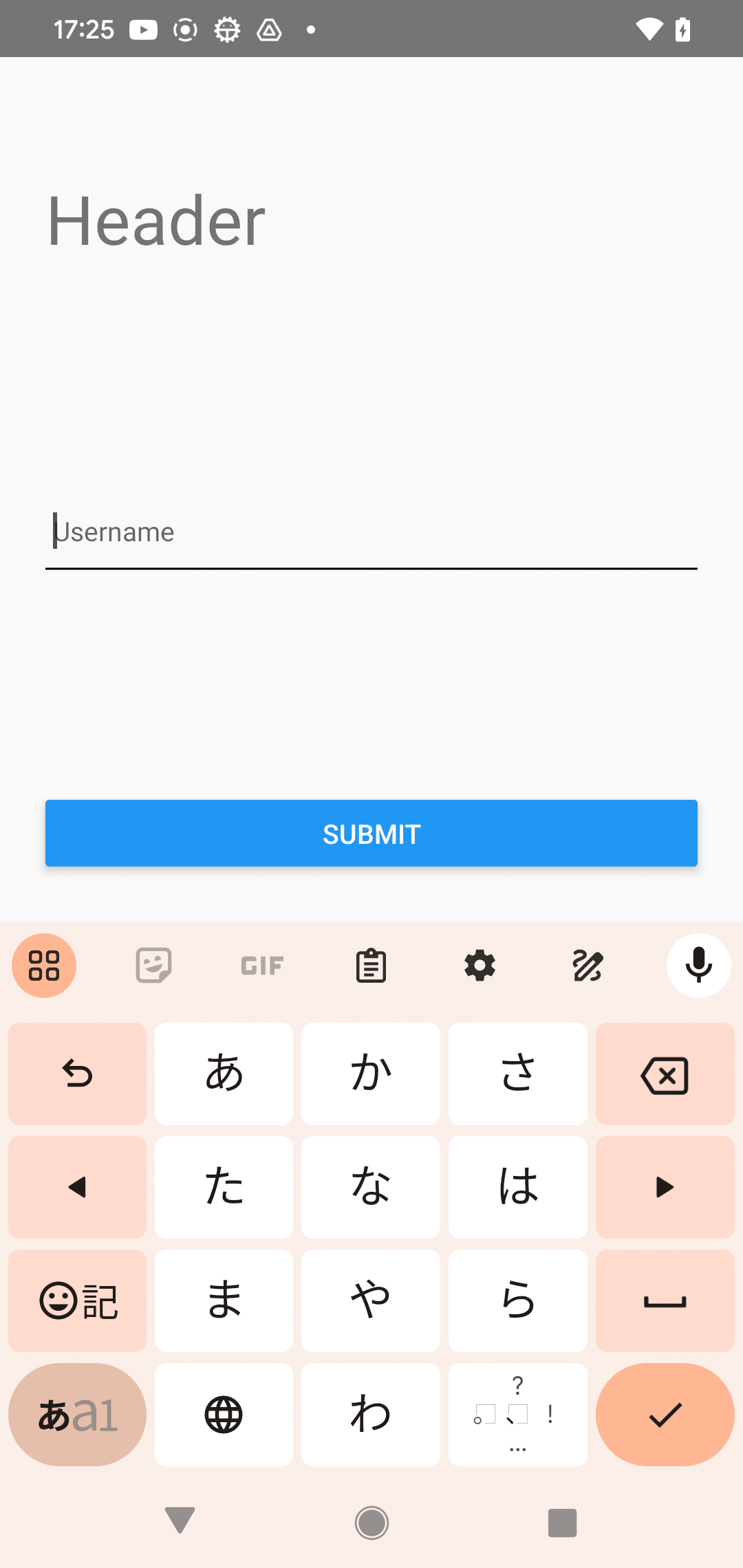
7-6. Modal
import React, {useState} from 'react';
import {Alert, Modal, Text, Pressable, View} from 'react-native';

// アプリ
const App = () => {
  const [modalVisible, setModalVisible] = useState(false);

  // UI
  return (
    <View style={{ flex: 1, justifyContent: 'center', alignItems: 'center', marginTop: 22 }}>
      <Modal
        animationType="slide"
        transparent={true}
        visible={modalVisible}
        onRequestClose={() => {
          Alert.alert('Modal has been closed.');
          setModalVisible(!modalVisible);
        }}>
        <View style={{ flex: 1, justifyContent: 'center', alignItems: 'center', marginTop: 22 }}>
          <View style={{ margin: 20, backgroundColor: 'white', borderRadius: 20, padding: 35, alignItems: 'center', shadowColor: '#000', shadowOffset: { width: 0, height: 2 }, shadowOpacity: 0.25, shadowRadius: 4, elevation: 5 }}>
            <Text style={{ marginBottom: 15, textAlign: 'center' }}>Hello World!</Text>
            <Pressable
              style={[{ borderRadius: 20, padding: 10, elevation: 2 }, { backgroundColor: '#2196F3' }]}
              onPress={() => setModalVisible(!modalVisible)}>
              <Text style={{ color: 'white', fontWeight: 'bold', textAlign: 'center' }}>Hide Modal</Text>
            </Pressable>
          </View>
        </View>
      </Modal>
      <Pressable
        style={[{ borderRadius: 20, padding: 10, elevation: 2 }, { backgroundColor: '#F194FF' }]}
        onPress={() => setModalVisible(true)}>
        <Text style={{ color: 'white', fontWeight: 'bold', textAlign: 'center' }}>Show Modal</Text>
      </Pressable>
    </View>
  );
};

export default App;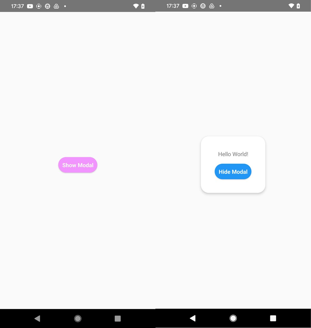
7-7. PixelRatio
import React from 'react';
import { Image, PixelRatio, ScrollView, Text, View } from 'react-native';

const size = 50;
const cat = {
  uri: 'https://reactnative.dev/docs/assets/p_cat1.png',
  width: size,
  height: size,
};

// アプリ
const App = () => (
  <ScrollView style={{ flex: 1 }}>
    <View style={{ justifyContent: 'center', alignItems: 'center' }}>
      <Text>Current Pixel Ratio is:</Text>
      <Text style={{ fontSize: 24, marginBottom: 12, marginTop: 4 }}>{PixelRatio.get()}</Text>
    </View>
    <View style={{ justifyContent: 'center', alignItems: 'center' }}>
      <Text>Current Font Scale is:</Text>
      <Text style={{ fontSize: 24, marginBottom: 12, marginTop: 4 }}>{PixelRatio.getFontScale()}</Text>
    </View>
    <View style={{ justifyContent: 'center', alignItems: 'center' }}>
      <Text>On this device images with a layout width of</Text>
      <Text style={{ fontSize: 24, marginBottom: 12, marginTop: 4 }}>{size} px</Text>
      <Image source={cat} />
    </View>
    <View style={{ justifyContent: 'center', alignItems: 'center' }}>
      <Text>require images with a pixel width of</Text>
      <Text style={{ fontSize: 24, marginBottom: 12, marginTop: 4 }}>
        {PixelRatio.getPixelSizeForLayoutSize(size)} px
      </Text>
      <Image
        source={cat}
        style={{
          width: PixelRatio.getPixelSizeForLayoutSize(size),
          height: PixelRatio.getPixelSizeForLayoutSize(size),
        }}
      />
    </View>
  </ScrollView>
);

export default App;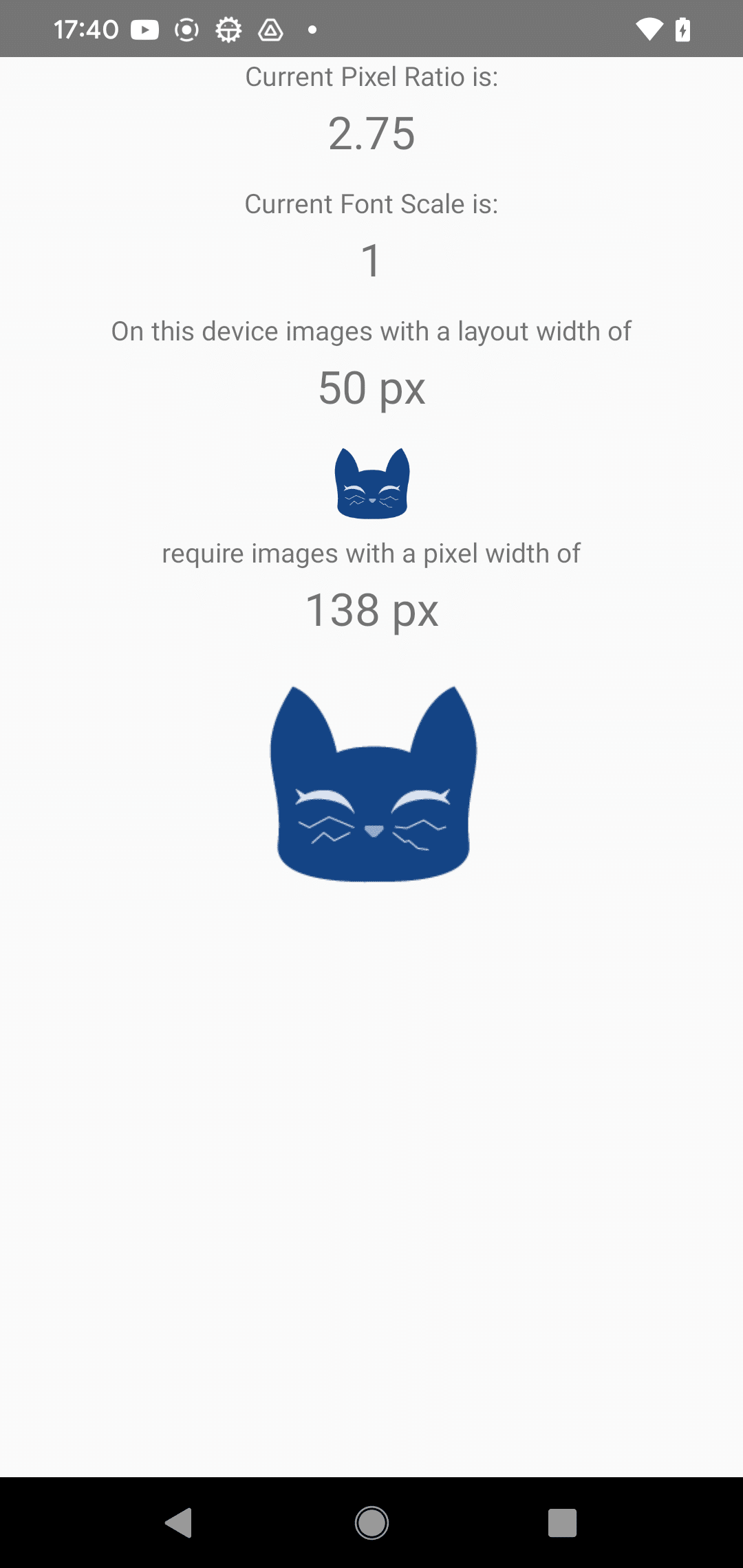
7-8. RefreshControl
import React from 'react';
import { RefreshControl, SafeAreaView, ScrollView, Text } from 'react-native';

// アプリ
const App = () => {
  const [refreshing, setRefreshing] = React.useState(false);

  const onRefresh = React.useCallback(() => {
    setRefreshing(true);
    setTimeout(() => {
      setRefreshing(false);
    }, 2000);
  }, []);

  // UI
  return (
    <SafeAreaView style={{ flex: 1 }}>
      <ScrollView
        contentContainerStyle={{ flex: 1, backgroundColor: 'pink', alignItems: 'center', justifyContent: 'center' }}
        refreshControl={
          <RefreshControl refreshing={refreshing} onRefresh={onRefresh} />
        }>
        <Text>Pull down to see RefreshControl indicator</Text>
      </ScrollView>
    </SafeAreaView>
  );
};

export default App;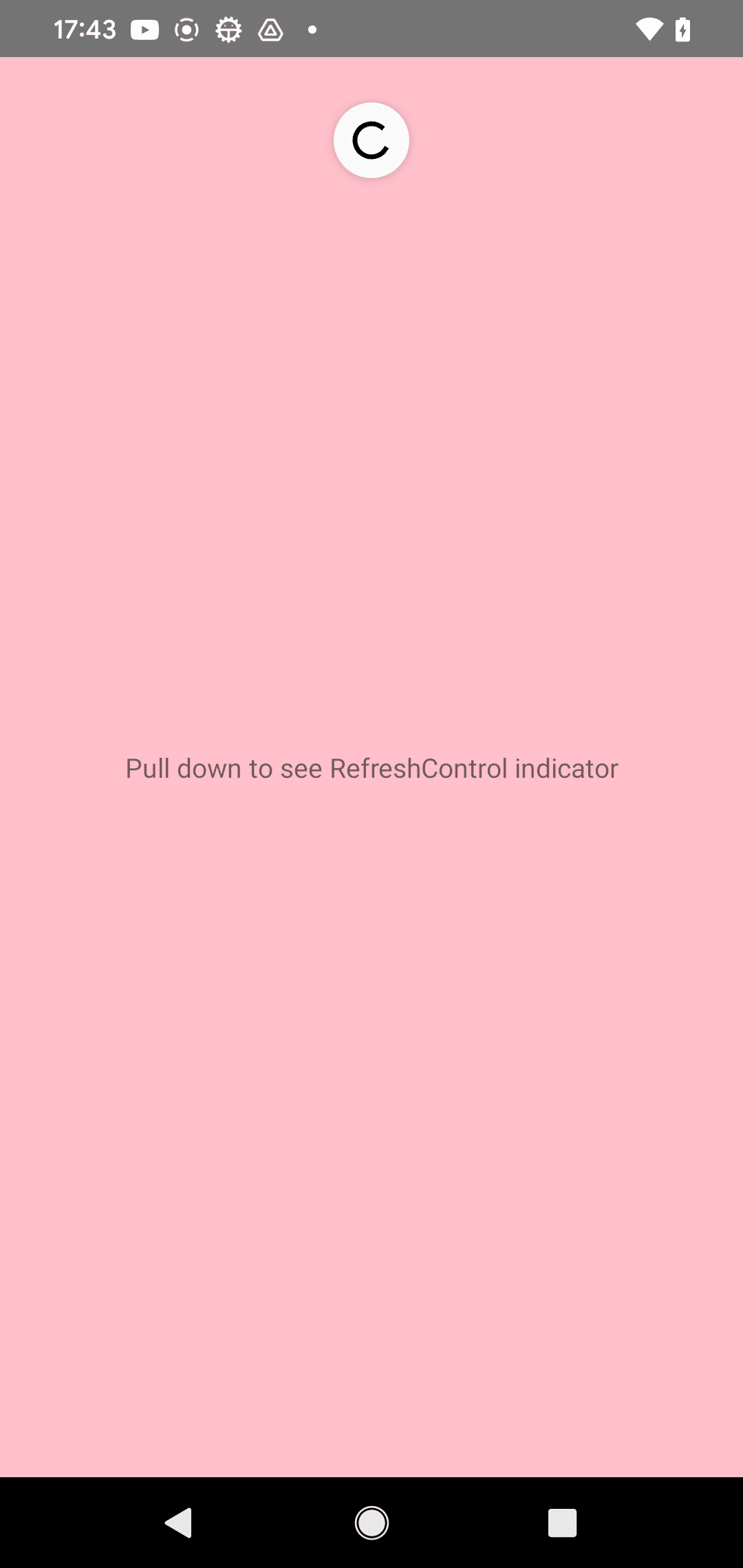
7-9. StatusBar
import React, {useState} from 'react';
import { Button, Platform, SafeAreaView, StatusBar, Text, View } from 'react-native';
import type {StatusBarStyle} from 'react-native';

const STYLES = ['default', 'dark-content', 'light-content'] as const;
const TRANSITIONS = ['fade', 'slide', 'none'] as const;

// アプリ
const App = () => {
  const [hidden, setHidden] = useState(false);
  const [statusBarStyle, setStatusBarStyle] = useState<StatusBarStyle>(
    STYLES[0],
  );
  const [statusBarTransition, setStatusBarTransition] = useState<
    'fade' | 'slide' | 'none'
  >(TRANSITIONS[0]);

  // ステータスバー表示の変更
  const changeStatusBarVisibility = () => setHidden(!hidden);

  // ステータスバースタイルの変更
  const changeStatusBarStyle = () => {
    const styleId = STYLES.indexOf(statusBarStyle) + 1;
    if (styleId === STYLES.length) {
      setStatusBarStyle(STYLES[0]);
    } else {
      setStatusBarStyle(STYLES[styleId]);
    }
  };

  // ステータスバートランジションの変更
  const changeStatusBarTransition = () => {
    const transition = TRANSITIONS.indexOf(statusBarTransition) + 1;
    if (transition === TRANSITIONS.length) {
      setStatusBarTransition(TRANSITIONS[0]);
    } else {
      setStatusBarTransition(TRANSITIONS[transition]);
    }
  };

  // UI
  return (
    <SafeAreaView style={{ flex: 1, justifyContent: 'center', backgroundColor: '#ECF0F1' }}>
      <StatusBar
        animated={true}
        backgroundColor="#61dafb"
        barStyle={statusBarStyle}
        showHideTransition={statusBarTransition}
        hidden={hidden}
      />
      <Text style={{ textAlign: 'center', marginBottom: 8 }}>
        StatusBar Visibility:{'\n'}
        {hidden ? 'Hidden' : 'Visible'}
      </Text>
      <Text style={{ textAlign: 'center', marginBottom: 8 }}>
        StatusBar Style:{'\n'}
        {statusBarStyle}
      </Text>
      {Platform.OS === 'ios' ? (
        <Text style={{ textAlign: 'center', marginBottom: 8 }}>
          StatusBar Transition:{'\n'}
          {statusBarTransition}
        </Text>
      ) : null}
      <View style={{ padding: 10 }}>
        <Button title="Toggle StatusBar" onPress={changeStatusBarVisibility} />
        <Button title="Change StatusBar Style" onPress={changeStatusBarStyle} />
        {Platform.OS === 'ios' ? (
          <Button
            title="Change StatusBar Transition"
            onPress={changeStatusBarTransition}
          />
        ) : null}
      </View>
    </SafeAreaView>
  );
};

export default App;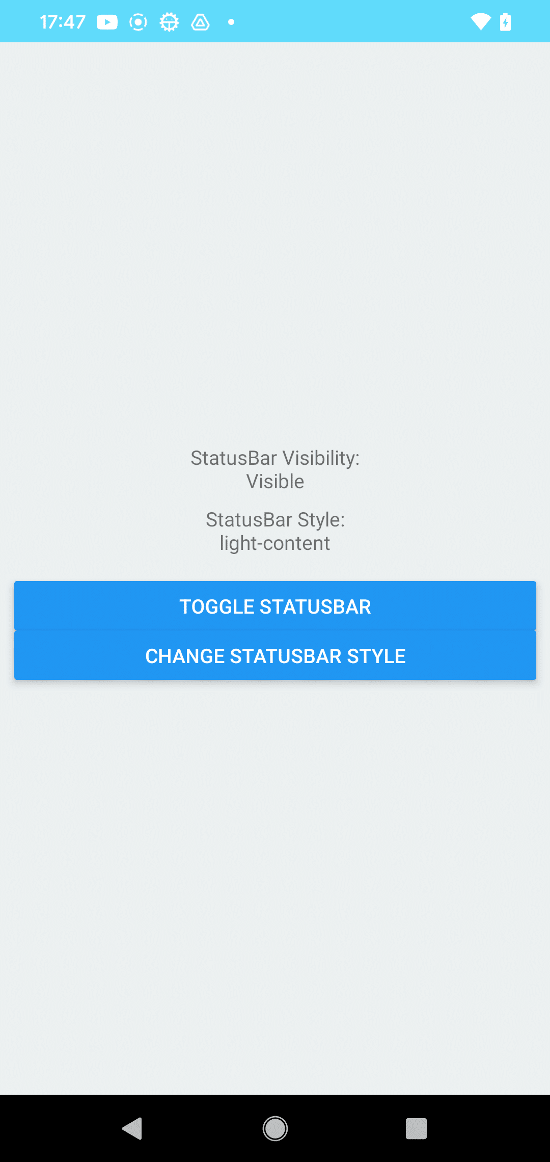
【おまけ】 React Native の主要コンポーネントのリンク集
・React Native のコアコンポーネント
・Expo SDK のコンポーネント
・React Native Pager のコンポーネント
・React Native のナビゲーション
・react-native-vector-icons