
S&P500+Bitcoinの組み合わせ

サブテーマ:最適ポートフォリオ
1 初めに
直近、米国大統領選挙の結果を受けて好調な市場の中、その中で一番価格があがっているBitcoinです。このBitcoinを組み入れた場合の最適な保有割合に興味がわきましたので算出してみました。
今回のまとめ:ポートフォリオに10%ビットコインが良い結果

(上:SP500、中:最適ポートフォリオ、下:おすすめポートフォリオ)
このチャンネルでは直近よりアウトプットを重視して、本文はPYTHONコードに触れず結果をご報告します。コード全文は最下部に公開しておきます。再現性を確保するため、GoogleColabを使って実行した結果としています。PYTHONを使ってみたい方勉強してみたい方はまずはコピペでぜひ触ってみてください。
2 豆知識
仮想通貨(Bitcoin)の見通し (私見)
Bitcoin(ビットコイン)の今後の見通しは、複数の要因により左右されます。一方で、規制の進展や国際的な認知度の向上により、長期的な資産価値の維持が期待されるとする楽観的な見方があります。特に、法定通貨のインフレヘッジとしての役割や、デジタルゴールドとしての性質が注目されています。また、企業や金融機関による採用が進むことで、さらなる市場拡大が予想されます。しかし、一方では規制強化や市場のボラティリティが懸念材料として挙げられます。特に、各国政府の仮想通貨規制や中央銀行デジタル通貨(CBDC)の導入が、Bitcoinの需要に影響を与える可能性があります。総じて、短期的には価格の変動が続くと予想されますが、技術革新や経済状況により、長期的な成長の可能性は依然として高いと言えるでしょう。
3 実践
1)実行結果
今回YahooFinanceからS&P500(SPY)とBitcoin、Gold(GLD)、米国長期債券(EDV)の各ETF価格をもとに、S&P500 50%に対し、どの保有割合がどのような過去実績だったのかを調査しました。ビットコインは2014年以降のため集計データは2014年から直近までとなっています。
その後、それぞれのポートフォリオの最適化プログラムで、投資効率を図る指標であるシャープレシオがもっともよくなる組み合わせを算出しました。また収益重視のポートフォリオとしておすすめポートフォリオでの実績も算出しました。
2)相関係数
この期間の相関係数(平均)を算出した結果です。1が相関ありに対し、いずれのアセットも0~0.3と低い相関を占めていて、組み合わせには好ましいことがうかがえます。

3)組み合わせ検討
初めにS&P500と組み合わた場合のざっくりとしたパフォーマンス分布です。Bitcoinのリターンとリスクのすさまじさが伝わるグラフです。過去からBitcoin投資していた人がうらやましいです。
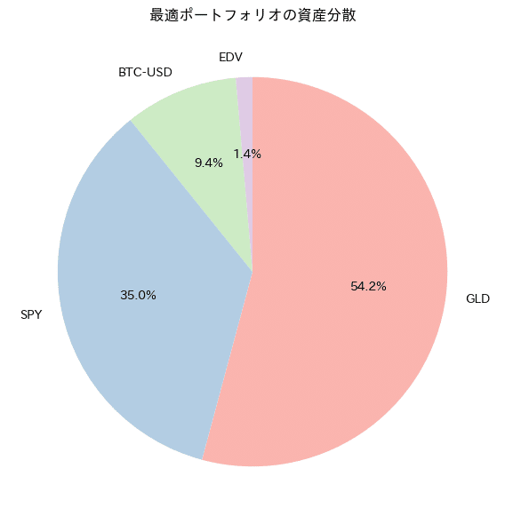
しかしながら全資産Bitcoinもリスクがありすぎると思います。妥当なところでS&P500 50%に対しその他アセットを組み合わせることで改善します。特に、S&P500を50%残りをGLD,米国債,Bitcoin(各割合16%)としたポートフォリオはS&P500の同等リスクでリターンが改善できていることがわかります。


4)カスタムポートフォリオのトレンド確認
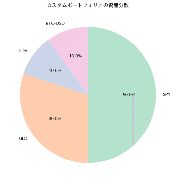
先ほどの結果より、お勧めできるポートフォリオとしてS&P500 50%+金20%+債券20%+Bitcoin10%としたカスタムポートフォリオの実績およびトレンドを算出しました。また同時にシャープレシオを最大とする最適ポートフォリオを算出してみました。こちらは守りでBitcoinとして10%保有することで各段に安定したポートフォリオを構築することができていますので、参考になれば幸いです。

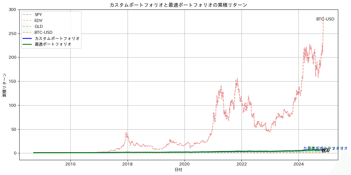


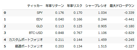
トレンドを確認するとカスタムポートフォリオ、最適ポートフォリオともSPYの変動に対しなだらかにかつ高位で推移している様子が確認できます。また最大ドローダウンもS&P500 単独より低くおさえられいることがわかります。
5)積み立て・取り崩しシミュレーション
最後に、これらポートフォリオの積み立てから取り崩し期までのモンテカルロシミュレーションを実施します。
積み立て期
初期投資額 200万円
月あたり積立 10万円 ×20年
取崩期(20年後以降)
月額 40万円取り崩し
シミュレーション回数500回
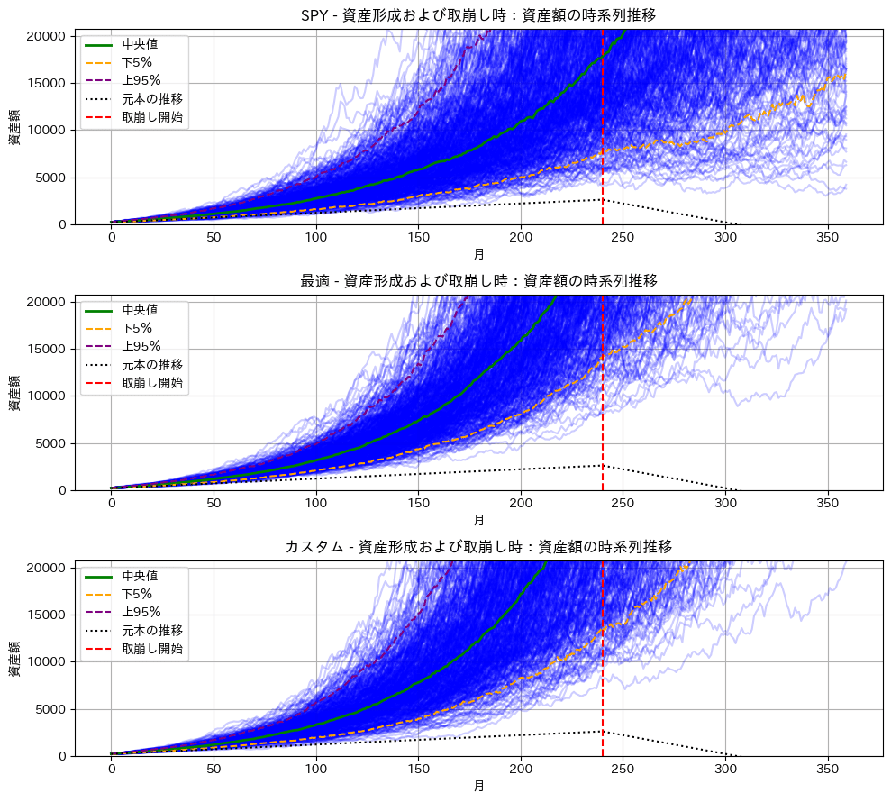
(上:SP500、中:最適ポートフォリオ、下:おすすめポートフォリオ)
実行した結果、S&P500 100%に比べ、Bitcoinを10%保有したポートフォリオは積み立て期に良い成績であり、積み上げた資産効果により取り崩し期に入っても下位5%以下の場合でも資産が減るどころか増えていく様子が確認できます。
今回の結果は2014年から直近までの、S&P500も金もBitcoinも最高値を更新中のベストに近いデータでのバックテストの可能性はありますが、いずれのアセットも組み合わせることでシャープレシオを改善することができる方向性には違いがないかと考えます。
皆様の投資の参考になれば幸いです。
4 最後に
今回はポートフォリオにBitcoinを入れた場合のシミュレーション結果を報告してみました。投資に正解はなく、今回の結果も将来を保証するものではありませんが、皆様のお役に立っていただけると嬉しい限りです。
今後もPYTHON×マネーリテラシー向上に役立つ情報を発信していきますので、引き続き応援よろしくお願いします!!
記事の感想、要望があれば下記X(旧Twitterまで)
*今後の記事に活用させていただきます!!
以下、過去記事、AI時系列予測等のご紹介
他サイトですがココならで、A I(LSTM)を使った株価予測の販売もやってます。こちらではFREDから、失業率や2年10年金利、銅価格等結果も取得しLSTMモデルで予測するコードとなってますので興味があれば見てみてください。またその他2件も米国株投資とは直接関係はありませんがプログラム入門におすすめです。
チャンネル紹介:Kota@Python&米国株投資チャンネル
過去の掲載記事:興味PYがあればぜひ読んでください。
グラフ化集計の基礎:S &P500と金や米国債を比較してます。
移動平均を使った時系列予測
以下実行コード全文:コピペで実行してみてください。
# カスタム・最適ポートフォリオの計算

必要なライブラリをインポート
import yfinance as yf
import pandas as pd
import numpy as np
import matplotlib.pyplot as plt
import japanize_matplotlib  # 日本語表示に対応
from scipy.optimize import minimize  # 最適化のために追加

# 対象のティッカーシンボル
tickers = ['SPY', 'EDV', 'GLD', 'BTC-USD', 'JPY=X']

# データの取得
data = yf.download(tickers, start="2014-01-01", end=pd.Timestamp.now().strftime('%Y-%m-%d'))['Adj Close']

# JPY=Xのデータを前詰めで空洞埋め
data['JPY=X'] = data['JPY=X'].fillna(method='ffill')

# データをドルから円に換算(JPY=X以外のティッカー)
for ticker in tickers[:-1]:  # 'JPY=X'は最後のティッカーなので除外
    data[ticker] = data[ticker] * data['JPY=X']

# 'JPY=X'の列を削除
data.drop(columns=['JPY=X'], inplace=True)

# 欠损値の削除
data = data.dropna()

# 日次リターンの計算
daily_returns = data.pct_change()

# 月次リターンの計算
monthly_data = data.resample('M').last()
monthly_returns = monthly_data.pct_change().dropna()

# 年率リターンと共分散行列の計算
mean_returns = monthly_returns.mean() * 12
cov_matrix = monthly_returns.cov() * 12

# カスタムポートフォリオの定義
custom_weights = {'SPY': 0.50, 'EDV': 0.10, 'GLD': 0.30, 'BTC-USD': 0.10}

# カスタムポートフォリオのリターンとリスクの計算
custom_return = sum(mean_returns[ticker] * weight for ticker, weight in custom_weights.items())
custom_volatility = np.sqrt(
    sum(custom_weights[ticker1] * custom_weights[ticker2] * cov_matrix.loc[ticker1, ticker2]
        for ticker1 in custom_weights for ticker2 in custom_weights)
)
custom_sharpe_ratio = custom_return / custom_volatility

# カスタムポートフォリオの累積リターンを計算
custom_daily_returns = daily_returns[list(custom_weights.keys())].dot(pd.Series(custom_weights))
custom_cumulative_return = (1 + custom_daily_returns).cumprod()

# 最適ポートフォリオの計算を追加
def portfolio_annualized_performance(weights, mean_returns, cov_matrix):
    returns = np.dot(weights, mean_returns)
    std = np.sqrt(np.dot(weights.T, np.dot(cov_matrix, weights)))
    return returns, std

def negative_sharpe_ratio(weights, mean_returns, cov_matrix):
    p_ret, p_std = portfolio_annualized_performance(weights, mean_returns, cov_matrix)
    return -p_ret / p_std

def max_sharpe_ratio(mean_returns, cov_matrix):
    num_assets = len(mean_returns)
    args = (mean_returns, cov_matrix)
    constraints = ({'type': 'eq', 'fun': lambda x: np.sum(x) - 1})
    bounds = tuple((0, 1) for asset in range(num_assets))  # ショートを許可しない場合
    result = minimize(negative_sharpe_ratio, num_assets * [1. / num_assets, ], args=args,
                      method='SLSQP', bounds=bounds, constraints=constraints)
    return result

# 最適ポートフォリオの計算
optimal_portfolio = max_sharpe_ratio(mean_returns, cov_matrix)
optimal_weights = optimal_portfolio.x

# 最適ポートフォリオのリターンとリスクの計算
optimal_return, optimal_volatility = portfolio_annualized_performance(optimal_weights, mean_returns, cov_matrix)
optimal_sharpe_ratio = optimal_return / optimal_volatility

# 最適ポートフォリオの累積リターンを計算
optimal_daily_returns = daily_returns[mean_returns.index].dot(optimal_weights)
optimal_cumulative_return = (1 + optimal_daily_returns).cumprod()

# 各ティッカーの累積リターンを計算
cumulative_returns = (1 + daily_returns).cumprod()

# グラフの描画
plt.figure(figsize=(12, 6))

# 各ティッカーの累積リターンをプロット
tickers = [ticker for ticker in tickers if ticker != 'JPY=X']
for ticker in tickers:
    plt.plot(cumulative_returns[ticker], label=ticker, linestyle='--', alpha=0.5)

# カスタムポートフォリオの累積リターンをプロット
plt.plot(custom_cumulative_return, label='カスタムポートフォリオ', color='blue', linewidth=2)

# 最適ポートフォリオの累積リターンをプロット
plt.plot(optimal_cumulative_return, label='最適ポートフォリオ', color='green', linewidth=2)

# 各ティッカーのラベルを累積リターンの最後に追加
for ticker in tickers:
    plt.annotate(ticker, (cumulative_returns.index[-1], cumulative_returns[ticker].iloc[-1]),
                 textcoords="offset points", xytext=(5, 0), ha='center')

plt.annotate('カスタムポートフォリオ', (custom_cumulative_return.index[-1], custom_cumulative_return.iloc[-1]),
             textcoords="offset points", xytext=(5, 0), ha='center', color='blue')

plt.annotate('最適ポートフォリオ', (optimal_cumulative_return.index[-1], optimal_cumulative_return.iloc[-1]),
             textcoords="offset points", xytext=(5, 0), ha='center', color='green')

# グラフの設定
plt.title('カスタムポートフォリオと最適ポートフォリオの累積リターン')
plt.xlabel('日付')
plt.ylabel('累積リターン')
plt.legend()
plt.grid(True)
plt.tight_layout()
plt.show()

# 対数スケールの累積リターンのグラフを追加
plt.figure(figsize=(12, 6))

# 各ティッカーの累積リターンをプロット(対数スケール)
for ticker in tickers:
    plt.plot(cumulative_returns[ticker], label=ticker, linestyle='--', alpha=0.5)

# カスタムポートフォリオの累積リターンをプロット(対数スケール)
plt.plot(custom_cumulative_return, label='カスタムポートフォリオ', color='blue', linewidth=2)

# 最適ポートフォリオの累積リターンをプロット(対数スケール)
plt.plot(optimal_cumulative_return, label='最適ポートフォリオ', color='green', linewidth=2)

# 各ティッカーのラベルを累積リターンの最後に追加(対数スケール)
for ticker in tickers:
    plt.annotate(ticker, (cumulative_returns.index[-1], cumulative_returns[ticker].iloc[-1]),
                 textcoords="offset points", xytext=(5, 0), ha='center')

plt.annotate('カスタムポートフォリオ', (custom_cumulative_return.index[-1], custom_cumulative_return.iloc[-1]),
             textcoords="offset points", xytext=(5, 0), ha='center', color='blue')

plt.annotate('最適ポートフォリオ', (optimal_cumulative_return.index[-1], optimal_cumulative_return.iloc[-1]),
             textcoords="offset points", xytext=(5, 0), ha='center', color='green')

# グラフの設定(対数スケール)
plt.title('カスタムポートフォリオと最適ポートフォリオの累積リターン(対数スケール)')
plt.xlabel('日付')
plt.ylabel('累積リターン(対数スケール)')
plt.yscale('log')
plt.legend()
plt.grid(True)
plt.tight_layout()
plt.show()

# 累積リターンの範囲を限定したグラフの追加
plt.figure(figsize=(12, 6))

# 各ティッカーの累積リターンをプロット(範囲限定)
for ticker in tickers:
    plt.plot(cumulative_returns[ticker], label=ticker, linestyle='--', alpha=0.5)

# カスタムポートフォリオの累積リターンをプロット(範囲限定)
plt.plot(custom_cumulative_return, label='カスタムポートフォリオ', color='blue', linewidth=2)

# 最適ポートフォリオの累積リターンをプロット(範囲限定)
plt.plot(optimal_cumulative_return, label='最適ポートフォリオ', color='green', linewidth=2)

# 各ティッカーのラベルを累積リターンの最後に追加(範囲限定)
for ticker in tickers:
    plt.annotate(ticker, (cumulative_returns.index[-1], cumulative_returns[ticker].iloc[-1]),
                 textcoords="offset points", xytext=(5, 0), ha='center')

plt.annotate('カスタムポートフォリオ', (custom_cumulative_return.index[-1], custom_cumulative_return.iloc[-1]),
             textcoords="offset points", xytext=(5, 0), ha='center', color='blue')

plt.annotate('最適ポートフォリオ', (optimal_cumulative_return.index[-1], optimal_cumulative_return.iloc[-1]),
             textcoords="offset points", xytext=(5, 0), ha='center', color='green')

# グラフの設定(範囲限定)
plt.title('カスタムポートフォリオと最適ポートフォリオの累積リターン(限定範囲)')
plt.xlabel('日付')
plt.ylabel('累積リターン')
plt.ylim(0.8, 10)  # 軸の範囲を限定
plt.legend()
plt.grid(True)
plt.tight_layout()
plt.show()

# 最大ドローダウンの計算
def calculate_max_drawdown(returns):
    cumulative = (1 + returns).cumprod()
    drawdown = (cumulative / cumulative.cummax()) - 1
    return drawdown.min()

# パフォーマンス指標の作成
performance_data = {
    'ティッカー': tickers,
    '年率リターン': [mean_returns.loc[ticker] for ticker in tickers],
    '年率リスク': [cov_matrix.loc[ticker, ticker] ** 0.5 for ticker in tickers],
    'シャープレシオ': [mean_returns.loc[ticker] / (cov_matrix.loc[ticker, ticker] ** 0.5) for ticker in tickers],
    '最大ドローダウン': [calculate_max_drawdown(daily_returns[ticker]) for ticker in tickers]
}
portfolio_performance = pd.DataFrame(performance_data)

# カスタムポートフォリオのパフォーマンス指標を追加
custom_data = pd.DataFrame({
    'ティッカー': ['カスタムポートフォリオ'],
    '年率リターン': [custom_return],
    '年率リスク': [custom_volatility],
    'シャープレシオ': [custom_sharpe_ratio],
    '最大ドローダウン': [calculate_max_drawdown(custom_daily_returns)]
})
portfolio_performance = pd.concat([portfolio_performance, custom_data], ignore_index=True)

# 最適ポートフォリオのパフォーマンス指標を追加
optimal_data = pd.DataFrame({
    'ティッカー': ['最適ポートフォリオ'],
    '年率リターン': [optimal_return],
    '年率リスク': [optimal_volatility],
    'シャープレシオ': [optimal_sharpe_ratio],
    '最大ドローダウン': [calculate_max_drawdown(optimal_daily_returns)]
})
portfolio_performance = pd.concat([portfolio_performance, optimal_data], ignore_index=True)

# 小数点以3桁に丸める
portfolio_performance = portfolio_performance.round(3)

# パフォーマンス指標の表示
print(portfolio_performance)

# リスクリターン散布図の描画
plt.figure(figsize=(10, 6))
colors = portfolio_performance['ティッカー'].apply(lambda x: 'r' if x == 'カスタムポートフォリオ' else ('g' if x == '最適ポートフォリオ' else 'b'))
plt.scatter(portfolio_performance['年率リスク'], portfolio_performance['年率リターン'], c=colors, marker='o')

for i, txt in enumerate(portfolio_performance['ティッカー']):
    plt.annotate(txt, (portfolio_performance['年率リスク'][i], portfolio_performance['年率リターン'][i]),
                 textcoords="offset points", xytext=(5, 5), ha='center')

plt.xlabel('年率リスク(標準偏差)')
plt.ylabel('年率リターン')
plt.title('ポートフォリオおよび各ティッカーのリスクとリターン')
plt.grid(True)
plt.tight_layout()
plt.show()

# SPYとの相関係数の算出とグラフ化
correlation_with_spy = daily_returns.corr()['SPY'].drop('SPY')

plt.figure(figsize=(10, 6))
correlation_with_spy.plot(kind='bar', color='skyblue')
plt.xlabel('資産')
plt.ylabel('相関係数')
plt.title('各資産とSPYの日次リターン相関係数')
plt.grid(True)
plt.tight_layout()
plt.show()

# 最適ポートフォリオのウェイトを表示
optimal_weights_df = pd.DataFrame({
    'ティッカー': mean_returns.index,
    'ウェイト': optimal_weights * 100  # パーセント表示
})
optimal_weights_df = optimal_weights_df.round(1)
optimal_weights_df = optimal_weights_df[optimal_weights_df['ウェイト'] >= 0.1]

print("\n最適ポートフォリオのウェイト:")
print(optimal_weights_df)

# 最適ポートフォリオのウェイトをパイプチャート化(割合の大きな順に並べ、右回りに変更)
plt.figure(figsize=(10, 6))
# ウェイトとティッカーをソート
sorted_indices = np.argsort(optimal_weights)[::-1]  # 降順にソート
sorted_weights = [optimal_weights[i] for i in sorted_indices if optimal_weights[i] * 100 >= 0.1]
sorted_labels = [mean_returns.index[i] for i in sorted_indices if optimal_weights[i] * 100 >= 0.1]
colors = plt.get_cmap('Pastel1').colors
plt.pie(sorted_weights, labels=sorted_labels, autopct='%1.1f%%', startangle=90, counterclock=False, colors=colors)
plt.title('最適ポートフォリオの資産分散')
plt.tight_layout()
plt.show()

# カスタムポートフォリオのウェイトをパイプチャート化
plt.figure(figsize=(10, 6))
# ウェイトとティッカーをソート
custom_data = sorted(zip(custom_weights.values(), custom_weights.keys()), reverse=True)  # 降順にソート
sorted_custom_sizes, sorted_custom_labels = zip(*custom_data)
plt.pie(sorted_custom_sizes, labels=sorted_custom_labels, autopct='%1.1f%%', startangle=90, counterclock=False, colors=plt.get_cmap('Pastel2').colors)
plt.title('カスタムポートフォリオの資産分散')
plt.tight_layout()
plt.show()

portfolio_performance