Making of Kyash Card: Part 2
Hello, It’s Carlos again. Hope you guys enjoyed the last post of this series. So, the story continues…
: People
Yes, we start to do user testing.
The design team tries to find some internal users not involved in this project, so we decide to ask some volunteers on slack.
And finally, we got 5, they’re working in accounting, human resources, marketing, and operations.
We made a simple scenario and invited them each to the small meeting room, let them touch the prototype that we made, and ask them some questions and feedback.

After a few rounds of the test, the answer is really obvious: We failed.
Some people could finish the task we asked them to, some even couldn’t finish that. Most of the feedback were around information provide, some of them couldn't feel safe by the sentence, and they were concerned about the price being too high….etc.
We felt exhausted after the user testing, but it was also exciting that we finally could see the shape of the problem.
: Problems
The key to getting solutions is about how you ask the questions.
And about the problems, there are also so many ways that can be solved.
We're always learning a lot through this process.
Sometimes it’s related to other divisions, like contents of description, tagline, or the UX writing issue. In this case, we needed to collaborate with other teams like operations and marketing, to figure out what is really important to the users, and how we could simplify the communication with them.

Sometimes it’s about the design solution. We try to brainstorm the ideas as often as we can, and we try to create different types of solutions and prototype them, followed by repeated testing and iteration.
We like to prototype to validate user problems over and over again. This helps us get closer to the answer to the problem. And we don't even need to get into the code.
We also found out that there were some empty waiting time while the user’s request were processed. So we tried to find a way to prompt the user to reopen the app from there to confirm the result, or can feel anticipation when they see on our main screen.

: Perseverance
For the product development method, iterate always a thing as we know.
For Kyash design team, we’re trying to build something that it doesn’t exist yet. As there are so many unsure insight and user behavior that we don’t know yet, the iterating process is really important for us to verify our concept and insight.

In the book “Design Sprint” and the method of design thinking, they also mentioned the iterate during the process. If you’re trying to create a user-central product, adopting this kind of cycle in the design team can be really helpful. The designer can use a prototype to confirm the concept, the contents, and the user behavior to consummate their design solution before starting the development.
We were done for a few runs in the EMV project period. Still not perfect, but as we said, we still can use this method to iterate the way we did and get better and better.
: Polish
Even when everything works fine on the design process, there still comes out of the problem when you start to develop.
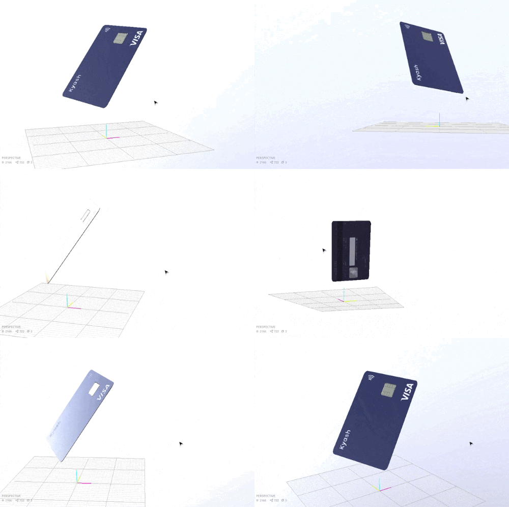
Kyash Card, for example, the most difficult part is this one:

This animation actually related so many details of the object and the design. Engineers need to take care of the resolution changes and the section movement.
Our engineer team struggled with this transaction for a long time, we even had a discussion to think of removing it. When we talk about this, I think I need to mention one of our values in Kyash: Always trying to go top, great isn’t good enough. Because of that, we didn’t give up implementing this smooth interaction in the production, even in the Android, which has much less animation support, our engineer, Mr. Tanaka always tries his best to provide the same experience with iOS users, really great job done.
As a designer, I’m really grateful that engineers love and try to support the design that we made, always thinking about providing a better experience to the users, feel happy to be in the team with them.
: Publish
On Feb 25, 2020, We finally announced the new Kyash Card to the public.

We got tens of thousands of requests just in one day, we didn’t expect that, it’s totally out of our control, our server even went down for a few times in a day.
This is the first time we've encountered this situation, and we're sorry that some users got some trouble during the experience when we just launch.
And we also got tons of feedback from our user community and SNS, really appreciate them.

Even the users still need to wait for about 1 month to get the real card, but some of them still enjoy the small detail and animation that we prepare for them, hope it can let them get some joy by our design.
It has been already 3 months since we launched the Kyash Card, we still think of how to improve the process of request and better browsing experience for this project. It’s like what I mentioned before, making a product is make a cycle to iterate, to learn, to get better in any way. We will keep learning by our users, communities, hope can provide the best experience for you.
: Part 3?
So, what’s next?
You never know. 🤫

この記事が気に入ったらサポートをしてみませんか?
