For R beginners Lesson 4. "Data Visualization Basics"

4. Data Visualization Basics
BasicsData visualization is a crucial part of data analysis, allowing you to visually explore and present your data. In R, there are several powerful packages that make creating visualizations straightforward and effective. This section will introduce some of the fundamental concepts and tools for creating basic plots and graphs in R.
4.1 Introduction to Base R Plotting Functions
R comes with a set of basic plotting functions that are easy to use for quick data exploration. Let's go over a few of these base functions.
Example: Basic Plotting with Base R
# Create a simple dataset
x <- c(1, 2, 3, 4, 5)
y <- c(3, 7, 8, 12, 15)

# Basic scatter plot
plot(x, y, main = "Basic Scatter Plot", xlab = "X Values", ylab = "Y Values", pch = 19)
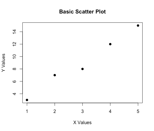
Explanation:
plot(): The most basic plotting function in R, which can create various types of plots depending on the input data.
main: Adds a main title to the plot.
xlab and ylab: Label the x-axis and y-axis.
pch: Specifies the type of points to use in the plot (e.g., 19 for filled circles).
4.2 The ggplot2 Package for Advanced Graphics
ggplot2 is a powerful and flexible package for creating complex visualizations in R. It uses the Grammar of Graphics, which allows you to build plots in a layered fashion.
Installing and Loading ggplot2
Before using ggplot2, you need to install and load it into your R session.
# Install ggplot2 (run this line only once)
install.packages("ggplot2")

# Load the ggplot2 library
library(ggplot2)
Example: Creating a Simple Plot with "ggplot2"
# Create a data frame for plotting
data <- data.frame(
  x = c(1, 2, 3, 4, 5),
  y = c(3, 7, 8, 12, 15)
)

# Basic scatter plot with ggplot2
ggplot(data, aes(x = x, y = y)) +
  geom_point() +
  labs(title = "Scatter Plot with ggplot2", x = "X Values", y = "Y Values")
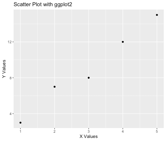
Explanation:
ggplot(): Initializes a ggplot object.
aes(): Defines the aesthetic mappings (e.g., which variables map to the x and y axes).
geom_point(): Adds a scatter plot layer to the plot.
labs(): Adds labels and titles to the plot.
4.3 Common Plot Types with ggplot2
Here are some common types of plots you can create using ggplot2.
5.3.1 Scatter Plots
Scatter plots are useful for showing the relationship between two continuous variables.
# Scatter plot with ggplot2
ggplot(data, aes(x = x, y = y)) +
  geom_point(color = "blue", size = 3) +
  labs(title = "Scatter Plot", x = "X Values", y = "Y Values")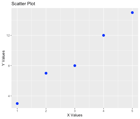
4.3.2 Line Plots
Line plots are useful for visualizing trends over time or another continuous variable.
# Line plot with ggplot2
ggplot(data, aes(x = x, y = y)) +
  geom_line(color = "red") +
  labs(title = "Line Plot", x = "X Values", y = "Y Values")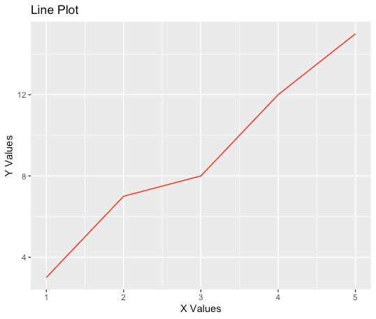
4.3.3 Bar Plots
Bar plots are useful for displaying the distribution of a categorical variable.
# Create a data frame for a bar plot
bar_data <- data.frame(
  category = c("A", "B", "C", "D"),
  values = c(3, 7, 8, 12)
)

# Bar plot with ggplot2
ggplot(bar_data, aes(x = category, y = values)) +
  geom_bar(stat = "identity", fill = "lightblue") +
  labs(title = "Bar Plot", x = "Category", y = "Values")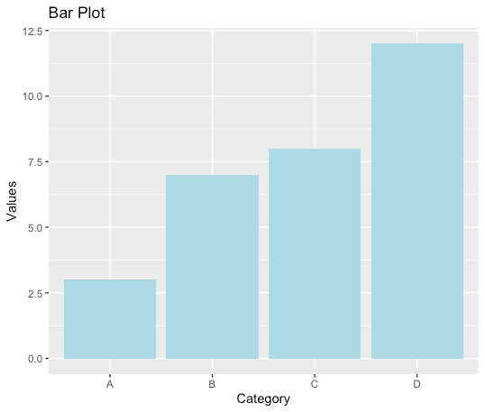
Explanation:
geom_bar(stat = "identity"): By default, geom_bar() uses stat = "count", which means it counts the number of observations in each category. When you set stat = "identity", it uses the actual values provided in the data frame (y = values in this case) to create the heights of the bars. This is useful when you already have summarized data and just want to plot it.
4.3.4 Histograms
Histograms are useful for visualizing the distribution of a single continuous variable.
# Create a dataset for histogram
hist_data <- data.frame(
  values = c(1, 2, 2, 3, 3, 3, 4, 4, 4, 4, 5, 5, 5, 5, 5)
)

# Histogram with ggplot2
ggplot(hist_data, aes(x = values)) +
  geom_histogram(binwidth = 1, fill = "orange", color = "black") +
  labs(title = "Histogram", x = "Values", y = "Frequency")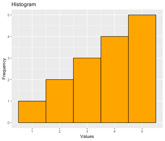
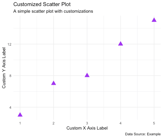
4.4 Customizing Plots
ggplot2 allows for extensive customization of plots to make them more informative and visually appealing.
Example: Customizing a Scatter Plot
# Customized scatter plot
ggplot(data, aes(x = x, y = y)) +
  geom_point(color = "purple", size = 4, shape = 17) +  # Change point color, size, and shape
  theme_minimal() +  # Apply a minimal theme
  labs(
    title = "Customized Scatter Plot",
    subtitle = "A simple scatter plot with customizations",
    x = "Custom X Axis Label",
    y = "Custom Y Axis Label",
    caption = "Data Source: Example"
  )
4.5 Saving Plots
You can save plots created in R to files using various functions. Here’s how you can do it with ggplot2.
Example: Saving a Plot to a File
# Save a ggplot to a file
p <- ggplot(data, aes(x = x, y = y)) +
  geom_point() +
  labs(title = "Scatter Plot Example")

# Save using default working directory
ggsave("scatter_plot.png", plot = p, width = 5, height = 4)

# Save using a specific path
ggsave("path/to/your/directory/scatter_plot.png", plot = p, width = 5, height = 4)

# Output: A file named "scatter_plot.png" saved to your specified directory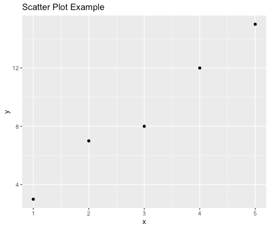
Explanation:
ggsave(): Saves the last plot that was displayed or a specified plot object (plot = p in this case) to a file. You can specify the file name and the dimensions.
Saving with a path: By specifying the path in the file name, you can save the plot to a specific directory. This is useful when organizing your outputs or when working in different projects.
In this section, we explored the basics of data visualization in R using both base plotting functions and the more advanced ggplot2 package. We learned how to create various types of plots, customize them, and save them to files. Visualization is a powerful tool in data analysis, and mastering these basics will help you better explore and communicate your data.
この記事が気に入ったらサポートをしてみませんか?