sapui5のグラフのデザイン変更について

sapui5のwizFrameを使用したグラフ描画の説明が公式にもなかなか見当たらなかったので調査した結果をここにまとめておきます。
sapui5のwizFrameを用いて作成したグラフという対象はピンポイントですのでソースコードは最小限にしております。
まずは基本の形式(横棒グラフ)
今回紹介するのはsapui5のvizFrameを用いた横棒グラフです。各種設定について紹介する前にベースとなるソースコードとグラフです。
Charts.view.xml
<mvc:View
    controllerName="uimodule.webapp.controller.Charts"
    xmlns="sap.m"
    xmlns:layout="sap.ui.layout"
    xmlns:mvc="sap.ui.core.mvc"
    xmlns:viz="sap.viz.ui5.controls"
    xmlns:viz.feeds="sap.viz.ui5.controls.common.feeds"
    xmlns:viz.data="sap.viz.ui5.data">
    <Page>
        <content>
            <layout:FixFlex>
                <layout:flexContent>
                    <viz:VizFrame id="idVizFrame" uiConfig="{applicationSet:'fiori'}"
                        height='100%'
                        width="100%"
                        vizType='bar'>
                        <viz:dataset>
                            <viz.data:FlattenedDataset data="{charts>/parttime}">
                                <viz.data:dimensions>
                                    <viz.data:DimensionDefinition name="department"
                                        value="{charts>department}" />
                                </viz.data:dimensions>
                                <viz.data:measures>
                                    <viz.data:MeasureDefinition name="hourly"
                                        value="{charts>hourly}" />
                                </viz.data:measures>
                            </viz.data:FlattenedDataset>
                        </viz:dataset>
                        <viz:feeds>
                            <viz.feeds:FeedItem uid="categoryAxis" type="Dimension"
                                values="department" />
                            <viz.feeds:FeedItem id='valueAxisFeed' uid="valueAxis" type="Measure"
                                values="hourly" />
                        </viz:feeds>
                        <viz:dependents>
                            <viz:Popover id="idPopOver"></viz:Popover>
                        </viz:dependents>
                    </viz:VizFrame>
                </layout:flexContent>
        </layout:FixFlex>
        </content>
    </Page>
</mvc:View>
Charts.controller.js
sap.ui.define([
    "sap/ui/core/mvc/Controller",
    ],
    function (Controller) {
    "use strict";
    var Controller =  Controller.extend("uimodule.webapp.controller.Charts", {

    });
    return Controller;
});
とりあえずグラフを出力するだけならコントローラーの中身は空っぽで大丈夫です。
Charts.json
{
    "parttime": [
        {
            "department": "東京営業部",
            "hourly": 1000
        },
        {
            "department": "横浜営業部",
            "hourly": 800
        },
        {
            "department": "広島営業部",
            "hourly": 1200
        },
        {
            "department": "九州営業部",
            "hourly": 2000
        }
      ]
}
データ項目の内容は適当です。
manifest.json
      "models": {
        "i18n": {
          "type": "sap.ui.model.resource.ResourceModel",
          "settings": {
            "bundleName": "uimodule.webapp.i18n.i18n"
          }
        },
        "charts":{
            "type": "sap.ui.model.json.JSONModel",
            "uri": "model/Charts.json"
        }
      },
manifest.jsonはmodelsの項目以外を省略しております。
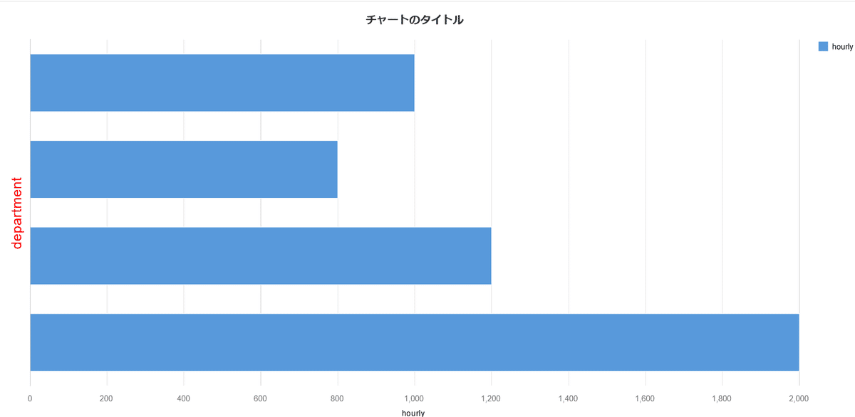
上記のソースで作成されたvizFrameの横棒グラフ

各種設定の紹介
それではvizFrameの各設定について説明していきます。触るのはコントローラー側だけを修正する流れとなっていきます。
項目軸の設定
では項目軸の設定についてです。ここでの項目軸は東京営業部とか横浜営業部を指しております。
項目軸名の表示非表示の設定
sap.ui.define([
    "sap/ui/core/mvc/Controller",
    ],
    function (Controller) {
    "use strict";
    var Controller =  Controller.extend("uimodule.webapp.controller.Charts", {
        onInit : function () {
            var oVizFrame = this.getView().byId("idVizFrame");
            oVizFrame.setVizProperties({
                categoryAxis: {
                    title: {
                        visible: false
                    },
                },
        });
     }
    });
    return Controller;
});
グラフの詳細設定はsetVizPropertiesで行います。そして項目軸の設定はcategoryAxis内で行います。titleは項目軸名、ここではdepartmentについての設定変更を行う箇所です。title内のvisibleをfalseにしますとdepartmentの表記が消えます。

左側に縦書きで表記されていたdepartmentが消えていることが分かると思います。後続で紹介する値軸の設定でも同様の記述が使用できます。
2.項目軸名の文字の大きさ、色の設定
続いて項目軸名の文字の大きさや色の設定についての解説です。
sap.ui.define([
    "sap/ui/core/mvc/Controller",
    ],
    function (Controller) {
    "use strict";
    var Controller =  Controller.extend("uimodule.webapp.controller.Charts", {
        onInit : function () {
            var oVizFrame = this.getView().byId("idVizFrame");
            oVizFrame.setVizProperties({
                categoryAxis: {
                    title: {
                        visible: true,
                        style: {
                            fontSize: "20px",
                            color:"red",
                        }
                    },
                },
        });
     }
    });
    return Controller;
});
文字の大きさや色の設定はtitle内にstyleを設定することで可能になります。ここでは文字の大きさを20px、文字色を赤にしています。

departmentの文字に装飾がかかっていることが分かるかと思います。
3.項目ラベルの設定
東京営業部、横浜営業部といったラベルも設定することができます。
設定個所はcategoryAxis内にlabel項目を設定し、その中で実装することになります。まずはラベルの表示非表示の設定方法の実装方法と結果です。
sap.ui.define([
    "sap/ui/core/mvc/Controller",
    ],
    function (Controller) {
    "use strict";
    var Controller =  Controller.extend("uimodule.webapp.controller.Charts", {
        onInit : function () {
            var oVizFrame = this.getView().byId("idVizFrame");
            oVizFrame.setVizProperties({
                categoryAxis: {
                    title: {
                        visible: true,
                        style: {
                            fontSize: "20px",
                            color:"red",
                        }
                    },
                    label: {
                        visible: false,
                    },
                },
        });
     }
    });
    return Controller;
});
続いてラベルを表示してラベルの装飾を実装していきます。実装方法はtitleと同様にstyleを設定するだけで可能です。
sap.ui.define([
    "sap/ui/core/mvc/Controller",
    ],
    function (Controller) {
    "use strict";
    var Controller =  Controller.extend("uimodule.webapp.controller.Charts", {
        onInit : function () {
            var oVizFrame = this.getView().byId("idVizFrame");
            oVizFrame.setVizProperties({
                categoryAxis: {
                    title: {
                        visible: true,
                        style: {
                            fontSize: "20px",
                            color:"red",
                        }
                    },
                    label: {
                        visible: true,
                        style: {
                            fontSize: "20px",
                            fontWeight:"bold"
                        }
                    },
                }
        });
     }
    });
    return Controller;
});
ラベルの大きさや太さが変わったことが分かるかと思います。
値軸の設定
先ほどは項目軸の設定について解説しましたので、続いて値軸の設定の方にいきます。設定はvalueAxis内に記述していきます。基本的には項目軸と同じなので一気に解説します。
sap.ui.define([
    "sap/ui/core/mvc/Controller",
    ],
    function (Controller) {
    "use strict";
    var Controller =  Controller.extend("uimodule.webapp.controller.Charts", {
        onInit : function () {
            var oVizFrame = this.getView().byId("idVizFrame");
            oVizFrame.setVizProperties({
                valueAxis: {
                    title: {
                        visible: true,
                        style: {
                            fontSize: "20px",
                            color:"red",
                        }
                    },
                    label:{
                        visible: true,
                        style:{
                            fontSize: "20px",
                            color:"orange",
                        }
                    },
                },
        });
     }
    });
    return Controller;
});
visibleをfalseに設定しますと項目やラベルは非表示になります。色や大きさの装飾も項目軸の設定方法と同じですね。

凡例・タイトルの設定方法
続いて凡例・タイトルの設定の実装方法について解説します。記載の仕方は基本同じで、凡例はlegend、タイトルはtitle内に記述していきます。
まずはそれぞれの非表示についてです。
sap.ui.define([
    "sap/ui/core/mvc/Controller",
    ],
    function (Controller) {
    "use strict";
    var Controller =  Controller.extend("uimodule.webapp.controller.Charts", {
        onInit : function () {
            var oVizFrame = this.getView().byId("idVizFrame");
            oVizFrame.setVizProperties({
      //~~省略しています
             // 凡例
            legend: {
                visible: false
            },
            title: {
                visible: false,
                text: 'sapui5のグラフの設定あれこれ'
            }

        });
     }
    });
    return Controller;
});
右上の凡例と上部のタイトルが消えていますね。タイトルの装飾方法も先ほど紹介しました項目軸と同様の方法です。凡例は同様にstyle項目を設定して試してみたのですが反映されませんでした。
sap.ui.define([
    "sap/ui/core/mvc/Controller",
    ],
    function (Controller) {
    "use strict";
    var Controller =  Controller.extend("uimodule.webapp.controller.Charts", {
        onInit : function () {
            var oVizFrame = this.getView().byId("idVizFrame");
            oVizFrame.setVizProperties({
      //~~省略しています
             // 凡例
            legend: {
                visible: true,
                style:{
                    fontSize: "20px",
                    color:"blue",
                }
            },
            title: {
                visible: true,
                text: 'sapui5のグラフの設定あれこれ',
                style:{
                    fontSize: "20px",
                    color:"green",
                }
            }
        });
     }
    });
    return Controller;
});
グラフ内の値の設定
今まではグラフの外側の設定変更について解説しましたが、いよいよグラフ自体の設定変更をしていきたいと思います。グラフの装飾変更はplotArea内に設定を書き込んでいきます。
グラフ内の値の表示・非表示はplotArea内にdataLabelで設定で実装いたします。以下の例は値を表示、表示された文字の大きさ30px、色が青のケースです。
sap.ui.define([
    "sap/ui/core/mvc/Controller",
    ],
    function (Controller) {
    "use strict";
    var Controller =  Controller.extend("uimodule.webapp.controller.Charts", {
        onInit : function () {
            var oVizFrame = this.getView().byId("idVizFrame");
            oVizFrame.setVizProperties({
            //~~省略しています
            plotArea: {
                dataLabel: {
                    // データの値の表示・非表示
                    visible: true,
                    style:{
                        color:"blue",
                        fontSize: "30px"
                    }
                },
            },

        });
     }
    });
    return Controller;
});

グラフ内部の文字に関しては反映されないようですね・・・。グラフの外にある値は反映されております。sapui5の仕様なのかは現時点で不明です。
グリッド線の非表示
グラフのグリッド線の非表示はplotArea内でgridlineをfalseに指定で実現できます。
sap.ui.define([
    "sap/ui/core/mvc/Controller",
    ],
    function (Controller) {
    "use strict";
    var Controller =  Controller.extend("uimodule.webapp.controller.Charts", {
        onInit : function () {
            var oVizFrame = this.getView().byId("idVizFrame");
            oVizFrame.setVizProperties({
            //~~省略しています
            plotArea: {
                dataLabel: {
                    // データの値の表示・非表示
                    visible: true,
                    style:{
                        color:"blue",
                        fontSize: "30px"
                    }
                },
                gridline: {
                    visible: false,
                },
            },

        });
     }
    });
    return Controller;
});

縦のグリッド線が非表示になったことが分かるかと思います。
項目別のグラフの色分け
グラフを色分けすることも可能です。実装方法はplotArea内のdataPointStyle内でrulesという項目を設定することで実現可能となります。
sap.ui.define([
    "sap/ui/core/mvc/Controller",
    ],
    function (Controller) {
    "use strict";
    var Controller =  Controller.extend("uimodule.webapp.controller.Charts", {
        onInit : function () {
            var oVizFrame = this.getView().byId("idVizFrame");
            oVizFrame.setVizProperties({
            // 省略しています
            plotArea: {
            // 省略しています
                dataPointStyle: {
                    "rules": [
                    {
                        // 条件
                        "dataContext": [{
                            department: { in : ["横浜営業部"]
                            },
                            "hourly": "*"
                        }],
                        // 条件に一致した時
                        "properties": {
                            "color":"blue"
                        },
                    },
                    {
                        // 条件
                        "dataContext": [{
                            department: { in : ["広島営業部","東京営業部"]
                            },
                            "hourly": "*"
                        }],
                        // 条件に一致した時
                        "properties": {
                            "color":"red"
                        },
                    },
                    {
                        // 条件
                        "dataContext": [{
                            department: { in : ["九州営業部"]
                            },
                            "hourly": "*"
                        }],
                        // 条件に一致した時
                        "properties": {
                            "color":"yellow"
                        },

                    }
                ]}
            },

        });
    }
    });
    return Controller;
});

rulesの中にあるdataContext項目に条件を記載し、一致した場合をpropertiesに記載することでグラフの色分けができます。右上にあるセマンティック範囲というキーワードは以下の処理の様にdisplayName項目を設定してあげることで変更が可能です。
                    "rules": [
                    {
                        // 条件
                        "dataContext": [{
                            department: { in : ["横浜営業部"]
                            },
                            "hourly": "*"
                        }],
                        // 条件に一致した時
                        "properties": {
                            "color":"blue"
                        },
                        displayName: "横浜営業部",
                    },
          // 以下省略
先ほどのセマンティック範囲という文言が変更されたことが分かるかと思います。これらの文言を非表示にしたい場合は凡例のvisibleをfalseにするだけです。
まとめ
sapui5のグラフの表示について解説しました。sapui5を使用して開発している人のヒントになれば幸いです。