【visionOS】HoverEffectをカスタマイズしてみる

はじめに
こんにちは!システム開発部のYです。
visionOS 1.xでは、デフォルトのハイライトによるHoverEffectのみの利用でしたが、visionOS 2.0からはHoverEffectをカスタマイズできるようになりました。
今回は、アップフロンティア製アプリ「System Monitor」のボタンを例に、そのカスタマイズ方法についてまとめます。
Entityのホバーのカスタマイズについてもまとめています。
気になる方は、以下を参照してください。
【visionOS】HoverEffectComponentをカスタマイズしてみる
環境
Swift Version: 5.10
Xcode: 16.1
visionOS: 2.1
Reality Composer Pro: 2.0
macOS: 14.5
実装について
以下の手順で進めていきます。
デフォルトのHoverEffect
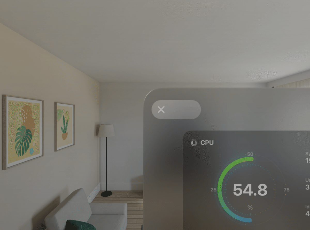
System Monitorには、Closeボタンがあります。
デフォルトのHoverEffectでは、フォーカスを合わせるとボタンがハイライトされます。
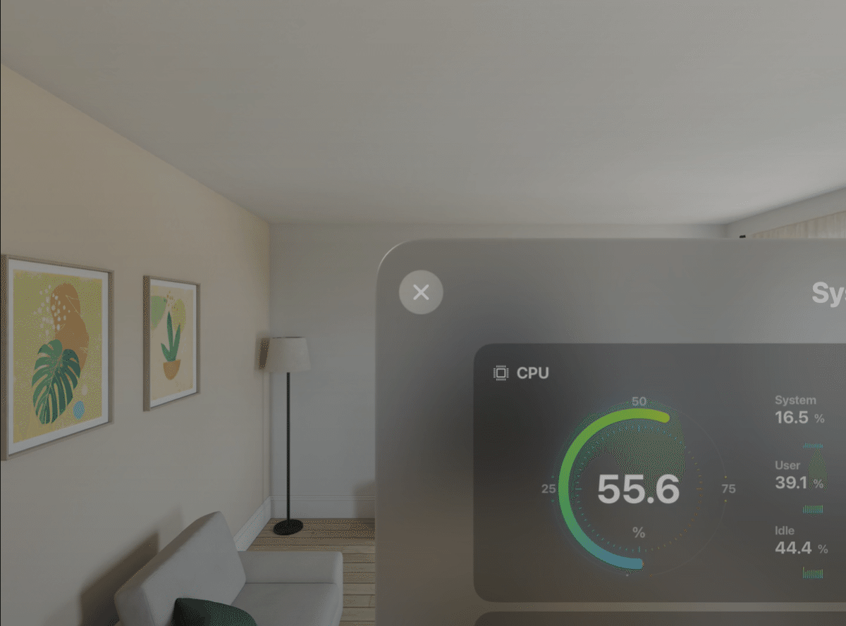
今回は、このCloseボタンにフォーカスを合わせた際のHoverEffectをカスタマイズしてみたいと思います。
Buttonの外観を制御するには、buttonStyle を使用して作成します。
HoverEffectをカスタマイズするには、.hoverEffectモディファイアを利用します。
.hoverEffect(.highlight)では、ハイライト効果を指定することができます。
スケールエフェクトは、.hoverEffectモディファイア内にコードブロックを追加して実装します。
.hoverEffectモディファイア内のisActiveプロパティを使用すると、エフェクトがアクティブか非アクティブかを判別できます。このisActiveを利用して、scaleEffectでサイズを変更しています。
struct CloseBtnView: View {
var action: () -> Void = { }
var body: some View {
Button(action: action) {
Image(.iconClose)
.padding(15)
}
.buttonStyle(CloseButtonScaleEffectStyle())
}
struct CloseButtonScaleEffectStyle: ButtonStyle {
func makeBody(configuration: Configuration) -> some View {
configuration.label
.background(.thinMaterial)
.hoverEffect(.highlight)
.clipShape(.capsule)
.hoverEffect { effect, isActive, _ in
effect.scaleEffect(isActive ? 1.05 : 1.0)
}
}
}
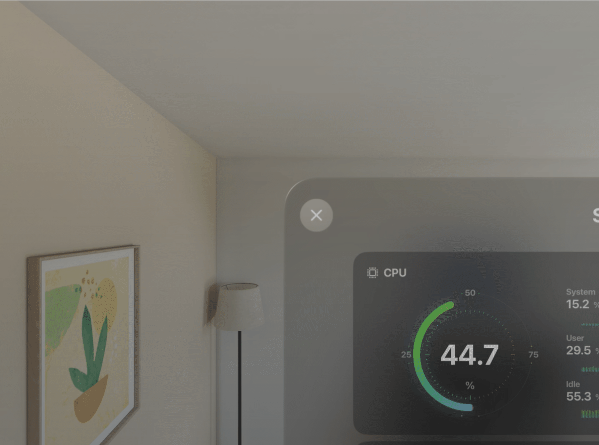
}フォーカス時にクリップシェイプエフェクトする
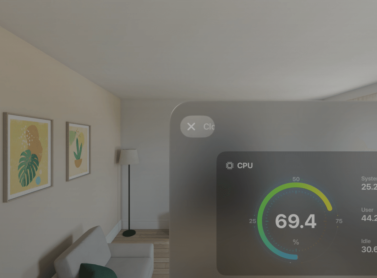
ボタンのデザインを画像とタイトルの組み合わせに変更しました。
エフェクトがアクティブな場合は、ボタンの幅に合わせたclipShapeを適用し、非アクティブ時には幅と高さを一致させて円形のclipShapeを作成します。
さらに、sizeのanchorパラメーターをleadingに指定することで、clipShapeの位置をボタンの先頭を基準に左端に揃えています。
struct CloseBtnView: View {
var action: () -> Void = { }
var body: some View {
Button(action: action) {
HStack(spacing: 2) {
Image(.iconClose)
.padding(15)
Text("Close")
.font(.body)
.padding(.trailing, 24)
}
}
.buttonStyle(CloseButtonClipShapeStyle())
}
struct CloseButtonClipShapeStyle: ButtonStyle {
func makeBody(configuration: Configuration) -> some View {
configuration.label
.background(.thinMaterial)
.hoverEffect(.highlight)
.hoverEffect { effect, isActive, proxy in
effect.clipShape(.capsule.size(
width: isActive ? proxy.size.width : proxy.size.height,
height: proxy.size.height,
anchor: .leading
))
.scaleEffect(isActive ? 1.05 : 1.0)
}
}
}
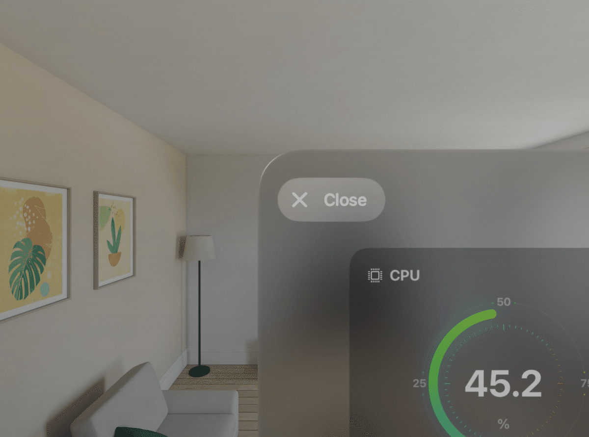
}フォーカス時にテキストもフェードイン
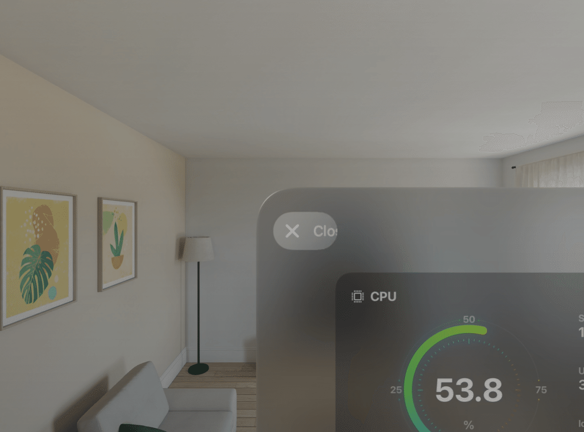
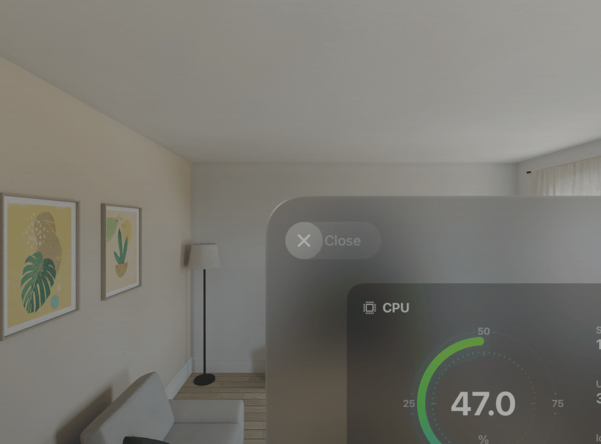
ボタンを拡大するにつれて、テキストがフェードインするように設定しています。
struct CloseBtnView: View {

    var action: () -> Void = { }

    var body: some View {
        Button(action: action) {
            HStack(spacing: 2) {
                Image(.iconClose)
                    .padding(15)

                Text("Close")
                    .font(.body)
                    .padding(.trailing, 24)
                    .hoverEffect { effect, isActive, _ in
                        effect.opacity(isActive ? 1 : 0)
                    }
            }
        }
        .buttonStyle(CloseButtonClipShapeStyle())
    }

    struct CloseButtonClipShapeStyle: ButtonStyle {
        func makeBody(configuration: Configuration) -> some View {
            configuration.label
                .background(.thinMaterial)
                .hoverEffect(.highlight)
                .hoverEffect { effect, isActive, proxy in
                    effect.clipShape(.capsule.size(
                        width: isActive ? proxy.size.width : proxy.size.height,
                        height: proxy.size.height,
                        anchor: .leading
                    ))
                    .scaleEffect(isActive ? 1.05 : 1.0)
                }
        }
    }
}
EffectGroupで、HoverEffectをグループ化する
しかし、現在の実装ではテキストにフォーカスを当てないとフェードインが発生しません。
これは、Hover効果がボタンとテキストそれぞれに適用されているため、テキストにフォーカスを当てた場合のみアクティブになる仕様が原因です。
EffectGroupを使用すると、エフェクトをグループ化できます。
グループ化されたエフェクトのいずれかがアクティブになると、他のエフェクトも一緒に適用されます。
今回は、フォーカスを当てた際にボタンとテキストを同時にHoverさせるため、エフェクトをグループ化します。
エフェクトをグループ化する方法には、明示的に追加する方法と暗黙的に追加する方法の2種類があります。
EffectGroupを明示的に追加する
HoverEffectGroupを作成し、Namespaceを使用してグループに一意のIDを指定します。
その後、hoverEffectの引数にHoverEffectGroupを追加することで、明示的にグループ化が可能です。
struct CloseBtnView: View {

    var action: () -> Void = { }

    @Namespace var hoverNamespace
    var hoverGroup: HoverEffectGroup {
        HoverEffectGroup(hoverNamespace)
    }

    var body: some View {
        Button(action: action) {
            HStack(spacing: 2) {
                Image(.iconClose)
                    .padding(15)

                Text("Close")
                    .font(.body)
                    .padding(.trailing, 24)
                    .hoverEffect(in: hoverGroup) { effect, isActive, _ in
                        effect.opacity(isActive ? 1 : 0)
                    }
            }
        }
        .buttonStyle(CloseButtonClipShapeStyle(hoverGroup: hoverGroup))
    }

    struct CloseButtonClipShapeStyle: ButtonStyle {
        var hoverGroup: HoverEffectGroup?

        func makeBody(configuration: Configuration) -> some View {
            configuration.label
                .background(.thinMaterial)
                .hoverEffect(.highlight, in: hoverGroup)
                .hoverEffect(in: hoverGroup) { effect, isActive, proxy in
                    effect.clipShape(.capsule.size(
                        width: isActive ? proxy.size.width : proxy.size.height,
                        height: proxy.size.height,
                        anchor: .leading
                    ))
                    .scaleEffect(isActive ? 1.05 : 1.0)
                }
        }
    }
}
EffectGroupを暗黙的に追加する
このレベルの細かい制御が不要な場合、HoverEffectGroupを作成する必要はありません。
代わりに、ViewにhoverEffectGroupモディファイアを追加するだけで、グループ化が適用されます。
struct CloseBtnView: View {

    var action: () -> Void = { }

    var body: some View {
        Button(action: action) {
            HStack(spacing: 2) {
                Image(.iconClose)
                    .padding(15)

                Text("Close")
                    .font(.body)
                    .padding(.trailing, 24)
                    .hoverEffect { effect, isActive, _ in
                        effect.opacity(isActive ? 1 : 0)
                    }
            }
        }
        .buttonStyle(CloseButtonClipShapeStyle())
        .hoverEffectGroup()
    }

    struct CloseButtonClipShapeStyle: ButtonStyle {
        func makeBody(configuration: Configuration) -> some View {
            configuration.label
                .background(.thinMaterial)
                .hoverEffect(.highlight)
                .hoverEffect { effect, isActive, proxy in
                    effect.clipShape(.capsule.size(
                        width: isActive ? proxy.size.width : proxy.size.height,
                        height: proxy.size.height,
                        anchor: .leading
                    ))
                    .scaleEffect(isActive ? 1.05 : 1.0)
                }
        }
    }
}
エフェクトを遅延させる
デフォルトではエフェクトは即座に実行されますが、遅延エフェクトを使用することでタイミングを制御できるようになります。
.hoverEffectモディファイア内のeffectに設定されたanimationのdelayプロパティを使用して遅延を指定します。
struct CloseBtnView: View {

    var action: () -> Void = { }

    var body: some View {
        Button(action: action) {
            HStack(spacing: 2) {
                Image(.iconClose)
                    .padding(15)

                Text("Close")
                    .font(.body)
                    .padding(.trailing, 24)
                    .hoverEffect { effect, isActive, _ in
                        effect.animation(.default.delay(isActive ? 0.8 : 0.2)) {
                            $0.opacity(isActive ? 1 : 0)
                        }
                    }
            }
        }
        .buttonStyle(CloseButtonClipShapeStyle())
        .hoverEffectGroup()
    }

    struct CloseButtonClipShapeStyle: ButtonStyle {
        func makeBody(configuration: Configuration) -> some View {
            configuration.label
                .background(.thinMaterial)
                .hoverEffect(.highlight)
                .hoverEffect { effect, isActive, proxy in
                    effect.animation(.default.delay(isActive ? 0.8 : 0.2)) {
                        $0.clipShape(.capsule.size(
                            width: isActive ? proxy.size.width : proxy.size.height,
                            height: proxy.size.height,
                            anchor: .leading
                        ))
                    }
                    .scaleEffect(isActive ? 1.05 : 1.0)
                }
        }
    }
}
なお、Animationが明示的に指定されていない場合は、SwiftUIのデフォルトアニメーションが適用されます。
また、Linear、easeOut、Spring Animation、Custom Timing Curves Animationなど、一般的なアニメーションがサポートされていますが、カスタムアニメーション(CustomAnimation)はサポートされていません。
CustomHoverEffectで、HoverEffectを分割
CustomHoverEffectプロトコルを使用して、HoverEffectを分割することができます。
struct CloseBtnView: View {

    var action: () -> Void = { }

    var body: some View {
        Button(action: action) {
            HStack(spacing: 2) {
                Image(.iconClose)
                    .padding(15)

                Text("Close")
                    .font(.body)
                    .padding(.trailing, 24)
                    .hoverEffect(FadeEffect())
            }
        }
        .buttonStyle(CloseButtonClipShapeStyle())
        .hoverEffectGroup()
    }

    struct CloseButtonClipShapeStyle: ButtonStyle {
        func makeBody(configuration: Configuration) -> some View {
            configuration.label
                .background(.thinMaterial)
                .hoverEffect(.highlight)
                .hoverEffect(ExpandEffect())
        }
    }

    struct ExpandEffect: CustomHoverEffect {
        func body(content: Content) -> some CustomHoverEffect {
            content.hoverEffect { effect, isActive, proxy in
                effect.animation(.default.delay(isActive ? 0.8 : 0.2)) {
                    $0.clipShape(.capsule.size(
                        width: isActive ? proxy.size.width : proxy.size.height,
                        height: proxy.size.height,
                        anchor: .leading
                    ))
                }.scaleEffect(isActive ? 1.05 : 1.0)
            }
        }
    }

    struct FadeEffect: CustomHoverEffect {
        var from: Double = 0
        var to: Double = 1

        func body(content: Content) -> some CustomHoverEffect {
            content.hoverEffect { effect, isActive, _ in
                effect.animation(.default.delay(isActive ? 0.8 : 0.2)) {
                    $0.opacity(isActive ? to : from)
                }
            }
        }
    }
}
アクセシビリティ対応
動きに敏感なユーザーには、エフェクトが不快に感じられることがあります。
そのため、エフェクトを開発する際はアクセシビリティを常に考慮し、必要に応じて代替エフェクトを提供することが重要です。
以下のコードでは、「視差効果を減らす」設定が有効になっているか判断し、フェードエフェクトに変更します。
accessibilityReduceMotionプロパティを使用して設定を取得し、この値がtrueの場合はExpandEffectを適用せず、空のエフェクトを適用することで対応しています。
struct CloseBtnView: View {

    var action: () -> Void = { }

    var body: some View {
        Button(action: action) {
            HStack(spacing: 2) {
                Image(.iconClose)
                    .padding(15)

                Text("Close")
                    .font(.body)
                    .padding(.trailing, 24)
                    .hoverEffect(FadeEffect())
            }
        }
        .buttonStyle(CloseButtonClipShapeStyle())
        .hoverEffectGroup()
    }

    struct CloseButtonClipShapeStyle: ButtonStyle {

        @Environment(.accessibilityReduceMotion) var reduceMotion

        func makeBody(configuration: Configuration) -> some View {
            configuration.label
                .background {
                    ZStack(alignment: .leading) {
                        Capsule()
                            .fill(.thinMaterial)
                            .hoverEffect(.highlight)
                            .hoverEffect(reduceMotion ? HoverEffect(FadeEffect()) : HoverEffect(.empty))
                        if reduceMotion {
                            Circle()
                                .fill(.thinMaterial)
                                .hoverEffect(.highlight)
                                .hoverEffect(FadeEffect(from: 1, to: 0))
                        }
                    }
                }
                .hoverEffect(
                    reduceMotion
                    ? HoverEffect(.empty)
                    : HoverEffect(ExpandEffect())
                )
        }
    }

    struct ExpandEffect: CustomHoverEffect {
        func body(content: Content) -> some CustomHoverEffect {
            content.hoverEffect { effect, isActive, proxy in
                effect.animation(.default.delay(isActive ? 0.8 : 0.2)) {
                    $0.clipShape(.capsule.size(
                        width: isActive ? proxy.size.width : proxy.size.height,
                        height: proxy.size.height,
                        anchor: .leading
                    ))
                }.scaleEffect(isActive ? 1.05 : 1.0)
            }
        }
    }

    struct FadeEffect: CustomHoverEffect {
        var from: Double = 0
        var to: Double = 1

        func body(content: Content) -> some CustomHoverEffect {
            content.hoverEffect { effect, isActive, _ in
                effect.animation(.default.delay(isActive ? 0.8 : 0.2)) {
                    $0.opacity(isActive ? to : from)
                }
            }
        }
    }
}
まとめ
HoverEffectのカスタマイズについてまとめました。
visionOS 2.0からHoverEffectがカスタマイズできるため、見た目の変更やアニメーションの組み込みが可能になりました。これは、visionOSにおいて非常に重要な要素であり、ユーザー体験を向上させるための鍵となります。
アクセシビリティを考慮しながら、ユーザーにとって魅力的でインタラクティブな体験を提供することが大切です。
この記事がお役に立てば幸いです。本記事について誤りや改善点があれば、是非ご指摘ください。
参考
#HoverEffect #Swift5 #Xcode16 #visionOS2 #RealityComposerPro2 #macOS14