
書記が数学やるだけ#602 ポアソン回帰

ポアソン回帰についての実装例を示す。
問題

説明
ポアソン回帰では,対数関数を連結関数としてポアソン分布で推測する。よく似たものとして対数正規モデルがあるが,連結関数が対数関数である点は同じだが,正規分布により推測する点が異なる。
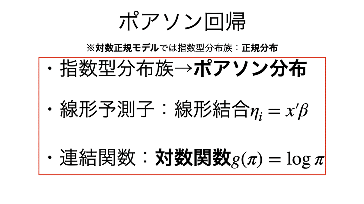
ポアソン分布ではなさそうな場合のうち,過分散が疑われる場合には負の2項分布モデルを用いることがある。

使い分けについては以下を参照:
解答
import math
import numpy as np
import scipy.stats as stats
import statsmodels.api as sm
import statsmodels.formula.api as smf
import seaborn as sns
import matplotlib.pyplot as plt
import pandas as pd

# チップのデータセット
df = sns.load_dataset("tips")
df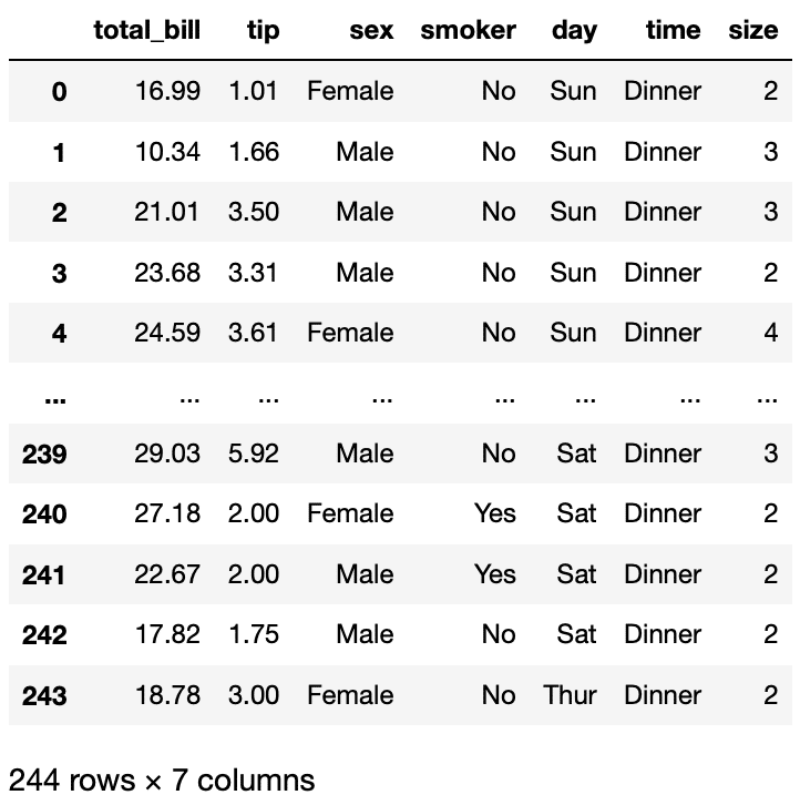
可視化をするにはSeabornのjointplotが便利である。
sns.set(style="darkgrid")
sns.jointplot(x="total_bill", y="tip", data=df,
             kind="scatter",
             xlim=(0, 60), ylim=(0, 12),
             color="b",
             height=7);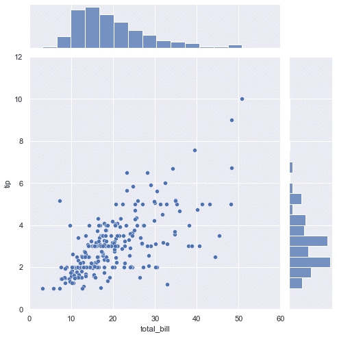
ここで標本のパラメータを求めておく。
mean = df['tip'].mean()
var = df['tip'].var()
scale = math.sqrt(var)

print("平均:", mean, "分散:", var, "標準偏差:", scale)
平均: 2.9982786885245902 分散: 1.9144546380624725 標準偏差: 1.3836381890011826
説明変数の分布を見ると,裾が長い分正規分布には見えない気もする。正規分布とポアソン分布でのサンプリングを行なってみると,その違いが出てくる。
norm = np.random.normal(mean,scale,244)
poisson = np.random.poisson(mean,244)
bins = np.linspace(-4, 12, 10)

plt.hist(norm, bins=bins, alpha=0.6, label="noem")
plt.hist(poisson, bins=bins,alpha=0.6, label="poisson")
plt.legend()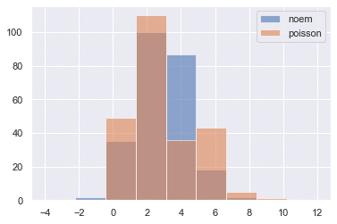
正規分布でのフィッテイングが妥当かどうか,いくつか試験してみる。
#Q-Qプロット,正規分布ではなさそう
stats.probplot(df['tip'], dist="norm", plot=plt)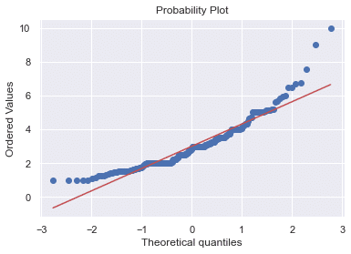
#シャピロ・ウィルク検定,帰無仮説「正規分布である」が棄却される
stats.shapiro(df["tip"])
ShapiroResult(statistic=0.897811233997345, pvalue=8.20057563521992e-12)
これらより,単純に正規分布でフィッティングするのは危ういかもしれない。
では,実際にいくつかモデルを立ててみる。まずは正規線形モデル,ここで定数項なしに設定していることに注意(会計を払わない人にチップはないだろう)。
#正規線形モデル,定数項なし
y = df['tip']
x = df['total_bill']
link = sm.families.links.identity()
family = sm.families.Gaussian(link)

model_norm = sm.GLM(y, x, family=family)
results_norm = model_norm.fit()
results_norm.summary()
この予測値を可視化してみると,割といい当てはまりに見える。
y_hat_norm = results_norm.predict(x)

plt.plot(x, y, "o")
plt.plot(x, y_hat_norm, "*", color="r")
plt.xlabel('x (total_bill)'), plt.ylabel('y (tips)')
plt.xlim(0, 60), plt.ylim(0, 12)
plt.show()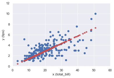
次にポアソンモデルを示す。
#ポアソンモデル
link = sm.families.links.log()
family = sm.families.Poisson(link)

model_poisson = sm.GLM(y, x, family=family)
results_poisson = model_poisson.fit()
results_poisson.summary()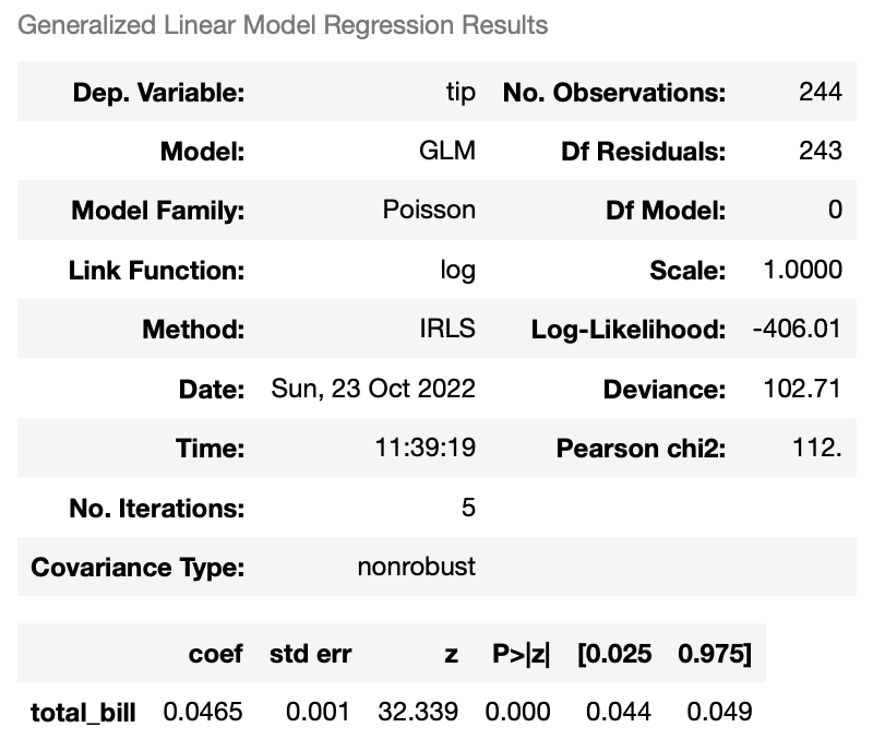
y_hat_poisson = results_poisson.predict(x)

plt.plot(x, y, "o")
plt.plot(x, y_hat_poisson, "*", color="r")
plt.xlabel('x (total_bill)'), plt.ylabel('y (tips)')
plt.xlim(0, 60), plt.ylim(0, 12)
plt.show()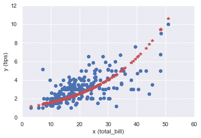
対数正規モデルも組んでみる。
#対数正規モデル
link = sm.families.links.log()
family = sm.families.Gaussian(link)

model_lognorm = sm.GLM(y, x, family=family)
results_lognorm = model_lognorm.fit()
results_lognorm.summary()
y_hat_lognorm = results_lognorm.predict(x)
plt.plot(x, y, "o")
plt.plot(x, y_hat_lognorm, "*", color="r")
plt.xlabel('x (total_bill)'), plt.ylabel('y (tips)')
plt.xlim(0, 60), plt.ylim(0, 12)
plt.show()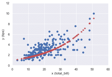
本記事のもくじはこちら: