
『Pythonではじめるベイズ機械学習入門』をPyMC ver.5で書き直す—第3章—

年末年始休暇を利用して、『Pythonではじめるベイズ機械学習入門 = Introduction to Bayesian Machine Learning with Python』 (森賀 新,木田 悠歩,須山 敦志著、講談社)を読んでいます。
各ベイズモデルが端的にまとまっており良い本なのですが、2022年に発行された書籍のため、実装がPyMC3で記載されています。
2024年12月末日においてはPyMC ver.5.16.1であり、そのまま実行するとPyMC3と互換性のない部分があることに由来するエラーが多発します。
本書に限らず、過去にPyMC3で記載されたあらゆる書籍が現在有志によってPyMC Ver.5に書き直されています。
本書の公式Github(https://github.com/sammy-suyama/PythonBayesianMLBook/tree/main)も2年前までで更新が止まっているため、読みすがら書き直したものを公表する次第です。
第一章、第二章は大きな変更はないので、コードと実行結果のみ記載していきます。
コードの説明はしません。興味のある方はぜひ本書をお読みください。
また、私は専門のPythonエンジニアではないので、コードに問題などがあればご指摘いただければ幸いです。
3.1 線形回帰モデル: 線形単回帰モデル
import numpy as np
import seaborn as sns
import matplotlib.pyplot as plt
import pymc as pm
import arviz as az
# 真のパラメータ
true_w1 = 1.5
true_w2 = 0.8
# サンプルデータ
N = 4
x_data = np.random.uniform(-5, 5, size=N)
y_data = true_w1 * x_data + true_w2 + np.random.normal(0, 1, size=N)
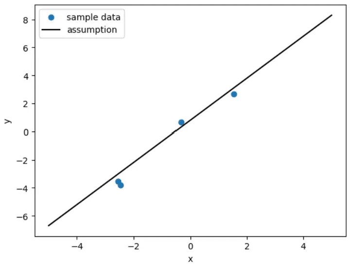
# データの描画
x_plot_data = np.linspace(-5, 5, 100)
y_plot_data = true_w1 * x_plot_data + true_w2
plt.scatter(x_data, y_data, marker='o', label='sample data')
plt.plot(x_plot_data, y_plot_data, color='black', label='assumption')
plt.xlabel('x')
plt.ylabel('y')
plt.legend()
plt.show()
"""
#元のコード(PyMC3版)
import numpy as np
import seaborn as sns
import matplotlib.pyplot as plt
import pymc3 as pm
import arviz as az
# 真のパラメータ
true_w1 = 1.5
true_w2 = 0.8
# サンプルデータ
N = 4
x_data = np.random.uniform(-5, 5, size=N)
y_data = true_w1 * x_data + true_w2 + np.random.normal(0, 1, size=N)
# データの描画
x_plot_data = np.linspace(-5, 5, 100)
y_plot_data = true_w1 * x_plot_data + true_w2
plt.scatter(x_data, y_data, marker='o', label='sample data')
plt.plot(x_plot_data, y_plot_data, color='black', label='assumption')
plt.xlabel('x')
plt.ylabel('y')
plt.legend()
plt.show()
"""
# PyMC モデルの定義
with pm.Model() as model:
    # 1) 学習用 x ノード
    x_train = pm.MutableData("x_train", x_data)
    # 2) 予測用 x ノード(最初はダミーででもOK)
    x_pred = pm.MutableData("x_pred", np.zeros(1))

    # 事前分布の設定
    w1 = pm.Normal("w1", mu=0, sigma=10.0)
    w2 = pm.Normal("w2", mu=0, sigma=10.0)

    # 学習用の mu
    mu_train = w1 * x_train + w2
    # 予測用の mu
    mu_pred = w1 * x_pred + w2

    # 尤度(学習用)
    y_obs = pm.Normal("y_obs", mu=mu_train, sigma=1.0, observed=y_data)

    # 予測用の y(観測なし)
    # - pm.Normal(..., observed=None) でもいいが
    #   「値をそのまま取り出したい」場合は Deterministic を使うことも多い
    y_pred = pm.Deterministic("y_pred", mu_pred)

with model:
    trace = pm.sample(
        draws=3000,
        tune=1000,
        chains=3,
        random_seed=1,
        return_inferencedata=True
    )

"""
#元コード
# モデルの定義
with pm.Model() as model:
  # 説明変数
  x = pm.Data('x', x_data)
  # 推論パラメータの事前分布
  w1 = pm.Normal('w1', mu=0.0, sigma=10.0)
  w2 = pm.Normal('w2', mu=0.0, sigma=10.0)
  # 尤度関数
  y = pm.Normal('y', mu=w1*x+w2, sigma=1.0, observed=y_data)
with model:
    trace = pm.sample(
        draws=3000,
        tune=1000,
        chains=3,
        random_seed=1,
        return_inferencedata=True
    )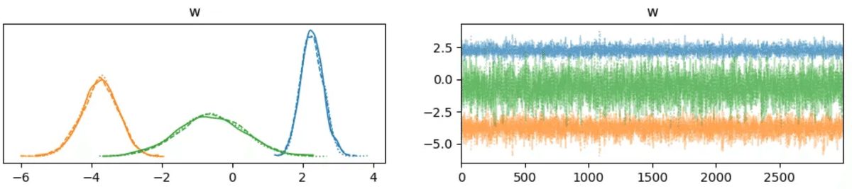
"""az.plot_trace(trace)
plt.show()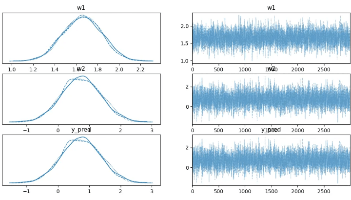
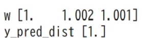
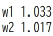
for var_info in az.rhat(trace).values():
print(var_info.name, var_info.values.round(3), sep=" ")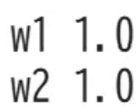
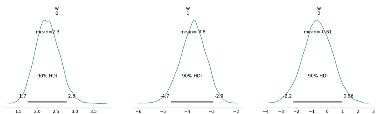
az.plot_posterior(trace, hdi_prob=0.9) plt.show()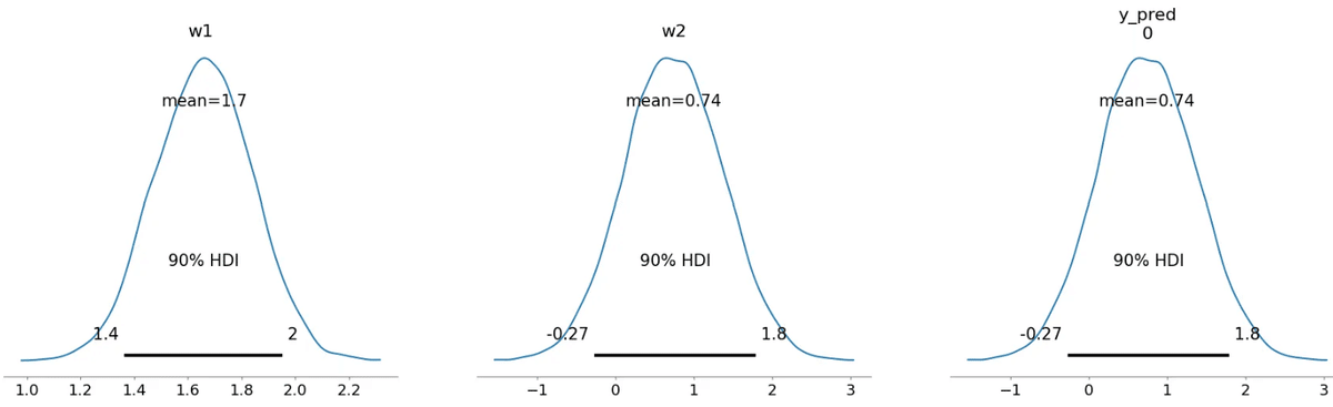
# 検証用データ
# x_new をセット
x_new = np.linspace(-5, 5, 10)
with model:
# 学習データ(x_train, y_obs)には触れず、予測用ノードだけ更新
model["x_pred"].set_value(x_new)
# 予測用 y_pred を取り出す
# var_names に "y_pred" を指定してあげる
pred_idata = pm.sample_posterior_predictive(
trace,
var_names=["y_pred"], # 予測用に欲しい変数
random_seed=1
)
# 返り値は InferenceData なので、予測結果を NumPy 配列として取り出す
y_pred_samples = pred_idata.posterior_predictive["y_pred"].values
# 形は (チェーン数, サンプル数, x_newの長さ) => (3, ? , 10) など
# チェーンが複数ある場合を考慮して結合
y_pred_flat = np.concatenate(y_pred_samples, axis=0) # (chains*draws, 10)
num_samples_to_plot = 1000 # 全部描画すると重い場合もある
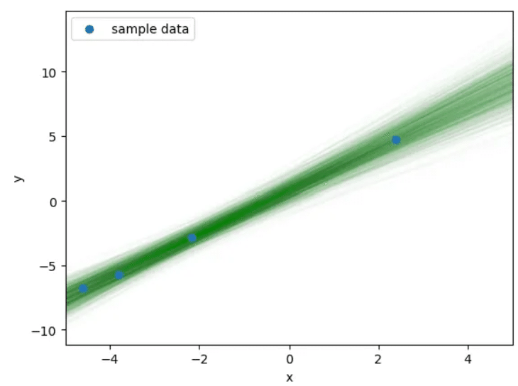
for i in range(min(num_samples_to_plot, len(y_pred_flat))):
plt.plot(x_new, y_pred_flat[i], alpha=0.01, color='green', zorder=1)
plt.scatter(x_data, y_data, marker='o', label='sample data', zorder=2)
plt.xlabel('x')
plt.ylabel('y')
plt.xlim(-5, 5)
plt.legend()
plt.show()
"""
#元コード
# 検証用データ
x_new = np.linspace(-5, 5, 10)
with model:
# 検証用データを推論したモデルに入力
pm.set_data({'x': x_new})
# 予測分布からサンプリング
pred = pm.sample_posterior_predictive(trace, samples=1000, random_seed=1)
y_pred_samples = pred['y']
# 予測分布からのサンプルを描画
for i in range(1000):
plt.plot(x_new, y_pred_samples[i,:], alpha=0.01, color='green', zorder=1)
plt.scatter(x=x_data, y=y_data, marker='o', label='sample data', zorder=2)
plt.xlabel('x')
plt.ylabel('y')
plt.xlim(-5, 5)
plt.legend()
plt.show()
"""
3.2 線形回帰モデル: 線形重回帰モデル
import numpy as np
import matplotlib.pyplot as plt
from mpl_toolkits.mplot3d import Axes3D
import arviz as az
import pymc as pm
np.random.seed(0)
dim = 2 # 入力次元
N = 4 # サンプル数
true_w = np.array([-1.5, 0.8, 1.2]).reshape([3, 1]) # 真のパラメータ (3x1)
# x_data (形状: [4,2]) を -5~5 の乱数で作成
x_data = np.random.uniform(-5, 5, [N, dim])
bias = np.ones(N).reshape([N, 1]) # バイアス項
x_data_add_bias = np.concatenate([x_data, bias], axis=1) # 形状: [4,3]
# y_data (形状: [4,1]) を作成 (回帰式 + ノイズ)
y_data = np.dot(x_data_add_bias, true_w) + np.random.normal(0.0, 1.0, size=[N, 1])
"""
#元データ
# 2次元
dim = 2
# データ数は4
N = 4
# 真のパラメータ
true_w = np.array([-1.5, 0.8, 1.2]).reshape([3, 1])
# サンプルデータ
x_data = np.random.uniform(-5, 5, [N, dim])
# バイアスの次元を追加
bias = np.ones(N).reshape([N, 1])
x_data_add_bias = np.concatenate([x_data, bias], axis=1)
y_data = np.dot(x_data_add_bias, true_w) + np.random.normal(0.0, 1.0, size=[N, 1])
"""with pm.Model() as model:
# 観測データをセットする Data
x_obs = pm.MutableData('x_obs', x_data_add_bias) # shape: [4,3]
# パラメータ w を Normal(0,10) で定義
w = pm.Normal('w', mu=0.0, sigma=10.0, shape=3)
# 観測データに対する平均値 mu_obs
mu_obs = pm.math.dot(w, x_obs.T) # shape: (4,)
# 観測データ y_obs
y_obs = pm.Normal('y_obs', mu=mu_obs, sigma=1.0, observed=y_data.ravel())
# 予測用データを受け取る Data
x_pred = pm.MutableData('x_pred', np.zeros((1, 3))) # ダミー (1,3)
# 予測用の平均値
mu_pred = pm.math.dot(w, x_pred.T)
# 予測用の確率変数 (観測されていない)
y_pred_dist = pm.Normal('y_pred_dist', mu=mu_pred, sigma=1.0, shape=(x_pred.shape[0],))
"""
#元コード
# モデルの定義
with pm.Model() as model:
# 説明変数
x = pm.Data('x', x_data_add_bias)
# 推論パラメータの事前分布
w = pm.Normal('w', mu=0.0, sigma=10.0, shape=3)
# 尤度関数 (ravel で shape を(4, 1) から (4, ) に変換)
y = pm.Normal('y', mu=pm.math.dot(w, x.T), sigma=1.0, observed=y_data.ravel())
"""with model:
trace = pm.sample(
draws=3000,
tune=1000,
chains=3,
random_seed=1,
return_inferencedata=True
)
"""
#元コード
with model:
# MCMCによる推論
trace = pm.sample(draws=3000,
tune=1000,
chains=3,
random_seed=1,
return_inferencedata=True)
"""az.plot_trace(trace)
plt.show()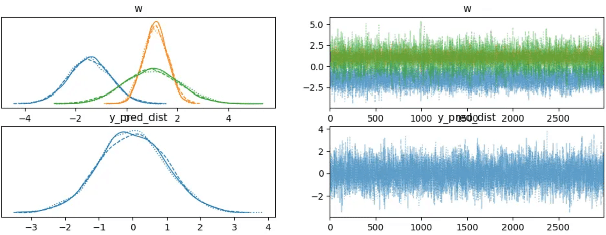
rhats = az.rhat(trace)
for var_name in rhats.data_vars:
print(var_name, rhats[var_name].values.round(3))
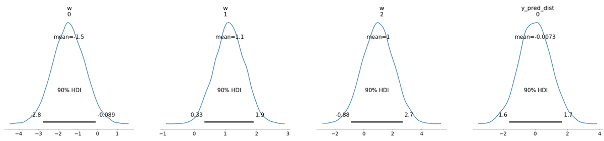
az.plot_posterior(trace, hdi_prob=0.9)
plt.show()
"""
#元コード
az.plot_posterior(trace, hdi_prob=0.9)
plt.show()
"""
x_linspace = np.linspace(-5, 5, 10)
X1, X2 = np.meshgrid(x_linspace, x_linspace) # shape: (10,10) x2
x_new = np.concatenate([X1.ravel()[:, np.newaxis],
X2.ravel()[:, np.newaxis]], axis=1) # shape: (100,2)
bias_new = np.ones((100,1))
x_new_add_bias = np.concatenate([x_new, bias_new], axis=1) # shape: (100,3)
with model:
# x_pred を置き換えて予測
pm.set_data({'x_pred': x_new_add_bias})
# ---- return_inferencedata=False とし、辞書で返してもらう例 ----
pred = pm.sample_posterior_predictive(
trace,
var_names=['y_pred_dist'],
random_seed=1,
return_inferencedata=False
)
# ここで必ず y_pred_samples を定義する (KeyError/NameError 回避)
y_pred_samples = pred['y_pred_dist']
# y_pred_samples.shape が (chain, draw, 100) など3次元になるはず
# 例: (3,3000,100) -> (-1,100) -> (9000,100)
y_pred_samples_2d = y_pred_samples.reshape(-1, x_new_add_bias.shape[0])
# axis=0 でパーセンタイル計算 -> 結果 shape (100,)
Y_10_array = np.percentile(y_pred_samples_2d, 10, axis=0)
Y_25_array = np.percentile(y_pred_samples_2d, 25, axis=0)
Y_50_array = np.percentile(y_pred_samples_2d, 50, axis=0)
Y_75_array = np.percentile(y_pred_samples_2d, 75, axis=0)
Y_90_array = np.percentile(y_pred_samples_2d, 90, axis=0)
# (10,10) に変換
Y_10_pred = Y_10_array.reshape(10, 10)
Y_25_pred = Y_25_array.reshape(10, 10)
Y_50_pred = Y_50_array.reshape(10, 10)
Y_75_pred = Y_75_array.reshape(10, 10)
Y_90_pred = Y_90_array.reshape(10, 10)
cmap = plt.get_cmap('tab10')
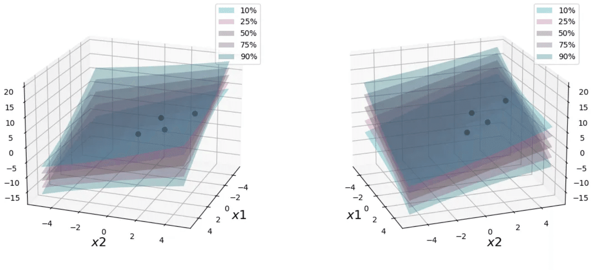
def make_3Dplot(axl, elev, azim):
surf1 = axl.plot_surface(X1, X2, Y_10_pred, alpha=0.3, color=cmap(7.5), label='10%')
surf2 = axl.plot_surface(X1, X2, Y_25_pred, alpha=0.3, color=cmap(6), label='25%')
surf3 = axl.plot_surface(X1, X2, Y_50_pred, alpha=0.3, color=cmap(5), label='50%')
surf4 = axl.plot_surface(X1, X2, Y_75_pred, alpha=0.3, color=cmap(4), label='75%')
surf5 = axl.plot_surface(X1, X2, Y_90_pred, alpha=0.3, color=cmap(2.5), label='90%')
axl.scatter(x_data[:, 0], x_data[:, 1], y_data, alpha=1.0, color='black', s=40)
axl.view_init(elev=elev, azim=azim)
axl.set_xlabel('$x1$', fontsize=16)
axl.set_ylabel('$x2$', fontsize=16)
axl.set_zlabel('$y$', fontsize=16)
axl.legend() #_facecolors3dメソッドは廃止された
fig = plt.figure(figsize=(12, 5))
ax1 = fig.add_subplot(121, projection='3d')
make_3Dplot(ax1, 20, 20)
ax2 = fig.add_subplot(122, projection='3d')
make_3Dplot(ax2, 20, -20)
plt.tight_layout()
plt.show()
for var_info in az.rhat(trace).values():
print(var_info.name, var_info.values.round(3), sep=" ")
"""
#元コード
# 検証用データの作成
x_linspace = np.linspace(-5, 5, 10)
X1, X2 = np.meshgrid(x_linspace, x_linspace)
x_new = np.concatenate([X1.ravel()[:, np.newaxis], X2.ravel()[:, np.newaxis]], axis=1)
# バイアスの次元を追加
x_new_add_bias = np.concatenate([x_new, np.ones((100, 1))], axis=1)
with model:
# 検証用データをモデルへ入力
pm.set_data({'x': x_new_add_bias})
# 予測分布からサンプリング
pred = pm.sample_posterior_predictive(trace, samples=1000, random_seed=1)
y_pred_samples = pred['y']
#パーセンタイルごとの超平面を取り出す
Y_10_pred = np.percentile(y_pred_samples, 10, axis=0).reshape(10, 10)
Y_25_pred = np.percentile(y_pred_samples, 25, axis=0).reshape(10, 10)
Y_50_pred = np.percentile(y_pred_samples, 50, axis=0).reshape(10, 10)
Y_75_pred = np.percentile(y_pred_samples, 75, axis=0).reshape(10, 10)
Y_90_pred = np.percentile(y_pred_samples, 90, axis=0).reshape(10, 10)
cmap = plt.get_cmap('tab10')
# 3D描画用関数
def make_3Dplot(axl, elev, azim):
surf1 = ax.plot_surface(X1, X2, Y_10_pred, alpha=0.3, color=cmap(7.5), label='10%')
surf2 = ax.plot_surface(X1, X2, Y_25_pred, alpha=0.3, color=cmap(6), label='25%')
surf3 = ax.plot_surface(X1, X2, Y_50_pred, alpha=0.3, color=cmap(5), label='50%')
surf4 = ax.plot_surface(X1, X2, Y_75_pred, alpha=0.3, color=cmap(4), label='75%')
surf5 = ax.plot_surface(X1, X2, Y_90_pred, alpha=0.3, color=cmap(2.5), label='90%')
ax.scatter(x_data[:, 0], x_data[:, 1], y_data, alpha=1.0, color='black', s=40)
ax.view_init(elev=elev, azim=azim)
axl.set_xlabel('$x1$', fontsize=16)
axl.set_ylabel('$x2$', fontsize=16)
axl.set_zlabel('$y$', fontsize=16)
surf1._facecolors2d = surf1._facecolors3d
surf1._edgecolors2d = surf1._edgecolors3d
surf2._facecolors2d = surf2._facecolors3d
surf2._edgecolors2d = surf2._edgecolors3d
surf3._facecolors2d = surf3._facecolors3d
surf3._edgecolors2d = surf3._edgecolors3d
surf4._facecolors2d = surf4._facecolors3d
surf4._edgecolors2d = surf4._edgecolors3d
surf5._facecolors2d = surf5._facecolors3d
surf5._edgecolors2d = surf5._edgecolors3d
axl.legend()
fig = plt.figure(figsize=(12, 5))
ax = fig.add_subplot(121, projection='3d')
make_3Dplot(ax, 20, 20)
#別角度から見えるように角度を変えて可視化
ax = fig.add_subplot(122, projection='3d')
make_3Dplot(ax, 20, -20)
plt.tight_layout()
plt.show()
"""
3.3 一般化線形モデル: ポアソン回帰モデル
import numpy as np
import matplotlib.pyplot as plt
from math import factorial
import math
# パラメータ λ
lam = 2.0
# x 軸の値を 0~10 とする
x_values = np.arange(0, 11)
# ポアソン分布の確率質量関数 (PMF)
# P(X=k) = (e^(-λ) * λ^k) / k!
poisson_pmf = []
for k in x_values:
# (np.exp(-lam) * lam**k) / factorial(k) でも可
pmf_k = (math.exp(-lam) * (lam ** k)) / factorial(k)
poisson_pmf.append(pmf_k)
# グラフ描画
plt.figure(figsize=(6, 4))
plt.bar(x_values, poisson_pmf, color='skyblue', edgecolor='black', alpha=0.8)
plt.title(f'Poisson distribution; λ={lam}')
plt.xlabel('x')
plt.ylabel('prob')
# x 軸を 0~10 の整数目盛に合わせる
plt.xticks(x_values)
plt.show()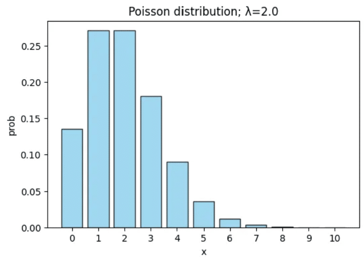
import numpy as np
import seaborn as sns
import matplotlib.pyplot as plt
import pymc as pm
import arviz as az
from scipy import stats
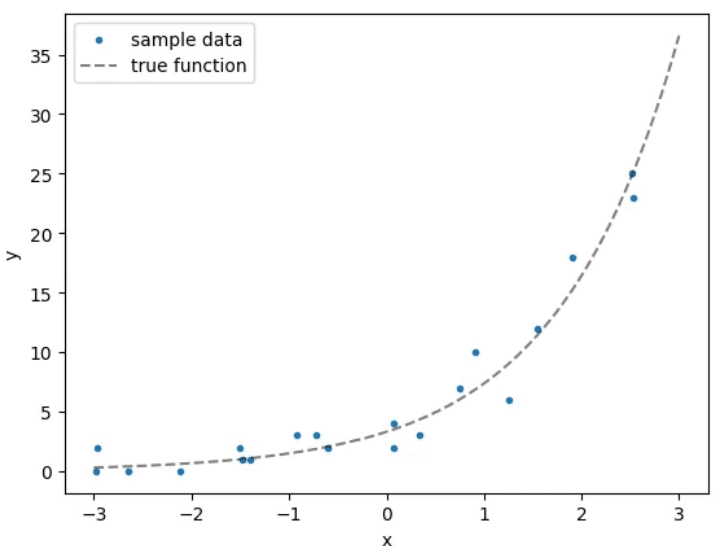
# データ数
N = 20
# 真のパラメータ
true_w1 = 0.8
true_w2 = 1.2
# サンプルデータ
x_data = np.random.uniform(-3, 3, N)
y_data = stats.poisson(mu=np.exp(true_w1 * x_data + true_w2)).rvs()
# 真の関数プロット用
x_plot_data = np.linspace(-3, 3, 100)
y_plot_data = stats.poisson(mu=np.exp(true_w1 * x_plot_data + true_w2)).mean()
plt.scatter(x_data, y_data, marker='.', label='sample data')
plt.plot(x_plot_data, y_plot_data, label='true function',
color='black', linestyle='--', alpha=0.5)
plt.xlabel('x')
plt.ylabel('y')
plt.legend()
plt.show()
"""
#元コード
import numpy as np
import seaborn as sns
import matplotlib.pyplot as plt
import pymc3 as pm
from scipy import stats
# データ数
N = 20
# 真のパラメータ
true_w1 = 0.8
true_w2 = 1.2
# サンプルデータ
x_data = np.random.uniform(-3, 3, N)
y_data = stats.poisson(mu=np.exp(true_w1 * x_data + true_w2)).rvs()
x_plot_data = np.linspace(-3, 3, 100)
y_plot_data = stats.poisson(mu=np.exp(true_w1 * x_plot_data + true_w2)).mean()
plt.scatter(x_data, y_data, marker='.', label='sample data')
plt.plot(x_plot_data, y_plot_data, label='true function', color='black', linestyle='--', alpha=0.5)
plt.xlabel('x')
plt.ylabel('y')
plt.legend()
plt.show()
"""
with pm.Model() as model:
# 学習用データ x_data(長さ20)
# PyMC5 での x は pm.Data or pm.MutableData どちらでも構いません
x = pm.Data("x", x_data)
# 推論対象パラメータ
w1 = pm.Normal("w1", mu=0.0, sigma=1.0)
w2 = pm.Normal("w2", mu=0.0, sigma=1.0)
# Poisson の平均 mu
mu = pm.math.exp(w1 * x + w2)
# 観測データ(長さ20)を与える Poisson変数
y_obs = pm.Poisson("y_obs", mu=mu, observed=y_data)
# 新しい x を入れたときにサンプリングするための
# 予測用 Poisson変数 (observed 指定なし)
y_pred = pm.Poisson("y_pred", mu=mu)
"""
#元コード
# モデルの定義
with pm.Model() as model:
# 説明変数
x = pm.Data('x', x_data)
# 推論対象のパラメータ事前分布
w1 = pm.Normal('w1', mu=0.0, sigma=1.0)
w2 = pm.Normal('w2', mu=0.0, sigma=1.0)
# 尤度関数
y = pm.Poisson('y', mu=pm.math.exp(w1*x+w2), observed=y_data)
"""
with model:
trace = pm.sample(
draws=3000,
tune=1000,
chains=3,
random_seed=1,
return_inferencedata=True
)
"""
#元コード
with model:
# MCMCによる推論
trace = pm.sample(draws=3000, tune=1000, chains=3, random_seed=1, return_inferencedata=True)
"""# トレースプロット
az.plot_trace(trace)
plt.show()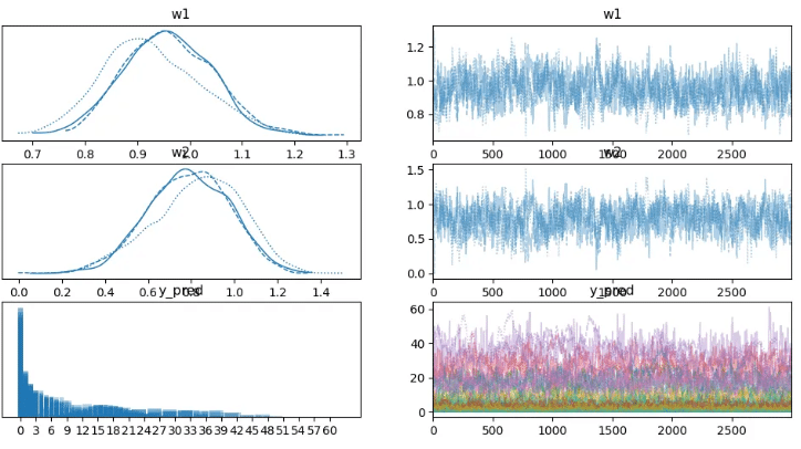
# R-hat
rhats = az.rhat(trace)
# 変数ごとのR-hat値を表示
for var_name, var_value in rhats.data_vars.items():
print(var_name, var_value.values.round(3))
"""
#元コード
for var_info in az.rhat(trace).values():
  print(var_info.name, var_info.values.round(3), sep=" ")
"""
# 事後分布 (posterior) プロット
az.plot_posterior(trace, hdi_prob=0.9)
plt.show()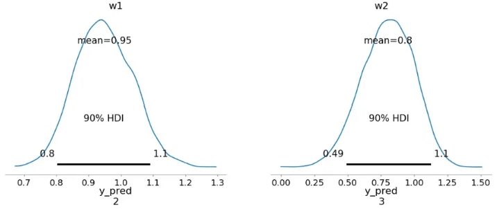
x_new = np.linspace(-3, 3, 10)
with model:
# x を 差し替え (MutableData/pm.Data に対し set_data)
pm.set_data({"x": x_new})
# サンプリング (var_names=["y_pred"] を指定)
posterior_predictive = pm.sample_posterior_predictive(
trace,
var_names=["y_pred"],
random_seed=1
)
# PyMC5 では返り値が InferenceData
y_pred_samples = posterior_predictive.posterior_predictive["y_pred"].values
# shape は (chain, draw, 10) なので、chain と draw をまとめる
y_pred_samples = y_pred_samples.reshape(-1, y_pred_samples.shape[-1])
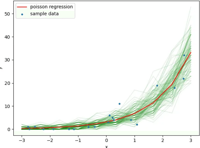
# 予測分布からのサンプルを一部描画
for i in range(0, 1000, 10):
plt.plot(x_new, y_pred_samples[i, :], alpha=0.1, color='green', zorder=i+1)
# 予測サンプルの平均
plt.plot(x_new, y_pred_samples.mean(axis=0), alpha=1.0, label='poisson regression',
zorder=20000, color='red')
# 元のサンプルデータを重ねて描画
plt.scatter(x_data, y_data, marker='.', label='sample data', zorder=20001)
plt.xlabel('x')
plt.ylabel('y')
plt.legend()
plt.tight_layout()
plt.show()
"""
#元コード
# 検証用データ
x_new = np.linspace(-3, 3, 10)
with model:
# 検証用データをモデルへ入力
pm.set_data({'x': x_new})
# 予測分布からサンプリング
pred = pm.sample_posterior_predictive(trace, samples=1000, random_seed=1)
y_pred_samples = pred['y']
# 予測分布からのサンプルを一部描画
for i in range(0, 1000, 10):
plt.plot(x_new, y_pred_samples[i,:], alpha=0.1, color='green', zorder=i+1)
# 予測分布からのサンプルの平均値を描画
plt.plot(x_new, y_pred_samples.mean(axis=0), alpha=1.0, label='poisson regression', zorder=i+1, color='red')
# データ点を描画
plt.scatter(x_data, y_data, marker='.', label='sample data', zorder=i+2)
plt.xlabel('x')
plt.ylabel('y')
plt.legend()
plt.tight_layout()
plt.show()
"""
3.4 一般化線形モデル: ロジスティック回帰モデル
import numpy as np
import pandas as pd
import seaborn as sns
import matplotlib.pyplot as plt
import pymc as pm
import arviz as az
# irisデータセット(setosa と versicolor)
iris_dataset = sns.load_dataset('iris')
iris_dataset_2species = iris_dataset[iris_dataset['species'].isin(['setosa', 'versicolor'])].copy()
# --- トレーニングデータ ---
x_data = iris_dataset_2species[['sepal_length', 'sepal_width']].values
N_train = x_data.shape[0] # ここは100
x_data_bias = np.concatenate([x_data, np.ones((N_train, 1))], axis=1)
y_data = pd.Categorical(iris_dataset_2species['species']).codes # 0 or 1, shape=(100,)
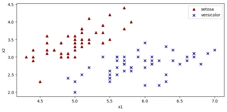
# データを species で分割して可視化(学習データ)
x_data_set = x_data[y_data == 0]
x_data_ves = x_data[y_data == 1]
fig, ax = plt.subplots(figsize=(8, 4))
ax.scatter(
x=x_data_set[:, 0], y=x_data_set[:, 1],
color='darkred', marker='^', label='setosa'
)
ax.scatter(
x=x_data_ves[:, 0], y=x_data_ves[:, 1],
color='darkblue', marker='x', label='versicolor'
)
ax.set_xlabel('x1')
ax.set_ylabel('x2')
ax.legend()
plt.tight_layout()
plt.show()
# --- 予測用データ ---
N_new = 100
x1_linspace = np.linspace(4.0, 7.2, N_new)
x2_linspace = np.linspace(2.0, 4.5, N_new)
X1_grid, X2_grid = np.meshgrid(x1_linspace, x2_linspace)
x_new = np.array([[x1, x2] for x1, x2 in zip(X1_grid.ravel(), X2_grid.ravel())])
N_test = x_new.shape[0] # 100 * 100 = 10000
x_new_bias = np.concatenate([x_new, np.ones((N_test, 1))], axis=1)
"""
#元コード
import numpy as np
import pandas as pd
import seaborn as sns
import matplotlib.pyplot as plt
import pymc3 as pm
import arviz as az
# irisデータセットの読み込み
iris_dataset = sns.load_dataset('iris')
# 使用するデータをサンプリング
iris_dataset_2species = iris_dataset[iris_dataset['species'].isin(['setosa', 'versicolor'])].copy()
# データ数
N = 50
# 説明変数
x_data = iris_dataset_2species[['sepal_length', 'sepal_width']].copy().values
# バイアス項の追加
x_data_add_bias = np.concatenate([x_data, np.ones((N, 1))], axis=1)
# 目的変数
y_data = pd.Categorical(iris_dataset_2species['species']).codes
# データを species で分割して可視化
x_data_set = x_data[y_data==0]
x_data_ves = x_data[y_data==1]
fig, ax = plt.subplots(figsize=(8, 4))
ax.scatter(x=x_data_set[:, 0], y=x_data_set[:, 1], color='darkred', marker='^', label='setosa')
ax.scatter(x=x_data_ves[:, 0], y=x_data_ves[:, 1], color='darkblue', marker='x', label='versicolor')
ax.set_xlabel('x1')
ax.set_ylabel('x2')
ax.legend()
plt.tight_layout()
plt.show()
"""
with pm.Model() as model_train:
# データホルダー
x_train = pm.Data('x_train', x_data_bias)
# パラメータ (shape=3)
w = pm.Normal('w', mu=0.0, sigma=1.0, shape=3)
# トレーニング用の尤度 (shape=100)
y_train = pm.Bernoulli('y_train',
logit_p=pm.math.dot(w, x_train.T),
observed=y_data)
# サンプリング (InferenceData を返す)
trace = pm.sample(
draws=3000,
tune=1000,
chains=3,
random_seed=1,
return_inferencedata=True
)
# 学習結果の可視化
az.plot_trace(trace)
plt.show()
"""
#元コード
# モデルの定義
with pm.Model() as model:
# 説明変数
x = pm.Data('x', x_data_add_bias)
# 推論対象のパラメータ事前分布
w = pm.Normal('w', mu=0.0, sigma=1.0, shape=3)
# 尤度関数
y = pm.Bernoulli('y', logit_p=pm.math.dot(w, x.T), observed=y_data)
with model:
# MCMC による推論
trace = pm.sample(draws=3000, tune=1000, chains=3, random_seed=1, return_inferencedata=True)
az.plot_trace(trace)
plt.show()
"""
#ここは元と同じ
for var_info in az.rhat(trace).values():
    print(var_info.name, var_info.values.round(3), sep=" ")

az.plot_posterior(trace, hdi_prob=0.9)
plt.show()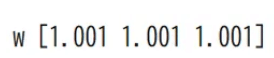
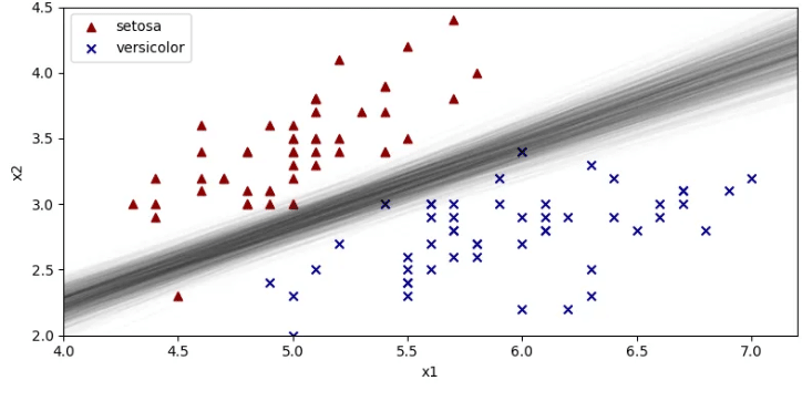
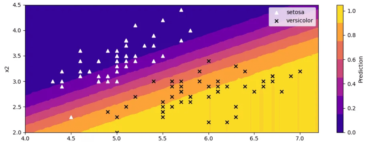
# --- ロジスティック回帰の境界線をいくつか描画 ---
# ここでは別の変数 N_line で区切り線を描く(N_newは上書きしない)
N_line = 10
xl = np.linspace(4.0, 7.2, N_line)

fig, ax = plt.subplots(figsize=(8, 4))
ax.scatter(x=x_data_set[:, 0], y=x_data_set[:, 1],
           color='darkred', marker='^', label='setosa')
ax.scatter(x=x_data_ves[:, 0], y=x_data_ves[:, 1],
           color='darkblue', marker='x', label='versicolor')

# 9000サンプルから一部(step=10)を使って境界線を描画
for i in range(0, w_mcmc_samples.shape[0], 10):
    w1_i, w2_i, w3_i = w1_samples[i], w2_samples[i], w3_samples[i]
    x2 = - w3_i / w2_i - (w1_i / w2_i) * xl
    ax.plot(xl, x2, alpha=0.01, color='black')

ax.set_xlabel('x1')
ax.set_ylabel('x2')
ax.set_xlim(4.0, 7.2)
ax.set_ylim(2.0, 4.5)
ax.legend()
plt.tight_layout()
plt.show()
"""
# 元コード
# サンプルの取り出し(チェーン3つ分を結合)
w_mcmc_samples = trace.posterior['w'].values.reshape(9000, 3)
# 次元ごとに取り出し
w1_samples = w_mcmc_samples[:, 0]
w2_samples = w_mcmc_samples[:, 1]
w3_samples = w_mcmc_samples[:, 2]
fig, ax = plt.subplots(figsize=(8, 4))
ax.scatter(x=x_data_set[:, 0], y=x_data_set[:, 1], color='darkred', marker='^', label='setosa')
ax.scatter(x=x_data_ves[:, 0], y=x_data_ves[:, 1], color='darkblue', marker='x', label='versicolor')
N_new = 10
xl = np.linspace(4.0, 7.2, N_new)
for i in range(0, 9000, 10):
    # xlに対してθ=0.5となるx2
    x2 = - w3_samples[i] / w2_samples[i] - w1_samples[i] / w2_samples[i] * xl
    ax.plot(xl, x2, alpha=0.01, color='black')
ax.set_xlabel('x1')
ax.set_ylabel('x2')
ax.set_xlim(4.0, 7.2)
ax.set_ylim(2.0, 4.5)
ax.legend()
plt.tight_layout()
plt.show()
"""
with pm.Model() as model_pred:
    # 同じパラメータ名 "w" を再度定義 (shape=3)
    w = pm.Normal('w', mu=0.0, sigma=1.0, shape=3)

    x_test = pm.Data('x_test', x_new_bias)

    # 予測用のBernoulli変数 (shape=10000)
    y_pred = pm.Bernoulli(
        'y_pred',
        logit_p=pm.math.dot(w, x_test.T),
        shape=(N_test,)
    )

with model_pred:
    pred_idata = pm.sample_posterior_predictive(
        trace,
        var_names=['y_pred'],
        random_seed=1
    )

# pred_idata は InferenceData。posterior_predictive グループから取り出す
y_pred_samples = pred_idata.posterior_predictive["y_pred"].values  # shape = (chains, draws, N_test)

# チェーン軸 & ドロー軸 の両方で平均をとって (N_test,) にする
mean_ypred_1d = y_pred_samples.mean(axis=(0, 1))  # shape=(10000,)

# → (100, 100) にリシェイプ
mean_ypred = mean_ypred_1d.reshape(N_new, N_new)

# 等高線図
# 分類確率(= Bernoulliの期待値)の平均を可視化
fig, ax = plt.subplots(figsize=(10, 4))
contourf = ax.contourf(
    X1_grid, X2_grid,
    mean_ypred,
    cmap='plasma'
)
ax.scatter(x=x_data_set[:, 0], y=x_data_set[:, 1],
           color='white', marker='^', label='setosa')
ax.scatter(x=x_data_ves[:, 0], y=x_data_ves[:, 1],
           color='black', marker='x', label='versicolor')
ax.set_xlabel('x1')
ax.set_ylabel('x2')
ax.legend()
cbar = fig.colorbar(contourf, ax=ax)
cbar.set_label('Prediction')
cbar.set_ticks(ticks=np.arange(0, 1.1, 0.2))
plt.tight_layout()
plt.show()

"""
#元コード
# 検証用データの作成
N_new = 100
x1_linspace = np.linspace(4.0, 7.2, N_new)
x2_linspace = np.linspace(2.0, 4.5, N_new)
X1_grid, X2_grid = np.meshgrid(x1_linspace, x2_linspace)
x_new = np.array([[x1, x2] for x1, x2 in zip(X1_grid.ravel(), X2_grid.ravel())])
x_new_add_bias = np.concatenate([x_new, np.ones((N_new**2, 1))], axis=1)

with model:
    # 検証用データをモデルへ入力
    pm.set_data({'x': x_new_add_bias})
    # 予測分布からサンプリング
    pred = pm.sample_posterior_predictive(trace, samples=3000, random_seed=1)
y_pred_samples = pred['y']

fig, ax = plt.subplots(figsize=(10, 4))
# 等高線図
contourf = ax.contourf(X1_grid, X2_grid, y_pred_samples.mean(axis=0).reshape(N_new, N_new), cmap='plasma')
# サンプルデータ
ax.scatter(x=x_data_set[:, 0], y=x_data_set[:, 1], color='white', marker='^', label='setosa')
ax.scatter(x=x_data_ves[:, 0], y=x_data_ves[:, 1], color='black', marker='x', label='versicolor')
ax.set_xlabel('x1')
ax.set_ylabel('x2')
ax.legend()
cbar = fig.colorbar(contourf, ax=ax)
cbar.set_label('Prediction')
cbar.set_ticks(ticks=np.arange(0, 1.1, 0.2))
plt.tight_layout()
plt.show()
"""
3.5 階層ベイズモデル
#サポートページ(https://github.com/sammy-suyama/PythonBayesianMLBook/blob/main/chapter3/3_5_%E9%9A%8E%E5%B1%A4%E3%83%99%E3%82%A4%E3%82%BA%E3%83%A2%E3%83%87%E3%83%AB.ipynb)より
import pandas as pd
import numpy as np
import matplotlib.pyplot as plt
import pymc as pm # ← PyMC v5
import seaborn as sns
import arviz as az
sns.set_context('talk', font_scale=0.8)
np.random.seed(12)
group_num = 9
data_num = 25
a_vector = np.random.normal(1000.0, scale=100.0, size=group_num)
b_vector = np.random.normal(50000.0, scale=500.0, size=group_num)
x_data = np.random.uniform(20, 50, data_num)
group_idx = np.random.randint(0, group_num, data_num)
y_data = a_vector[group_idx] * x_data + b_vector[group_idx] + np.random.normal(0, scale=1500.0, size=data_num)
x_data = np.append(x_data, 33.322)
y_data = np.append(y_data, 75004.54)
group_idx = np.append(group_idx, 8)
# # データ読み込み
#df_data = pd.read_csv('toy_data.csv')
# # 真の係数パラメータデータ
#df_coef = pd.read_csv('true_corf.csv')
df_data = pd.DataFrame([x_data, y_data, group_idx]).T
df_data.columns = ['x', 'y', 'systemID']
df_coef = pd.DataFrame([a_vector, b_vector]).T
df_coef.columns = ['a', 'b']
# 説明変数
x_data = df_data['x'].values
# 目的変数
y_data = df_data['y'].values
# 地域グループ
group_idx = df_data['systemID'].values.astype(int)
# 地域ごとの傾きとバイアス
a_vector, b_vector = df_coef['a'].values, df_coef['b'].values
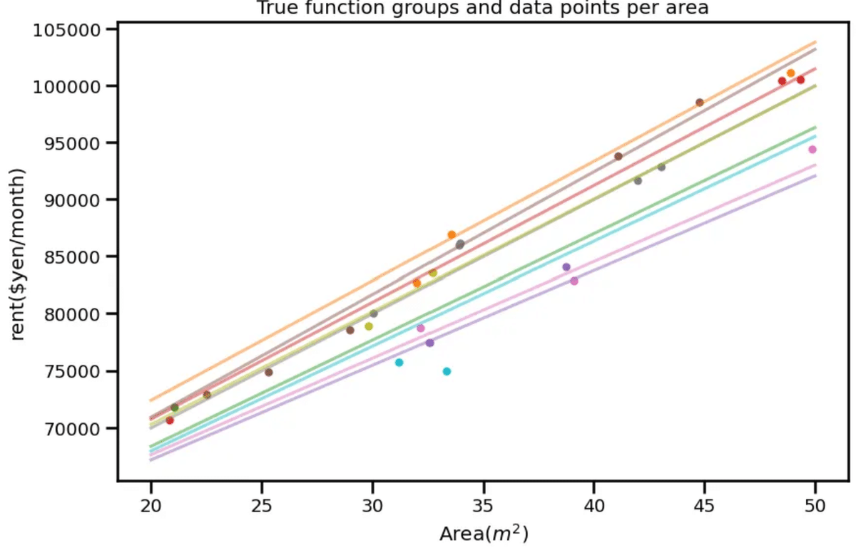
# 可視化用
x_linspace = np.linspace(20, 50, 100)
fig, ax = plt.subplots(figsize=(9, 6))
cmap = plt.get_cmap('tab10', 10)
for i in range(9):
# 真の関数可視化
ax.plot(x_linspace, a_vector[i] * x_linspace + b_vector[i], color=cmap(i + 1), alpha=0.5)
# 学習データ可視化
ax.scatter(x_data[group_idx == i], y_data[group_idx == i], marker='.', color=cmap(i+1))
ax.set_xlabel('Area($m^2$)')
ax.set_ylabel('rent($yen/month)')
ax.set_title('True function groups and data points per area')
plt.tight_layout()
plt.show()
"""
#元コード
import pandas as pd
import numpy as np
import matplotlib.pyplot as plt
import pymc3 as pm
import seaborn as sns
import arviz as az
# データ読み込み
df_data = pd.read_csv('toy_data.csv')
# 真の係数パラメータの読み込み
df_coef = pd.read_csv('true_coef.csv')
# 説明変数
x_data = df_data['x'].values
# 目的変数
y_data = df_data['y'].values
# 地域グループ
group_idx = df_data['systemID'].values.astype(int)
# 地域ごとの傾きとバイアス
a_vector, b_vector = df_coef['a'].values, df_coef['b'].values
# 可視化用
x_linspace = np.linspace(20, 50, 100)
fig, ax = plt.subplots(figsize=(9, 6))
cmap = plt.get_cmap('tab10', 10)
for i in range(9):
# 真の関数可視化
ax.plot(x_linspace, a_vector[i] * x_linspace + b_vector[i], color=cmap(i + 1), alpha=0.5)
# 学習データ可視化
ax.scatter(x_data[group_idx == i], y_data[group_idx == i], marker='.', color=cmap(i+1))
ax.set_xlabel('面積($m^2$)')
ax.set_ylabel('家賃(円/月)')
ax.set_title('地域毎の真の関数群とデータ点')
plt.tight_layout()
plt.show()
"""
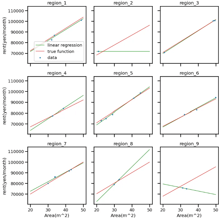
from sklearn.linear_model import LinearRegression
fig, ax = plt.subplots(figsize=(10, 10), ncols=3, nrows=3, sharex=True, sharey=True)

x_new = np.linspace(20, 50, 100)

for i in range(9):
    row_index = i // 3
    col_index = i % 3
    # 地域グループ取り出し
    x_i = x_data[group_idx == i]
    y_i = y_data[group_idx == i]
    # 線形回帰
    lr = LinearRegression()
    lr.fit(x_i.reshape(-1, 1), y_i.reshape(-1, 1))
    # 線形回帰可視化
    y_linear_model = lr.predict(x_new.reshape(-1, 1))
    ax[row_index, col_index].plot(x_new, y_linear_model, color='green', linewidth=1, label='linear regression')
    # True function visualization
    y_true = a_vector[i] * x_new + b_vector[i]
    ax[row_index, col_index].plot(x_new, y_true, color='red', linewidth=1, label='true function')
    # training data visualization
    ax[row_index, col_index].scatter(x_i, y_i, marker='.' , s=25, zorder=2, label='data')
    ax[row_index, col_index].set_title(f'region_{i+1}')
    if row_index == 2:
        ax[row_index, col_index].set_xlabel('Area(m^2)')
    if col_index == 0:
        ax[row_index, col_index].set_ylabel('rent(yen/month)')

ax[0, 0].legend()
plt.tight_layout()
plt.show()
"""
"元コード
from sklearn.linear_model import LinearRegression
fig, ax = plt.subplots(figsize=(10, 10), ncols=3, nrows=3, sharex=True, sharey=True)
x_new = np.linspace(20, 50, 100)
# 地域グループごとに処理
for i in range(9):
    row_index = i // 3
    col_index = i % 3
    # 地域グループ取り出し
    x_i = x_data[group_idx==i]
    y_i = y_data[group_idx==i]
    # 線形回帰
    lr = LinearRegression()
    lr.fit(x_i.reshape(-1, 1), y_i.reshape(-1, 1))
    # 線形回帰可視化
    y_linear_model = lr.predict(x_new.reshape(-1, 1))
    ax[row_index, col_index].plot(x_new, y_linear_model, color='green', linewidth=1, label='線形回帰')
    # 真の関数可視化
    y_true = a_vector[i] * x_new + b_vector[i]
    ax[row_index, col_index].plot(x_new, y_true, color='red', linewidth=1, label='真の関数')
    # 学習データ可視化
    ax[row_index, col_index].scatter(x_i, y_i, marker='.', s=25, zorder=2, label='データ')
    ax[row_index, col_index].set_title(f'地域_{i+1}')
    if row_index==2:
        ax[row_index, col_index].set_xlabel('面積(m^2)')
    if col_index==0:
        ax[row_index, col_index].set_ylabel('家賃(円/月)')
ax[0, 0].legend()
plt.tight_layout()
plt.show()
"""
# データはhttps://github.com/sammy-suyama/PythonBayesianMLBook/blob/main/chapter3/3_5_%E9%9A%8E%E5%B1%A4%E3%83%99%E3%82%A4%E3%82%BA%E3%83%A2%E3%83%87%E3%83%AB.ipynbより

import pandas as pd
import numpy as np
import matplotlib.pyplot as plt
import pymc as pm  # PyMC v5
import seaborn as sns
import arviz as az

sns.set_context('talk', font_scale=0.8)
np.random.seed(12)

group_num = 9
data_num = 25

a_vector = np.random.normal(1000.0, scale=100.0, size=group_num)
b_vector = np.random.normal(50000.0, scale=500.0, size=group_num)

x_data = np.random.uniform(20, 50, data_num)
group_idx = np.random.randint(0, group_num, data_num)
y_data = a_vector[group_idx] * x_data + b_vector[group_idx] + np.random.normal(0, scale=1500.0, size=data_num)

# 外れ値っぽい1点
x_data = np.append(x_data, 33.322)
y_data = np.append(y_data, 75004.54)
group_idx = np.append(group_idx, 8)

df_data = pd.DataFrame([x_data, y_data, group_idx]).T
df_data.columns = ['x', 'y', 'systemID']
df_coef = pd.DataFrame([a_vector, b_vector]).T
df_coef.columns = ['a', 'b']

x_data = df_data['x'].values
y_data = df_data['y'].values
group_idx = df_data['systemID'].values.astype(int)
a_vector, b_vector = df_coef['a'].values, df_coef['b'].values

# 可視化 (省略可)
x_linspace = np.linspace(20, 50, 100)
fig, ax = plt.subplots(figsize=(9, 6))
cmap = plt.get_cmap('tab10', 10)

for i in range(group_num):
    ax.plot(x_linspace, a_vector[i] * x_linspace + b_vector[i], color=cmap(i+1), alpha=0.5)
    ax.scatter(x_data[group_idx == i], y_data[group_idx == i], marker='.', color=cmap(i+1))

ax.set_xlabel('Area($m^2$)')
ax.set_ylabel('rent($yen/month)')
ax.set_title('True function groups and data points per area')
plt.tight_layout()
plt.show()
"""
#元コード
import pymc3 as pm
import numpy as np
import pandas as pd
import seaborn as sns
import matplotlib.pyplot as plt
import arviz as az

# データ読み込み
df_data = pd.read_csv('toy_data.csv')
# 真の係数パラメータの読み込み
df_coef = pd.read_csv('true_coef.csv')
# 説明変数
x_data = df_data['x'].values
# 目的変数
y_data = df_data['y'].values
# 地域グループ
group_idx = df_data['systemID'].values.astype(int)
# 地域数
group_num = np.max(group_idx) + 1
# 地域ごとの傾きとバイアス
a_vector, b_vector = df_coef['a'].values, df_coef['b'].values
"""
group_num = int(np.max(group_idx) + 1)
with pm.Model() as model:
x_ = pm.Data('x_', x_data) # (26,) 学習用
g_ = pm.Data('g_', group_idx) # (26,) 学習用
# ハイパーパラメータ
a_mu = pm.Normal('a_mu', mu=50.0, sigma=10.0)
a_sigma = pm.HalfCauchy('a_sigma', beta=100.0)
b_mu = pm.Normal('b_mu', mu=50000.0, sigma=1000.0)
b_sigma = pm.HalfCauchy('b_sigma', beta=1000.0)
# 地域ごとの傾き・バイアス
a_offset = pm.Normal('a_offset', mu=a_mu, sigma=a_sigma, shape=group_num)
b_offset = pm.Normal('b_offset', mu=b_mu, sigma=b_sigma, shape=group_num)
# ------- 学習用の分布 (観測あり) -------
y_ = pm.Normal(
'y_',
mu=a_offset[g_] * x_ + b_offset[g_],
sigma=1000,
observed=y_data # shape=(26,)
)
# ------- 予測用の分布 (観測なし) -------
# sigma=1000 を仮定するか、推論した値を使う等はケースバイケース
y_pred = pm.Normal(
'y_pred',
mu=a_offset[g_] * x_ + b_offset[g_],
sigma=1000,
shape=x_.shape # <= ここが (None,) として扱われる
)
trace = pm.sample(
draws=2000, tune=1000, chains=2, random_seed=1,
return_inferencedata=True
)
"""
# 元コード
# モデルの定義
with pm.Model() as model:
# 説明変数
x = pm.Data('x', x_data)
# 傾きについてのハイパーパラメータの事前分布
a_mu = pm.Normal('a_mu', mu=50.0, sigma=10.0)
a_sigma = pm.HalfCauchy('a_sigma', beta=100.0)
# 地域ごとの傾き
a_offset = pm.Normal('a_offset', mu=a_mu, sigma=a_sigma, shape=group_num)
# バイアスについてのハイパーパラメータの事前分布
b_mu = pm.Normal('b_mu', mu=50000.0, sigma=1000.0)
b_sigma = pm.HalfCauchy('b_sigma', beta=1000.0)
# 地域ごとのバイアス
b_offset = pm.Normal('b_offset', mu=b_mu, sigma=b_sigma, shape=group_num)
# 尤度関数 (地域を表す group_idx で傾きとバイアスの次元を指定)
y = pm.Normal('y', mu=a_offset[group_idx] * x + b_offset[group_idx], sigma=1000, observed=y_data)
with model:
# MCMCによる推論
trace = pm.sample(draws=3000, tune=1000, chains=3, random_seed=1, return_inferencedata=True)
"""
# ここは変化なし
az.plot_trace(trace, var_names=['a_mu', 'a_sigma', 'a_offset', 'b_mu', 'b_sigma', 'b_offset'])
plt.show()
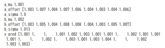
for var_info in az.rhat(trace).values():
print(var_info.name, var_info.values.round(3), sep=" ")
az.plot_posterior(trace, var_names=['a_mu', 'a_sigma', 'a_offset', 'b_mu', 'b_sigma', 'b_offset'], hdi_prob=0.9)
plt.show()
# 予測用 x_new
x_new = np.linspace(20, 50, 100)

# 3x3 サブプロット作成
fig, axes = plt.subplots(nrows=3, ncols=3, figsize=(12, 10), sharex=True, sharey=True)
fig.suptitle("Posterior Predictive for Each Region", fontsize=16)

for i in range(9):
    row = i // 3
    col = i % 3
    ax = axes[row, col]

    # region i 用の g_idx_new を作成 (全要素が i の配列)
    g_idx_new = np.full_like(x_new, i, dtype=np.int32)

    # Posterior Predictive
    with model:
        x_.set_value(x_new)
        g_.set_value(g_idx_new)

        pred = pm.sample_posterior_predictive(
            trace,
            var_names=["y_pred"],
            random_seed=1
        )

    # サンプリング結果を (n_draws, 100) の形に
    y_pred_samples = pred.posterior_predictive['y_pred'].stack(draws=("chain", "draw")).values.T

    # 各パーセンタイル
    Y_10_pred = np.percentile(y_pred_samples, 10, axis=0)
    Y_25_pred = np.percentile(y_pred_samples, 25, axis=0)
    Y_50_pred = np.percentile(y_pred_samples, 50, axis=0)
    Y_75_pred = np.percentile(y_pred_samples, 75, axis=0)
    Y_90_pred = np.percentile(y_pred_samples, 90, axis=0)

    # 真の関数
    true_a = df_coef['a'][i]
    true_b = df_coef['b'][i]
    y_true_i = true_a * x_new + true_b

    # プロット
    ax.plot(x_new, y_true_i, color='red', linewidth=1, label='True function')
    ax.plot(x_new, Y_50_pred, color='green', linewidth=1, label='Median')
    ax.fill_between(x_new, Y_25_pred, Y_75_pred, color='green', alpha=0.2, label='25-75%')
    ax.fill_between(x_new, Y_10_pred, Y_90_pred, color='green', alpha=0.1, label='10-90%')

    # 学習データ(region_iのみ)
    x_i = df_data.loc[df_data['systemID'] == i, 'x']
    y_i = df_data.loc[df_data['systemID'] == i, 'y']
    ax.scatter(x_i, y_i, marker='.', s=25, zorder=3, label='Training data')

    ax.set_title(f"Region {i}")
    if row == 2:
        ax.set_xlabel("Area(m^2)")
    if col == 0:
        ax.set_ylabel("rent(yen/month)")

    # 凡例は最初のサブプロットだけ表示する例 (あるいは全サブプロット表示でもOK)
    if i == 0:
        ax.legend()

plt.tight_layout()
plt.show()

"""
#元コード
#検証用データの作成
x_new = np.linspace(20, 50, 100)
with model:
    #検証用データをモデルへ入力
    pm.set_data({'x': x_new})
    #予測分布からサンプリング
    pred = pm.sample_posterior_predictive(trace, samples=1000, random_seed=1)
y_pred_samples = pred['y']
# パーセンタイルごとの超平面を取り出す
Y_10_pred = np.percentile(y_pred_samples, 10, axis=0)
Y_25_pred = np.percentile(y_pred_samples, 25, axis=0)
Y_50_pred = np.percentile(y_pred_samples, 50, axis=0)
Y_75_pred = np.percentile(y_pred_samples, 75, axis=0)
Y_90_pred = np.percentile(y_pred_samples, 90, axis=0)
fig, ax = plt.subplots(figsize=(10, 10), ncols=3, nrows=3, sharex=True, sharey=True)
cmap = plt.get_cmap('tab10', 10)
# 地域グループごとに処理
for i in range(9):
    row_index = i // 3
    col_index = i % 3
    # 地域ごとの係数パラメータのMCMCサンプル平均値と標準偏差を算出
    a_i_mcmc_samples = trace.posterior['a_offset'][0, :, i]
    b_i_mcmc_samples = trace.posterior['b_offset'][0, :, i]
    # 学習データ可視化
    x_i = x_data[group_idx == i]
    y_i = y_data[group_idx == i]
    ax[row_index, col_index].scatter(x_i, y_i, marker='.', s=25, zorder=3, label='データ')
    # MCMCサンプルを使って予測分布の平均を可視化
    for k in range(0, 3000, 15):
        y_new_sample = a_i_mcmc_samples[k].values * x_new + b_i_mcmc_samples[k].values
        ax[row_index, col_index].plot(x_new, y_new_sample, alpha=0.01, color='green', zorder=1)
    # 真の関数可視化
    y_true = a_vector[i] * x_new + b_vector[i]
    ax[row_index, col_index].plot(x_new, y_true, color='red', linewidth=1, label='真の関数')
    ax[row_index, col_index].set_title(f'地域_{i+1}')
    if row_index == 2:
      ax[row_index, col_index].set_xlabel('面積(m^2)')
    if col_index == 0:
        ax[row_index, col_index].set_ylabel('家賃(円/月)')
ax[0,0].legend()
plt.tight_layout()
plt.show()
"""
3.6 ガウス過程回帰モデル: ガウス尤度
コード修正なし
3.7 ガウス過程回帰モデル: 尤度の一般化
コード修正なし
4章以降はまた気が向いたときに