Python matplotlibで描画したグラフ画像をSlackで送るスクリプト(2024年10月投稿 files_upload_v2を使用)

採用データの可視化に取り組んでいて、matplotlibで描画したグラフをSlackで送りたいなと思う場面がありました。
その備忘録として残しておきます。なお、files_upload_v2で書いています。
今回もGoogle Colabを使用しています。
スクリプト実行時
必要なBot Token Scopesについて
chat:write(メッセージ送信に必要なScope)
files:write(ファイルをアップロードに必要なScope)
サンプルスクリプト
import matplotlib.pyplot as plt
import japanize_matplotlib
import io
from slack_sdk import WebClient
from slack_sdk.errors import SlackApiError
# Google Colabの認証を付与する
from google.colab import userdata
from google.colab import auth
auth.authenticate_user()
# Google Spreadsheetとの連携
import gspread
from google.auth import default
creds, _ = default()
gc = gspread.authorize(creds)
def create_bar_chart():
# 描画に必要なデータの準備
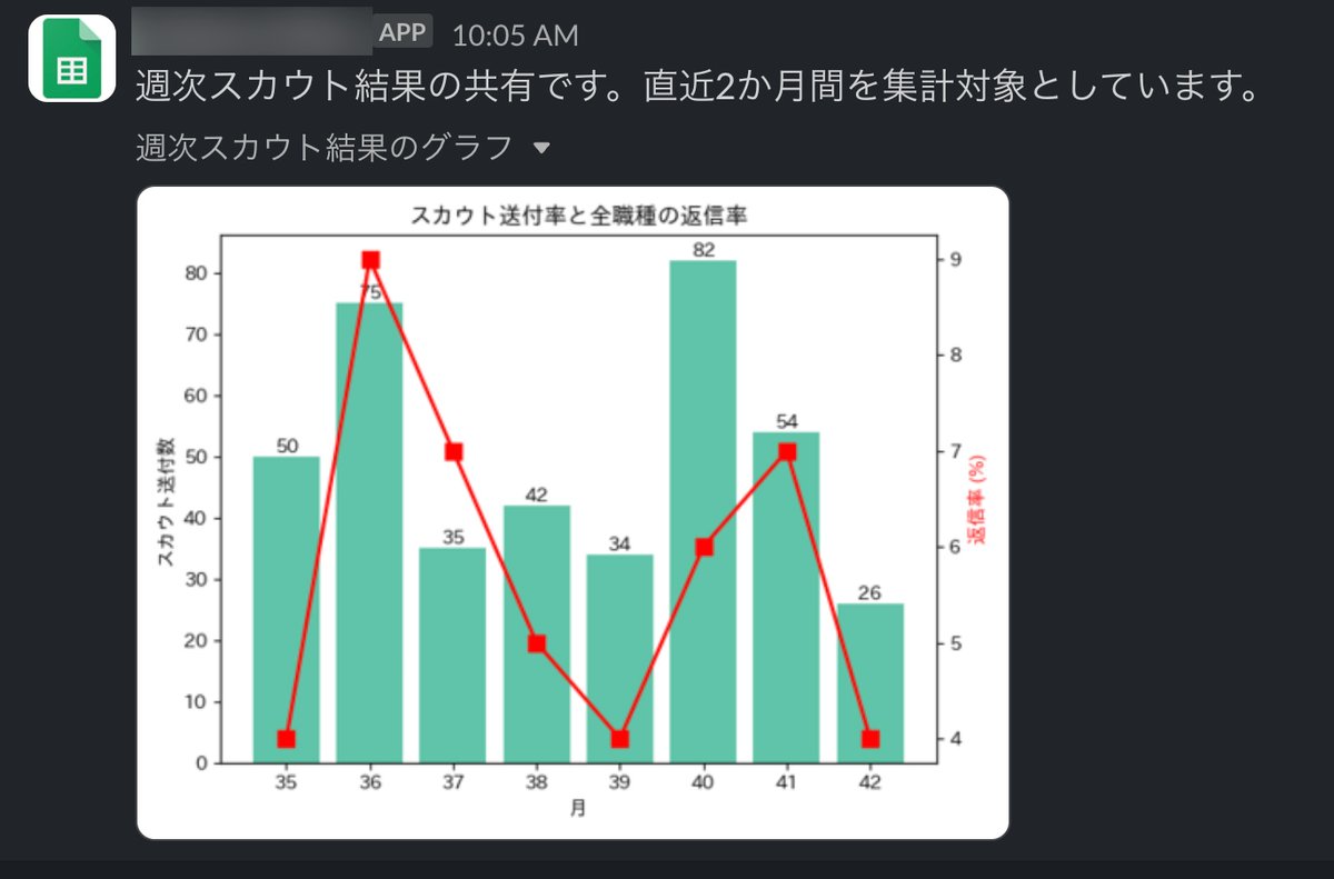
week_numbers = [35, 36, 37, 38, 39, 40, 41, 42]
scout_counts = [50, 75, 35, 42, 34, 82, 54, 26]
reply_rates = [4, 9, 7, 5, 4, 6, 7, 4]
print(f"week_numbers: {week_numbers} len: {len(week_numbers)}")
print(f"scout_counts: {scout_counts} len: {len(scout_counts)}")
print(f"reply_rates: {reply_rates} len: {len(reply_rates)}\n\n")
# プロットの設定
fig, ax1 = plt.subplots()
# 棒グラフのプロット
bars = ax1.bar(week_numbers, scout_counts, color='#60c4a8', label='スカウト送付数')
ax1.set_xlabel('月')
ax1.set_ylabel('スカウト送付数')
# 棒グラフに数値を追加
for bar, count in zip(bars, scout_counts):
height = bar.get_height()
ax1.text(bar.get_x() + bar.get_width() / 2, height, count,
ha ='center', va ='bottom')
# 折れ線グラフのプロット
ax2 = ax1.twinx()
ax2.set_ylabel('返信率 (%)', color='r')
ax2.plot(week_numbers, reply_rates, color='r', marker='s', label='返信率', markersize=8, linewidth=2)
# グラフのタイトルと凡例の設定
plt.title('スカウト送付率と全職種の返信率')
fig.tight_layout()
plt.show()
return fig
def upload_plot_to_slack(channel_id, fig):
# プロットをPNG形式でバッファに保存
buf = io.BytesIO()
fig.savefig(buf, format='png')
buf.seek(0)
# Slackクライアントを初期化
client = WebClient(token=userdata.get('SLACK_BOT_USER_TOKEN'))
try:
# Slackにファイルをアップロード
response = client.files_upload_v2(
channel = channel_id,
file = buf.getvalue(),
title = '週次スカウト結果のグラフ',
initial_comment = "週次スカウト結果の共有です。直近2か月間を集計対象としています。"
)
permalink = response['file']['permalink']
print(f"File uploaded successfully: {permalink}")
return permalink
except SlackApiError as e:
print(f"Error uploading file: {e.response['error']}")
return None
finally:
buf.close()
def main():
channel_id = userdata.get('SLACK_CHANNEL_ID')
fig = create_bar_chart()
upload_plot_to_slack(channel_id, fig)
if __name__ == "__main__":
main()注意点
ライブラリのインストールについて
%%bash
pip install -q japanize-matplotlib
channel_idについて
SLACK_CHANNEL_IDは、channel_idのみ有効です。
テストでDMに送ろうと何度も試したのですが、メンバーID(user_id)の場合はエラーになってしまい成功しませんでした。
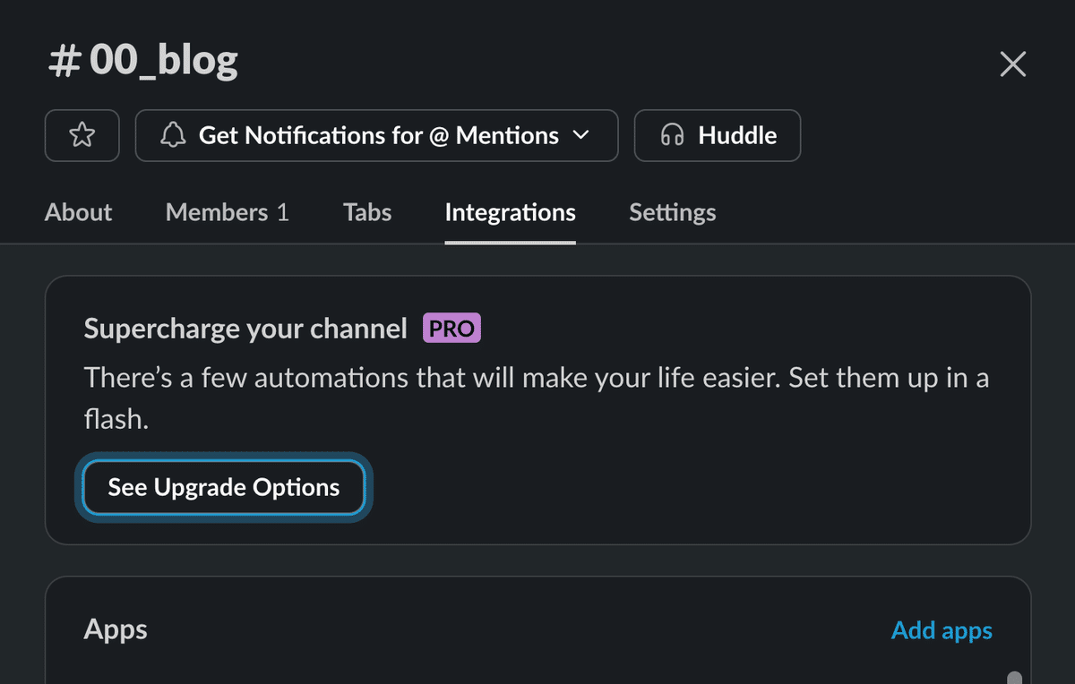
Bot User OAuth Tokenの場合
Bot User OAuth Tokenの場合は、チャンネルにappを追加する必要があります。
Integrations > Add appsをクリックして、グラフを送るappを追加してください。
app追加はチャンネルのオーナーのみ可能です。
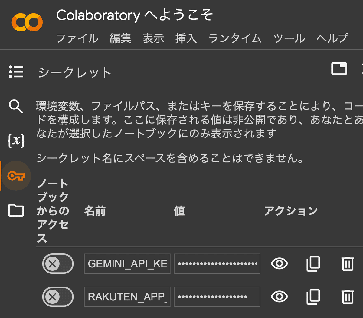
userdata.get('*******')
Google Colabオリジナルの環境変数です。os.getenvみたいな感じです。
鍵のアイコンから登録できます。
複合グラフを作る際の注意点
このスクリプトの大半はAIに書いてもらったものですが、複合グラフを作る際は、barを使用してください。
棒グラフと折れ線グラフ両方が正しく表示されるケース
bars = ax1.bar(week_numbers, scout_counts, color='#60c4a8', label='スカウト送付数')棒グラフのみしか表示されないケース
pivot_data = df.pivot_table(index='週番号', columns=['曜日', '職種', '返信の有無'], values='count', fill_value=0)pivot_tableを使って棒グラフを描写することも出来るようですが、使用すると折れ線グラフが表示されなくなりました。理由はよく分かりませんが、barを使う方が目的を早く達成することができます。
参考にしたGitHubについて
# 単一ファイルを送る方法
response = client.files_upload_v2(
    file="./logo.png",
    title="New company logo",
    # Note that channels still works but going with channel="C12345" is recommended
    # channels=["C111", "C222"] is no longer supported. In this case, an exception can be thrown
    channels=["C12345"],
    initial_comment="Here is the latest version of our new company logo :wave:",
)
response.get("file")  # returns the full metadata of the uploaded file

# 複数ファイルを送る方法
response = client.files_upload_v2(
    file_uploads=[
        {
            "file": "./logo.png",
            "title": "New company logo",
        },
        {
            "content": "Minutes ....",
            "filename": "team-meeting-minutes-2022-03-01.md",
            "title": "Team meeting minutes (2022-03-01)",
        },
    ],
    channel="C12345",
    initial_comment="Here is the latest version of our new company logo :wave:",
)
response.get("files")  # returns the full metadata of all the uploaded files
複数ファイルを送る方法について、今回は検証していません。
追記:Spreadsheetから情報を読み取るスクリプト
def read_spreadsheet():
"""
採用数値のRawデータを取得しデータフレームを返します
Returns:
DataFrame: アクティブなユーザーのデータフレーム
"""
sheet_url = "https://docs.google.com/spreadsheets/d/***********"
spreadsheet = gc.open_by_url(sheet_url)
sheet = spreadsheet.worksheet('シート名を入れる')
original_data = sheet.get_all_records()
df = pd.DataFrame(original_data)
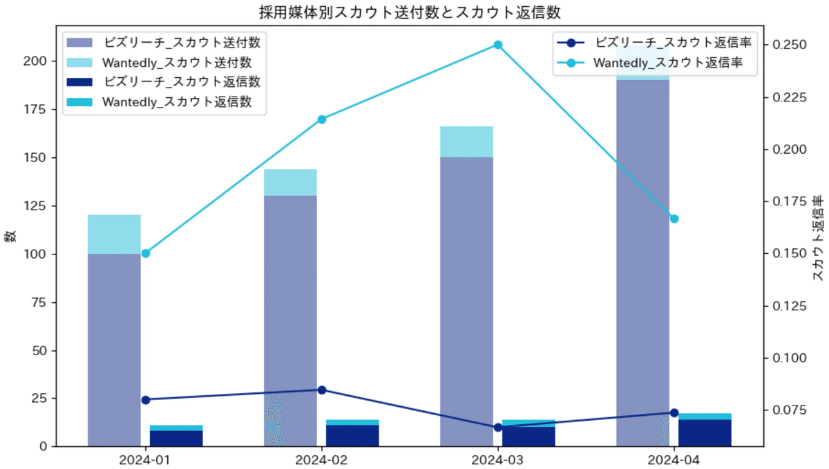
return df積み上げ棒グラフの描画について
多分、採用数値の可視化に興味を示す人であれば、職種別に、スカウト媒体別に積み上げ棒グラフで描画できないかと思うはず。
関連記事を書いているので、併せて覗いてみてください。