alpine.jsのx-showを学ぶ

ここではtailwind cssも使ってるけど、こんな感じの奴。この機能自体はjavascriptでよくみられる奴であるが
jQueryとかでやる場合
<!DOCTYPE html>
<html>
<head>
  <title>jQuery Show/Hide Demo</title>
  <!-- jQueryを読み込む -->
  <script src="https://code.jquery.com/jquery-3.6.0.min.js"></script>
  <!-- Tailwind CSSを読み込む -->
  <link href="https://cdn.jsdelivr.net/npm/tailwindcss@2.2.15/dist/tailwind.min.css" rel="stylesheet">
  <script>
    $(document).ready(function() {
      // ボタンがクリックされたら実行
      $("#toggleButton").click(function() {
        // .toggleElementクラスの要素の表示・非表示をトグル
        $(".toggleElement").toggle();
      });
    });
  </script>
</head>
<body class="bg-gray-200 h-screen flex justify-center items-center">
  <div class="p-6 bg-white rounded shadow-lg w-1/3">
    <!-- ボタンで要素の表示・非表示をトグル -->
    <button id="toggleButton" class="bg-blue-500 text-white px-4 py-2 rounded">
      Toggle
    </button>

    <!-- toggleElementクラスで表示・非表示を制御 -->
    <div class="toggleElement mt-4">
      <div class="bg-green-100 text-green-800 p-4 rounded">
        This is a visible element.
      </div>
    </div>
  </div>
</body>
</html>
このように全体的に仕掛ける要素を探り探りやるのが従来のjQuery式といえる。つまり
    <button id="toggleButton" class="bg-blue-500 text-white px-4 py-2 rounded">
      Toggle
</button>このようにtoggleButtonというidに
    $(document).ready(function() {
      // ボタンがクリックされたら実行
      $("#toggleButton").click(function() {


      });
    });
こんな感じでトリガーを仕掛けるわけだ。
$(".toggleElement").toggle();toggle()とかいうユーティリティーメソッドがあるのも特徴である。
が、いずれにせよコード全体を整理しておかないと結構あかん感じがある。
alpine.jsで書く
<!DOCTYPE html>
<html lang="en">
<head>
<meta charset="UTF-8">
<title>Alpine.js with Tailwind CSS</title>
<script src="https://cdn.tailwindcss.com"></script>
<script defer src="https://cdn.jsdelivr.net/npm/alpinejs@3.13.0/dist/cdn.min.js"></script>
</head>
<body class="bg-gray-200 h-screen flex justify-center items-center">
<!-- Alpine.jsのスコープを定義 -->
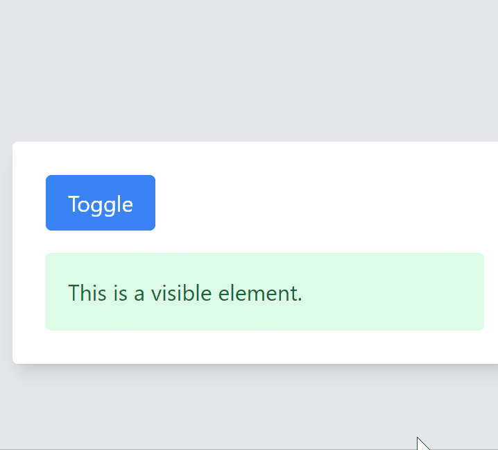
<div x-data="{ show: true }" class="p-6 bg-white rounded shadow-lg w-1/3">
<!-- ボタンでshow変数をトグルする -->
<button @click="show = !show" class="bg-blue-500 text-white px-4 py-2 rounded">
Toggle
</button>
<!-- x-showで要素の表示・非表示を制御 -->
<div x-show="show" class="mt-4">
<div class="bg-green-100 text-green-800 p-4 rounded">
This is a visible element.
</div>
</div>
</div>
</body>
</html>
ほぼ同じ処理だがちょっと変わった指向で組み立てられている
まず
<div x-data="{ show: true }" class="p-6 bg-white rounded shadow-lg w-1/3">
</div>
この x-data という属性がキモだ。これがセットされた属性の中だけで変数が有効になる、つまりここでは show に true がセットされている。
つまりx-dataはclassで考えると、そのプロパティをセットし、その初期値も同時に設定できると考えてよい。が、いずれにせよx-dataのタグ内でのみ使える
そして
    <button @click="show = !show" class="bg-blue-500 text-white px-4 py-2 rounded">
      Toggle
    </button>
これにより show = !show が入る。この書き方は慣れている人には釈迦に説法だけどshowの値を反転させてshowに詰めるので show が true だったときはfalseに、falseだったときは trueにするという、非常に良く見られるトラディショナルな書き方である
すると
    <div x-show="show" class="mt-4">
      <div class="bg-green-100 text-green-800 p-4 rounded">
        This is a visible element.
      </div>
    </div>
ここであらわれる
<div x-show="show" class="mt-4">
</div>
によってshow変数に応じた表示/非表示が行われるのだ。これの良い所は
  <div x-data="{ show: true }" class="p-6 bg-white rounded shadow-lg w-1/3">
    <button @click="show = !show" class="bg-blue-500 text-white px-4 py-2 rounded">
      Toggle
    </button>

    <div x-show="show" class="mt-4">
      <div class="bg-green-100 text-green-800 p-4 rounded">
        This is a visible element.
      </div>
    </div>
  </div>
このように増やしても独立して動作する。jQuery式ではちょっと面倒な事になるというか少なくともコピペ対応がうまくいかないのは直ぐに理解できるだろう。

以上がx-showの動作となる。これ以上はあんまり語る事もねえな。
もうちょっと追加
  <div x-data="{ show: true }" class="p-6 bg-white rounded shadow-lg w-1/3">
    <button @click="show = !show" class="bg-blue-500 text-white px-4 py-2 rounded">
      Toggle
    </button>

    <div x-show="show" x-transition class="mt-4">
      <div class="bg-green-100 text-green-800 p-4 rounded">
        This is a visible element.
      </div>
    </div>
  </div>
このように x-transition を追加するとちょっとだけ動きが変わる

さらに
<div x-show="show" x-transition.duration.500ms class="mt-4">などを付け加えると秒数を変更できたりするようだ、この辺はオフィシャルドキュメントに詳しい
最後の方にある例
            <div
                x-show="open"
                x-transition:enter="transition ease-out duration-300"
                x-transition:enter-start="opacity-0 scale-90"
                x-transition:enter-end="opacity-100 scale-100"
                x-transition:leave="transition ease-in duration-300"
                x-transition:leave-start="opacity-100 scale-100"
                x-transition:leave-end="opacity-0 scale-90"
                >Hello 👋</div>
うーん、ここまでくると、ちょっとよくわかんねえなあ…
わかんねえというか、自分でここまで沢山定義する事が果たしてあるんかという。

ただ、laravel breezeの置いていくbladeのdropdownコンポーネントは以下のようになってたりして
<div class="relative" x-data="{ open: false }" @click.outside="open = false" @close.stop="open = false">
    <div @click="open = ! open">
        {{ $trigger }}
    </div>

    <div x-show="open"
            x-transition:enter="transition ease-out duration-200"
            x-transition:enter-start="opacity-0 scale-95"
            x-transition:enter-end="opacity-100 scale-100"
            x-transition:leave="transition ease-in duration-75"
            x-transition:leave-start="opacity-100 scale-100"
            x-transition:leave-end="opacity-0 scale-95"
            class="absolute z-50 mt-2 {{ $width }} rounded-md shadow-lg {{ $alignmentClasses }}"
            style="display: none;"
            @click="open = false">
        <div class="rounded-md ring-1 ring-black ring-opacity-5 {{ $contentClasses }}">
            {{ $content }}
        </div>
    </div>
</div>
まあ何だかんだ人の作ったコードのコピペ対応で頑張るみたいな所があるのかもしれん