matplotlib.pyplotの使い方

はじめてのニューラルネットワーク:分類問題の初歩
https://www.tensorflow.org/tutorials/keras/classification
上記の記事を読んでつまづいたところのメモ。
pyplotはグラフなんかを表示するためのモジュール。
なんとなくは知ってるけど使いこなせてはいないので、改めて使い方を確認。
matplotlib.pyplotをインポート
import matplotlib.pyplot as pltpyplotのインポート。
as pltをつけると
plt.figure()
plt.show()
みたいな書き方ができるようになる。
import matplotlib
matplotlib.pyplot.figure()
一番原始的な書き方は上記のような感じ。
from matplotlib import pyplot
pyplot.figure()
from ○○ import △△
という書き方をすると
○○.△△.figure()
と書く代わりに
△△.figure()
と書くだけで良くなる。
文字数が少なるのでコードが見やすい。
import matplotlib.pyplot as plt
plt.figure()
from ○○ import △△ as □□
という書き方をすると
□□.figure()
という書き方ができるようなる。
import matplotlib.pyplot as mp
mp.figure()
上記のような書き方をすることも可能。
「mp」はmatplot pyplotの略のつもり。
ただし、matplotlib.pyplotは「plt」と略すのがpython界のマナーになっている。
独自の略語を使うと他人が読むときに困るので慣例に従ってas pltとした方が無難。
pltの各メソッドの確認
plt.figure()
plt.imshow(train_images[0])
plt.colorbar()
plt.grid(False)
plt.show()
plt.figure()
は空の図を作る。
グラフの中身となるデータや見出しは後付けで追加していく。
plt.show()
作成したグラフを画面に表示する。
plt.figure()
plt.show()
上記だけ実行すると、グラフの中身が空なので何も表示されない。
plt.figure()
plt.imshow(train_images[0])
plt.show()
上記のコードを実行すると下記のような画像が表示される。

ちなみに、train_images[0]の中身はこんな感じ。
array([
[0.        , 0.        , 0.        , 0.        , 0.        ,        0.        , 0.        , 0.        , 0.        , 0.        ,        0.        , 0.        , 0.        , 0.        , 0.        ,        0.        , 0.        , 0.        , 0.        , 0.        ,        0.        , 0.        , 0.        , 0.        , 0.        ,        0.        , 0.        , 0.        ],
[0.        , 0.        , 0.        , 0.        , 0.        ,        0.        , 0.        , 0.        , 0.        , 0.        ,        0.        , 0.        , 0.        , 0.        , 0.        ,        0.        , 0.        , 0.        , 0.        , 0.        ,        0.        , 0.        , 0.        , 0.        , 0.        ,        0.        , 0.        , 0.        ],
[0.        , 0.        , 0.        , 0.        , 0.        ,        0.        , 0.        , 0.        , 0.        , 0.        ,        0.        , 0.        , 0.        , 0.        , 0.        ,        0.        , 0.        , 0.        , 0.        , 0.        ,        0.        , 0.        , 0.        , 0.        , 0.        ,        0.        , 0.        , 0.        ],
[0.        , 0.        , 0.        , 0.        , 0.        ,        0.        , 0.        , 0.        , 0.        , 0.        ,        0.        , 0.        , 0.00392157, 0.        , 0.        ,        0.05098039, 0.28627451, 0.        , 0.        , 0.00392157,        0.01568627, 0.        , 0.        , 0.        , 0.        ,        0.00392157, 0.00392157, 0.        ],
[0.        , 0.        , 0.        , 0.        , 0.        ,        0.        , 0.        , 0.        , 0.        , 0.        ,        0.        , 0.        , 0.01176471, 0.        , 0.14117647,        0.53333333, 0.49803922, 0.24313725, 0.21176471, 0.        ,        0.        , 0.        , 0.00392157, 0.01176471, 0.01568627,        0.        , 0.        , 0.01176471],
[0.        , 0.        , 0.        , 0.        , 0.        ,        0.        , 0.        , 0.        , 0.        , 0.        ,        0.        , 0.        , 0.02352941, 0.        , 0.4       ,        0.8       , 0.69019608, 0.5254902 , 0.56470588, 0.48235294,        0.09019608, 0.        , 0.        , 0.        , 0.        ,        0.04705882, 0.03921569, 0.        ],
[0.        , 0.        , 0.        , 0.        , 0.        ,        0.        , 0.        , 0.        , 0.        , 0.        ,        0.        , 0.        , 0.        , 0.        , 0.60784314,        0.9254902 , 0.81176471, 0.69803922, 0.41960784, 0.61176471,        0.63137255, 0.42745098, 0.25098039, 0.09019608, 0.30196078,        0.50980392, 0.28235294, 0.05882353],
[0.        , 0.        , 0.        , 0.        , 0.        ,        0.        , 0.        , 0.        , 0.        , 0.        ,        0.        , 0.00392157, 0.        , 0.27058824, 0.81176471,        0.8745098 , 0.85490196, 0.84705882, 0.84705882, 0.63921569,        0.49803922, 0.4745098 , 0.47843137, 0.57254902, 0.55294118,        0.34509804, 0.6745098 , 0.25882353],
[0.        , 0.        , 0.        , 0.        , 0.        ,        0.        , 0.        , 0.        , 0.        , 0.00392157,        0.00392157, 0.00392157, 0.        , 0.78431373, 0.90980392,        0.90980392, 0.91372549, 0.89803922, 0.8745098 , 0.8745098 ,        0.84313725, 0.83529412, 0.64313725, 0.49803922, 0.48235294,        0.76862745, 0.89803922, 0.        ],
[0.        , 0.        , 0.        , 0.        , 0.        ,        0.        , 0.        , 0.        , 0.        , 0.        ,        0.        , 0.        , 0.        , 0.71764706, 0.88235294,        0.84705882, 0.8745098 , 0.89411765, 0.92156863, 0.89019608,        0.87843137, 0.87058824, 0.87843137, 0.86666667, 0.8745098 ,        0.96078431, 0.67843137, 0.        ],
[0.        , 0.        , 0.        , 0.        , 0.        ,        0.        , 0.        , 0.        , 0.        , 0.        ,        0.        , 0.        , 0.        , 0.75686275, 0.89411765,        0.85490196, 0.83529412, 0.77647059, 0.70588235, 0.83137255,        0.82352941, 0.82745098, 0.83529412, 0.8745098 , 0.8627451 ,        0.95294118, 0.79215686, 0.        ],
[0.        , 0.        , 0.        , 0.        , 0.        ,        0.        , 0.        , 0.        , 0.        , 0.00392157,        0.01176471, 0.        , 0.04705882, 0.85882353, 0.8627451 ,        0.83137255, 0.85490196, 0.75294118, 0.6627451 , 0.89019608,        0.81568627, 0.85490196, 0.87843137, 0.83137255, 0.88627451,        0.77254902, 0.81960784, 0.20392157],
[0.        , 0.        , 0.        , 0.        , 0.        ,        0.        , 0.        , 0.        , 0.        , 0.        ,        0.02352941, 0.        , 0.38823529, 0.95686275, 0.87058824,        0.8627451 , 0.85490196, 0.79607843, 0.77647059, 0.86666667,        0.84313725, 0.83529412, 0.87058824, 0.8627451 , 0.96078431,        0.46666667, 0.65490196, 0.21960784],
[0.        , 0.        , 0.        , 0.        , 0.        ,        0.        , 0.        , 0.        , 0.        , 0.01568627,        0.        , 0.        , 0.21568627, 0.9254902 , 0.89411765,        0.90196078, 0.89411765, 0.94117647, 0.90980392, 0.83529412,        0.85490196, 0.8745098 , 0.91764706, 0.85098039, 0.85098039,        0.81960784, 0.36078431, 0.        ],
[0.        , 0.        , 0.00392157, 0.01568627, 0.02352941,        0.02745098, 0.00784314, 0.        , 0.        , 0.        ,        0.        , 0.        , 0.92941176, 0.88627451, 0.85098039,        0.8745098 , 0.87058824, 0.85882353, 0.87058824, 0.86666667,        0.84705882, 0.8745098 , 0.89803922, 0.84313725, 0.85490196,        1.        , 0.30196078, 0.        ],
[0.        , 0.01176471, 0.        , 0.        , 0.        ,        0.        , 0.        , 0.        , 0.        , 0.24313725,        0.56862745, 0.8       , 0.89411765, 0.81176471, 0.83529412,        0.86666667, 0.85490196, 0.81568627, 0.82745098, 0.85490196,        0.87843137, 0.8745098 , 0.85882353, 0.84313725, 0.87843137,        0.95686275, 0.62352941, 0.        ],
[0.        , 0.        , 0.        , 0.        , 0.07058824,        0.17254902, 0.32156863, 0.41960784, 0.74117647, 0.89411765,        0.8627451 , 0.87058824, 0.85098039, 0.88627451, 0.78431373,        0.80392157, 0.82745098, 0.90196078, 0.87843137, 0.91764706,        0.69019608, 0.7372549 , 0.98039216, 0.97254902, 0.91372549,        0.93333333, 0.84313725, 0.        ],
[0.        , 0.22352941, 0.73333333, 0.81568627, 0.87843137,        0.86666667, 0.87843137, 0.81568627, 0.8       , 0.83921569,        0.81568627, 0.81960784, 0.78431373, 0.62352941, 0.96078431,        0.75686275, 0.80784314, 0.8745098 , 1.        , 1.        ,        0.86666667, 0.91764706, 0.86666667, 0.82745098, 0.8627451 ,        0.90980392, 0.96470588, 0.        ],
[0.01176471, 0.79215686, 0.89411765, 0.87843137, 0.86666667,        0.82745098, 0.82745098, 0.83921569, 0.80392157, 0.80392157,        0.80392157, 0.8627451 , 0.94117647, 0.31372549, 0.58823529,        1.        , 0.89803922, 0.86666667, 0.7372549 , 0.60392157,        0.74901961, 0.82352941, 0.8       , 0.81960784, 0.87058824,        0.89411765, 0.88235294, 0.        ],
[0.38431373, 0.91372549, 0.77647059, 0.82352941, 0.87058824,        0.89803922, 0.89803922, 0.91764706, 0.97647059, 0.8627451 ,        0.76078431, 0.84313725, 0.85098039, 0.94509804, 0.25490196,        0.28627451, 0.41568627, 0.45882353, 0.65882353, 0.85882353,        0.86666667, 0.84313725, 0.85098039, 0.8745098 , 0.8745098 ,        0.87843137, 0.89803922, 0.11372549],
[0.29411765, 0.8       , 0.83137255, 0.8       , 0.75686275,        0.80392157, 0.82745098, 0.88235294, 0.84705882, 0.7254902 ,        0.77254902, 0.80784314, 0.77647059, 0.83529412, 0.94117647,        0.76470588, 0.89019608, 0.96078431, 0.9372549 , 0.8745098 ,        0.85490196, 0.83137255, 0.81960784, 0.87058824, 0.8627451 ,        0.86666667, 0.90196078, 0.2627451 ],
[0.18823529, 0.79607843, 0.71764706, 0.76078431, 0.83529412,        0.77254902, 0.7254902 , 0.74509804, 0.76078431, 0.75294118,        0.79215686, 0.83921569, 0.85882353, 0.86666667, 0.8627451 ,        0.9254902 , 0.88235294, 0.84705882, 0.78039216, 0.80784314,        0.72941176, 0.70980392, 0.69411765, 0.6745098 , 0.70980392,        0.80392157, 0.80784314, 0.45098039],
[0.        , 0.47843137, 0.85882353, 0.75686275, 0.70196078,        0.67058824, 0.71764706, 0.76862745, 0.8       , 0.82352941,        0.83529412, 0.81176471, 0.82745098, 0.82352941, 0.78431373,        0.76862745, 0.76078431, 0.74901961, 0.76470588, 0.74901961,        0.77647059, 0.75294118, 0.69019608, 0.61176471, 0.65490196,        0.69411765, 0.82352941, 0.36078431],
[0.        , 0.        , 0.29019608, 0.74117647, 0.83137255,        0.74901961, 0.68627451, 0.6745098 , 0.68627451, 0.70980392,        0.7254902 , 0.7372549 , 0.74117647, 0.7372549 , 0.75686275,        0.77647059, 0.8       , 0.81960784, 0.82352941, 0.82352941,        0.82745098, 0.7372549 , 0.7372549 , 0.76078431, 0.75294118,        0.84705882, 0.66666667, 0.        ],
[0.00784314, 0.        , 0.        , 0.        , 0.25882353,        0.78431373, 0.87058824, 0.92941176, 0.9372549 , 0.94901961,        0.96470588, 0.95294118, 0.95686275, 0.86666667, 0.8627451 ,        0.75686275, 0.74901961, 0.70196078, 0.71372549, 0.71372549,        0.70980392, 0.69019608, 0.65098039, 0.65882353, 0.38823529,        0.22745098, 0.        , 0.        ],
[0.        , 0.        , 0.        , 0.        , 0.        ,        0.        , 0.        , 0.15686275, 0.23921569, 0.17254902,        0.28235294, 0.16078431, 0.1372549 , 0.        , 0.        ,        0.        , 0.        , 0.        , 0.        , 0.        ,        0.        , 0.        , 0.        , 0.        , 0.        ,        0.        , 0.        , 0.        ],
[0.        , 0.        , 0.        , 0.        , 0.        ,        0.        , 0.        , 0.        , 0.        , 0.        ,        0.        , 0.        , 0.        , 0.        , 0.        ,        0.        , 0.        , 0.        , 0.        , 0.        ,        0.        , 0.        , 0.        , 0.        , 0.        ,        0.        , 0.        , 0.        ],
[0.        , 0.        , 0.        , 0.        , 0.        ,        0.        , 0.        , 0.        , 0.        , 0.        ,        0.        , 0.        , 0.        , 0.        , 0.        ,        0.        , 0.        , 0.        , 0.        , 0.        ,        0.        , 0.        , 0.        , 0.        , 0.        ,        0.        , 0.        , 0.        ]
])
元は白黒画像なんですが、plt.imshow()することで、ヒートマップとして表示されるみたいですね。
元画像の黒いところ(arrayの中で0に近い数字)はヒートマップで紫っぽい色に。
元画像の白いところ(arrayの中で1に近い数字)はヒートマップで黄色っぽい色になっています。
plt.figure()
plt.imshow(train_images[0])
plt.colorbar()
plt.show()
plt.colorbar()を追加すると画像が以下のように変化しました。

カラーバー(目盛り)が追加されています。
目盛りが0.0~1.0になっているのは、train_images[0]のarrayの中身が最小0.0、最大1.0になっているからです。
plt.figure()
plt.imshow(train_images[0])
plt.colorbar()
plt.grid(False)
plt.show()
plt.grid(False)
を追加してみました。

特に変化なし。
plt.figure()
plt.imshow(train_images[0])
plt.colorbar()
plt.grid(True)
plt.show()
plt.grid()の引数をTrueに変更してみました。

グリッド線が表示されました。
ちなみに、
plt.grid(True)
の代わりに
plt.grid()
と書いてもグリッド線が表示されました。
plt、複数の画像やグラフを表示
plt.figure(figsize=(10,10))
for i in range(25):
   plt.subplot(5,5,i+1)
   plt.xticks([])
   plt.yticks([])
   plt.grid(False)
   plt.imshow(train_images[i], cmap=plt.cm.binary)
   plt.xlabel(class_names[train_labels[i]])
plt.show()
上記のコードを実行すると、25枚の画像を、縦5x横5に並べて表示できます。

plt.figure()
for i in range(25):
   plt.subplot(5,5,i+1)
   plt.xticks([])
   plt.yticks([])
   plt.grid(False)
   plt.imshow(train_images[i], cmap=plt.cm.binary)
   plt.xlabel(class_names[train_labels[i]])
plt.show()
figsize=(10,10)って何だ?
試しに
plt.figure(figsize=(10,10))
の部分を
plt.figure()
に書き換えて実行。

画像が小さくなった。
というよりは、この小さい画像の方が本来の大きさ。
plt.figure(figsize=(10,10))という書き方をすることで、画像を拡大表示していたんですね。
ちなみに、figsizeのデフォルト値は(6.4, 4.8)です。
plt.figure()
と書いた場合は、
plt.figure(figsize=(6.4, 4.8))
と書いたのと同じ意味に。
6.4や4.8の数字の単位はインチです。
plt.figure(figsize=(20,10))
for i in range(25):
   plt.subplot(5,5,i+1)
   plt.xticks([])
   plt.yticks([])
   plt.grid(False)
   plt.imshow(train_images[i], cmap=plt.cm.binary)
   plt.xlabel(class_names[train_labels[i]])
plt.show()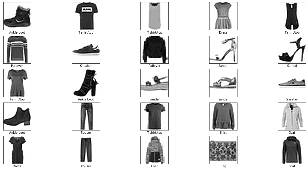
また、figsize=(20,10)としたら、横に余白が増えました。
figsizeは、各画像のサイズではなく、画像全体のサイズです。
figsize=(20,10)とした場合は、
「横20インチx縦10インチの画像」を25枚並べるのではなく、
「横20インチx縦10インチの枠」の中に25枚の画像を配置する感じに。
plt.subplotって何だ?
お次はplt.subplot(5,5,i+1)の部分の説明。
plt.figure(figsize=(10,10))

i=0
plt.subplot(5,5,i+1)
plt.xticks([])
plt.yticks([])
plt.grid(False)
plt.imshow(train_images[i], cmap=plt.cm.binary)
plt.xlabel(class_names[train_labels[i]])

plt.show()
ループの部分を崩してi=0のときだけを使って動作確認。
画像が1つだけ表示されました。
plt.subplot(5,5,i+1)
と書いたので画像25個をセットで処理しないとエラーになるかなと思ったけど、普通に処理されました。
plt.figure(figsize=(10,10))

i=0
plt.subplot(5,5,i+1)
plt.xticks([])
plt.yticks([])
plt.grid(False)
plt.imshow(train_images[i], cmap=plt.cm.binary)
plt.xlabel(class_names[train_labels[i]])

i=1
plt.subplot(5,5,i+1)
plt.xticks([])
plt.yticks([])
plt.grid(False)
plt.imshow(train_images[i], cmap=plt.cm.binary)
plt.xlabel(class_names[train_labels[i]])

i=2
plt.subplot(5,5,i+1)
plt.xticks([])
plt.yticks([])
plt.grid(False)
plt.imshow(train_images[i], cmap=plt.cm.binary)
plt.xlabel(class_names[train_labels[i]])

plt.show()
i=0,1,2のときの処理を追加。
画像が3つ表示されました。
figsize=(10,10)としたので、画像全体のサイズは横10インチx縦10インチのサイズになっています。
plt.subplot(5,5,i+1)とすると10x10インチを横5個x縦5個に区切ったエリアになるみたいです。
つまり、1つの画像あたりのサイズは2x2インチ。
それが以下のような順序で並びます。
1 2 3 4 5
6 7 8 9 10
11 12 13 14 15
16 17 18 19 20
21 22 23 24 25
plt.figure(figsize=(10,10))

i=0
plt.subplot(5,5,i+1)
plt.xticks([])
plt.yticks([])
plt.grid(False)
plt.imshow(train_images[i], cmap=plt.cm.binary)
plt.xlabel(class_names[train_labels[i]])

i=24
plt.subplot(5,5,i+1)
plt.xticks([])
plt.yticks([])
plt.grid(False)
plt.imshow(train_images[i], cmap=plt.cm.binary)
plt.xlabel(class_names[train_labels[i]])

plt.show()
plt.subplot(5,5,1)
と書くと、1の位置(左上)に画像が表示される。
plt.subplot(5,5,25)
と書くと、25の位置(左上)に画像が表示される。
間のナンバーが抜けててもちゃんと表示されます。
plt.xticks([])って何?
plt.figure(figsize=(10,10))

i=0
plt.subplot(1,1,i+1)
plt.xticks([])
plt.yticks([])
plt.grid(False)
plt.imshow(train_images[i], cmap=plt.cm.binary)
plt.xlabel(class_names[train_labels[i]])

plt.show()
plt.subplot(5,5,i+1)
の部分を
plt.subplot(1,1,i+1)
に変更しました。
figsize=(10,10)の10x10インチサイズのエリア全体を使って1つの画像が表示されました。
plt.figure(figsize=(10,10))

i=0
plt.subplot(1,1,i+1)
# plt.xticks([])
# plt.yticks([])
plt.grid(False)
plt.imshow(train_images[i], cmap=plt.cm.binary)
plt.xlabel(class_names[train_labels[i]])

plt.show()
# plt.xticks([])
# plt.yticks([])
の部分をコメントアウトしてみました。
画像の下側と左側に目盛りが出てきました。
plt.figure(figsize=(10,10))

i=0
plt.subplot(1,1,i+1)
plt.xticks([1, 10, 100])
# plt.yticks([])
plt.grid(False)
plt.imshow(train_images[i], cmap=plt.cm.binary)
plt.xlabel(class_names[train_labels[i]])

plt.show()
plt.xticks([])
の部分を
plt.xticks([1, 10, 100])
に変更してみました。
横軸の目盛りが、1と10の部分だけ表示されました。
元の画像が28x28ピクセルなので、ナンバリング的には0~27まであります。
100番は目盛り的にあてはまらないので無視されたみたいですね。
縦軸は0, 5, 10, 15, 20, 25と表示されています。
# plt.yticks([])
のようにコメントアウトしていました。
yticksの指定がない場合は、自動的にちょうどいい感じの目盛りを付けてくれるっぽい。
# plt.yticks([])
とコメントアウトしたから目盛りが出てきたというよりは
普通は、自動的に目盛りが表示されるもの。
そして、
plt.yticks([0, 10, 20])
みたいに数字を指定してやると、好きな粒度で目盛りを表示できる。
応用として
plt.yticks([])
のように空のリストを引数に指定とすると目盛りが消せる。
という流れですね。
cmap=plt.cm.binaryって何だ?
plt.figure(figsize=(10,10))

i=0
plt.subplot(1,1,i+1)
plt.xticks([])
plt.yticks([])
plt.grid(False)
plt.imshow(train_images[i])
plt.xlabel(class_names[train_labels[i]])

plt.show()
plt.imshow(train_images[i], cmap=plt.cm.binary)
の部分を
plt.imshow(train_images[i])
に変更しました。
plt.imshow()はヒートマップを表示する関数でしたね。
数字の小さいところは紫、
数字の大きいところは黄色で表現されます。
cmap=plt.cm.binaryはカラフルヒートマップではなく、バイナリーヒートマップ、ようは白黒でヒートマップを表示しているだけです。
plt.xlabel()って何だ?
plt.xlabel(class_names[train_labels[i]])plt.xlabel()
は、画像下部のAnkle bootって表示されている部分のことです。
plt.figure(figsize=(10,10))

i=0
plt.subplot(1,1,i+1)
plt.xticks([])
plt.yticks([])
plt.grid(False)
plt.imshow(train_images[i], cmap=plt.cm.binary)
# plt.xlabel(class_names[train_labels[i]])
plt.ylabel(class_names[train_labels[i]])

plt.show()
plt.ylabel()
を使うとラベルをy軸の位置に表示できます。
plt.bar()って何?
def plot_image(i, predictions_array, true_label, img):
   predictions_array, true_label, img = predictions_array[i], true_label[i], img[i]
   plt.grid(False)
   plt.xticks([])
   plt.yticks([])

   plt.imshow(img, cmap=plt.cm.binary)

   predicted_label = np.argmax(predictions_array)
   if predicted_label == true_label:
       color = 'blue'
   else:
       color = 'red'

   plt.xlabel("{} {:2.0f}% ({})".format(class_names[predicted_label],
                                   100*np.max(predictions_array),
                                   class_names[true_label]),
                                   color=color)

def plot_value_array(i, predictions_array, true_label):
   predictions_array, true_label = predictions_array[i], true_label[i]
   plt.grid(False)
   plt.xticks([])
   plt.yticks([])
   thisplot = plt.bar(range(10), predictions_array, color="#777777")
   plt.ylim([0, 1])
   predicted_label = np.argmax(predictions_array)

   thisplot[predicted_label].set_color('red')
   thisplot[true_label].set_color('blue')


i = 17
plt.figure(figsize=(6,3))
plt.subplot(1,2,1)
plot_image(i, predictions, test_labels, test_images)
plt.subplot(1,2,2)
plot_value_array(i, predictions,  test_labels)
plt.show()
元々の記事は、6万件のファッション画像データから、どういうタイプの服なのか靴なのかを判定する機械学習プログラムについて書かれています。
本記事ではその中に出てきたpltについて重点的に説明しています。
上記のコードは
「17番目の画像を判定したら、『Pullover』の確率が86%と判定されたけど、正解は『Coat』でした」
というものです。
棒グラフは赤い奴がPullover、青い奴がCoatです。
i = 17
plt.figure(figsize=(3,3))

predictions_array, true_label = predictions[i], test_labels[i]
plt.grid(False)
plt.xticks([])
plt.yticks([])
thisplot = plt.bar(range(10), predictions_array, color="#777777")
plt.ylim([0, 1])
predicted_label = np.argmax(predictions_array)

thisplot[predicted_label].set_color('red')
thisplot[true_label].set_color('blue')

plt.show()
動作確認しやすくするため、
plt.subplot(1,2,1)
plot_image(i, predictions, test_labels, test_images)
plt.subplot(1,2,2)
の部分を削除、
plot_value_array(i, predictions, test_labels)
の部分は関数を使わずに、plt.figure()やplt.show()の間に直接書いてみました。

実行結果は棒グラフだけになりました。
thisplot = plt.bar(range(10), predictions_array, color="#777777")上記のコードを動作確認します。
In:  predictions_array
Out: array([4.6413830e-03, 1.2508749e-05, 8.6435008e-01, 3.0298206e-06,
      9.7767003e-02, 3.6455492e-09, 3.3160895e-02, 6.7120659e-08,
      6.4967695e-05, 7.3762919e-08], dtype=float32)
predictions_arrayの中身は上記の通り。
4.6413830e-03というのは、4.6413830×10の-3乗という意味です。
つまり、4.6413830e-03 = 0.004.6413830
In:  for x in predictions_array:
        print('{:.2f}'.format(x))
Out: 0.00
0.00
0.86
0.00
0.10
0.00
0.03
0.00
0.00
0.00
桁をそろえると上記のような感じ。
2番目のカテゴリーである確率が86%、4番目のカテゴリーである確率が10%、6番目のカテゴリーである確率が3%と判断されています。
(2番目のカテゴリーがプルオーバーで、4番目がコート)
i = 17
plt.figure(figsize=(3,3))

predictions_array, true_label = predictions[i], test_labels[i]
plt.grid(False)
plt.xticks([0,1,2,3,4,5,6,7,8,9])
# plt.yticks([])
thisplot = plt.bar(range(10), predictions_array, color="#777777")

plt.ylim([0, 1])
predicted_label = np.argmax(predictions_array)

# thisplot[predicted_label].set_color('red')
# thisplot[true_label].set_color('blue')

plt.show()
目盛りがあった方が見やすいので
plt.xticks([0,1,2,3,4,5,6,7,8,9])
# plt.yticks([])
の部分を変更しました。
x軸2のところがy軸数値0.86、
x軸4のところがy軸数値0.10になっています。
また、グラフの棒がすべてグレーになりました。
これは、
# thisplot[predicted_label].set_color('red')
# thisplot[true_label].set_color('blue')
の部分をコメントアウトしたため。
thisplot = plt.bar(range(10), predictions_array, color="#777777")
なので、棒グラフがグレーに。
#777777はグレー 、
#FFFFFFは白 、
#000000は黒です 。
thisplot[predicted_label].set_color('red')って何?
thisplot = plt.bar(range(10),
                  predictions_array,
                  color="#777777"
                  )
thisplot[predicted_label].set_color('red')
thisplot[true_label].set_color('blue')
predicted_labelの中身は2、true_labelの中身は4という数字が入っています。
thisplot = plt.bar([0, 1, 2, 3, 4, 5, 6, 7, 8, 9],
                  [0.00, 0.00, 0.86, 0.00, 0.10, 0.00, 0.03, 0.00, 0.00, 0.00],
                  color="#777777"
                  )
thisplot[2].set_color('red')
thisplot[4].set_color('blue')
変数の部分を実際の数値で書くとこんな感じです。
thisplot[2].set_color('red')
の部分は、x軸2番のデータ(y軸0.86)の棒を赤色にします。
thisplot[4].set_color('blue')
の部分は、x軸4番のデータ(y軸0.10)の棒を青色にします。
plt.xticks(range(10), class_names, rotation=45)って何だ?
img = test_images[0]
img = (np.expand_dims(img,0))
predictions_single = model.predict(img)

plot_value_array(0, predictions_single, test_labels)
_ = plt.xticks(range(10), class_names, rotation=45)
plt.xticks(range(10), class_names, rotation=45)って何だ?
In:  class_names
Out: ['T-shirt/top',
'Trouser',
'Pullover',
'Dress',
'Coat',
'Sandal',
'Shirt',
'Sneaker',
'Bag',
'Ankle boot']
class_names
はリスト。
リストの中身は
['T-shirt/top', 'Trouser', 'Pullover', 'Dress', 'Coat', 'Sandal', 'Shirt', 'Sneaker', 'Bag', 'Ankle boot']
という文字が入っています。
_ = plt.xticks([1, 2, 3], ['a', 'b', 'c'])
たとえば、
_ = plt.xticks([1, 2, 3], ['a', 'b', 'c'])
のように書くと、x軸のラベルをa, b, cのように文字にできます。
_ = plt.xticks(['a', 'b', 'c'])試しに上記のように書いてみたらエラーになりました。
plt.xticks()は、わざわざ数字のリストを渡してから、文字列のリストを再度渡すのはなぜなのか?
それは以下のような場合のため。
_ = plt.xticks([1, 2, 10], ['a', 'b', 'c'])
ラベルが1から順に並ぶとは限りません。
[1, 2, 10], ['a', 'b', 'c']みたいな指定をすると、数値が飛んだ場合のラベルを表現できます。
plot_value_array(0, predictions_single, test_labels)
_ = plt.xticks(range(10), class_names)
元の棒グラフに話を戻します。
rotation=45
の指定がないと、ラベルは横書きになります。
文字同士が重なってしまい判読できません。
plot_value_array(0, predictions_single, test_labels)
_ = plt.xticks(range(10), class_names, rotation=45)
_ = plt.xticks(range(10), class_names)
の部分を
_ = plt.xticks(range(10), class_names, rotation=45)
のように書くと、文字が斜めになり読みやすくなります。
以上で、
「はじめてのニューラルネットワーク:分類問題の初歩」
に登場した
matplotlib.pyplot
関連の部分は解説終了です。
pltは機械学習の本題ではないけど、分かってた方がコードが読みやすい。