【3-5】Rのggplot2でヒストグラムを作るgeom_histogram関数

*無料で全文読めます。
第3章ではggplot2を使ったグラフの作り方を紹介しています。
今回はヒストグラムを紹介します。
パッケージとデータの読み込み
#tidyverseパッケージを読み込みます
if(!require(tidyverse)) install.packages("tidyverse", repos = "http://cran.us.r-project.org")

#既にtidyverseパッケージをインストールしている方は以下でもOK
library(tidyverse)

#データ取り込みます。今回はdatという変数にデータを入れます
url <- "https://github.com/mitti1210/myblog/blob/master/heights.csv?raw=true"
dat <- read.csv(url)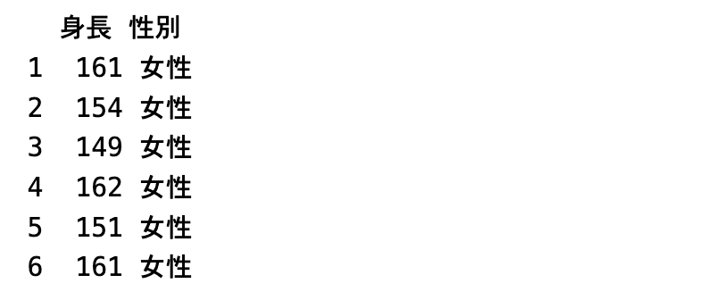
ヒストグラムの基本
ヒストグラムとは?
ヒストグラムはデータの分布を確認することができます。 まず1本1本の縦棒のことを”bin”といいます。binの幅や数は指定が可能です。
まずはヒストグラムを描いてみる
ggplot2でヒストグラムを作るのは
ggplot(dat)+
  geom_histogram(aes(x = 身長), bins = 30, data = dat) +
  theme_light() #+
  #theme_light(base_family = "HiraginoSans-W3") #macで日本語を使う場合はフォントの指定が必要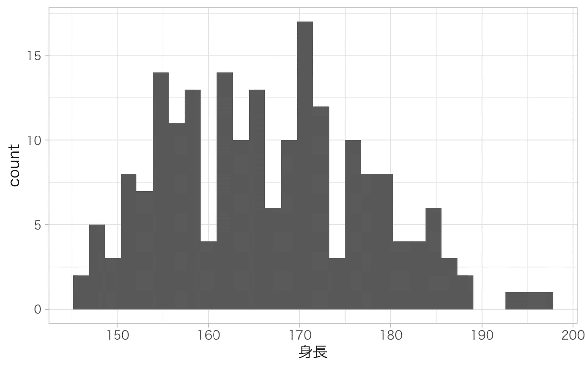
ヒストグラムを見ることでわかることの例:
分布がどうなっているか?
分布には正規分布や対数正規分布、ポワソン分布など様々な分布があります。分布を確認するときにはヒストグラムで直接データを確認することが必要です。最大値・最小値やなんとなくの平均値もこれでわかります。
ちなみにこのデータは正規分布にしては平べったい感じもしますが何ともいえない感じもします。外れ値がないか?
とんでもないところにデータがあれば、それが偶然飛び抜けたデータなのか入力ミスなのか確認することをおすすめしますカテゴリーごとの分布がわかる
もし山が2つある分布だったとします。その場合、もしかしたら2つ以上の別のグループが潜んでいるかもしれません。その場合は全体の傾向を見たほうがいいのか?グループごとに分析をしたほうが良いのか?といった視点を与えてくれます。
bins, binwidthについて
ヒストグラムはbin1つの幅を指定する必要があります。 幅を変えると見え方が変わります。
bins = binの数を指定する
binwidth = binの幅を指定する
何も指定しないと自動的にbins = 30としてグラフを作ります。
# binの数を10にしたグラフ
ggplot()+
  geom_histogram(aes(x = 身長), bins = 10, data = dat) +
  theme_light() + #
  #theme_light(base_family = "HiraginoSans-W3") + #macで日本語を使う場合はフォントの指定が必要
  ggtitle("binの数を10にしたグラフ")

# binの幅を10にしたグラフ
ggplot()+
  geom_histogram(aes(x = 身長), binwidth =  10, data = dat) +
  theme_light() + #
  #theme_light(base_family = "HiraginoSans-W3") + #macで日本語を使う場合はフォントの指定が必要
  ggtitle("binの幅を10にしたグラフ")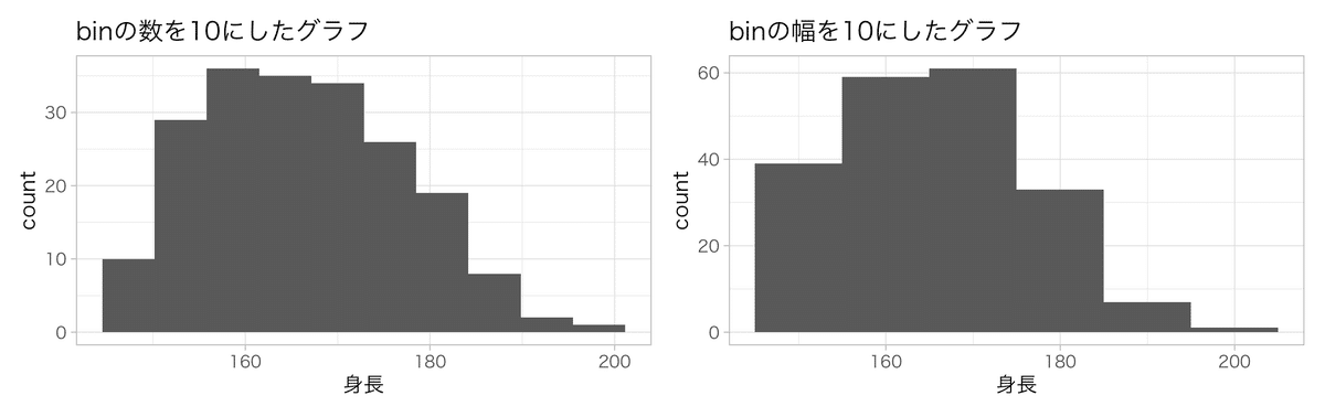
正規分布を確認する
正規分布かどうかを確認するときもヒストグラムは有効です。
しかしサンプルサイズ(N数)が少ないと正規分布のデータでも正規分布には見えなくなることに注意が必要です。
set.seed(123) # 乱数のシードを固定
df <- data.frame(
  n10 = rnorm(10, mean = 0, sd = 1),
  n20 = c(rnorm(20, mean = 0, sd = 1), rep(NA, 9980)),
  n50 = c(rnorm(50, mean = 0, sd = 1), rep(NA, 9950)),
  n100 = c(rnorm(100, mean = 0, sd = 1), rep(NA, 9900)),
  n1000 = c(rnorm(1000, mean = 0, sd = 1), rep(NA, 9000)),
  n10000 = rnorm(10000, mean = 0, sd = 1)
)

# 10のデータ
ggplot()+
  geom_histogram(aes(x = n10), bins = 30, data = df) +
  theme_light() + #
  #theme_light(base_family = "HiraginoSans-W3") + #macで日本語を使う場合はフォントの指定が必要
  ggtitle("10のデータ")

# 20のデータ
ggplot()+
  geom_histogram(aes(x = n20), bins = 30, data = df) +
  theme_light() + #
  #theme_light(base_family = "HiraginoSans-W3") + #macで日本語を使う場合はフォントの指定が必要
  ggtitle("20のデータ")

    # 50のデータ
ggplot()+
  geom_histogram(aes(x = n50), bins = 30, data = df) +
  theme_light() + #
  #theme_light(base_family = "HiraginoSans-W3") + #macで日本語を使う場合はフォントの指定が必要
ggtitle("50のデータ")

# 100のデータ
ggplot()+
  geom_histogram(aes(x = n100), bins = 30, data = df) +
  theme_light() + #
  #theme_light(base_family = "HiraginoSans-W3") + #macで日本語を使う場合はフォントの指定が必要
  ggtitle("100のデータ")

# 1000のデータ
ggplot()+
  geom_histogram(aes(x = n1000), bins = 30, data = df) +
  theme_light() + #
  #theme_light(base_family = "HiraginoSans-W3") + #macで日本語を使う場合はフォントの指定が必要
  ggtitle("1000のデータ")

# 10000のデータ
ggplot()+
  geom_histogram(aes(x = n10000), bins = 30, data = df) +
  theme_light() + #
  #theme_light(base_family = "HiraginoSans-W3") + #macで日本語を使う場合はフォントの指定が必要
  ggtitle("10000のデータ")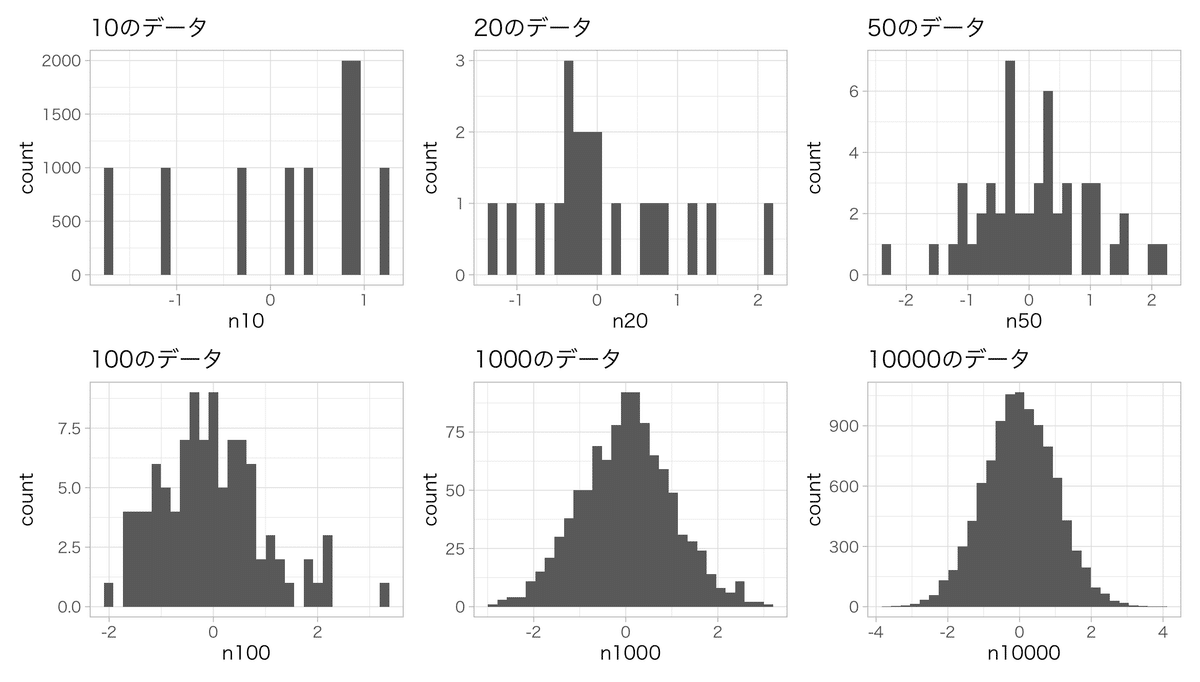
ヒストグラムの色々な設定
color : 線の色を変える
線の色を変えるにはaes()外でcolor = "◯◯"を指定します
ggplot()+
  theme_gray(base_family = "HiraKakuPro-W3")+
  geom_histogram(aes(x = 身長), color = "red", bins = 30, data = dat)+
  theme_light() #+
  #theme_light(base_family = "HiraginoSans-W3") #macで日本語を使う場合はフォントの指定が必要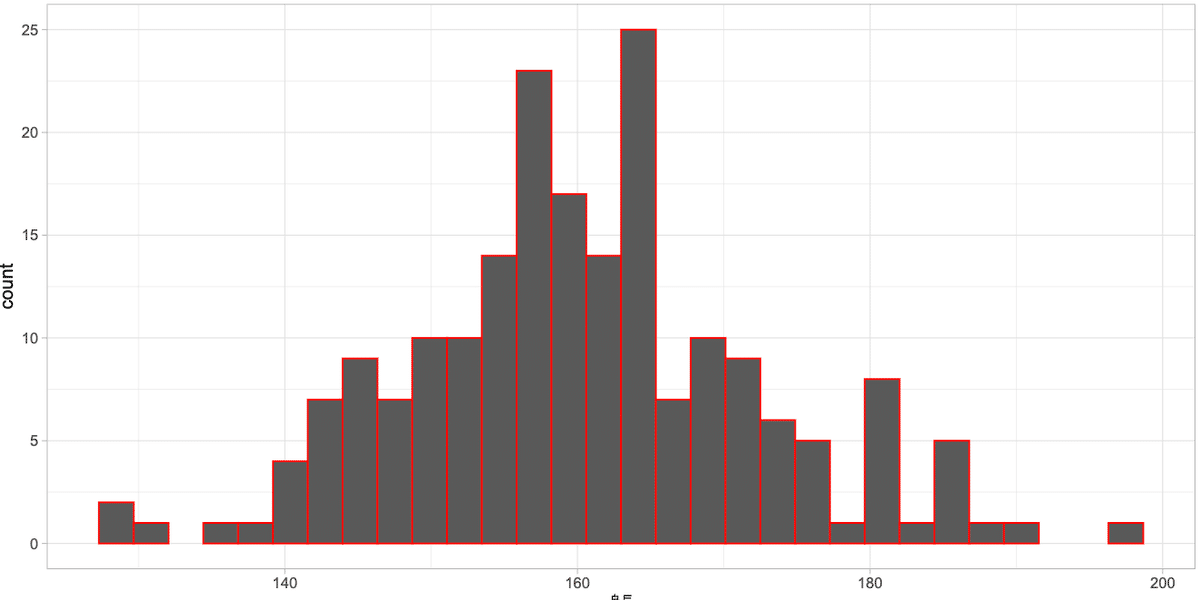
fill : binの色を別の色に塗りつぶす
塗りつぶしの色を変えるにはaes()外でfill = "◯◯"を指定します
ggplot()+
  theme_gray(base_family = "HiraKakuPro-W3")+
  theme_light() +
  geom_histogram(aes(x = 身長), fill = "red", bins = 30, data = dat)+
  theme_light() #+
  #theme_light(base_family = "HiraginoSans-W3") #macで日本語を使う場合はフォントの指定が必要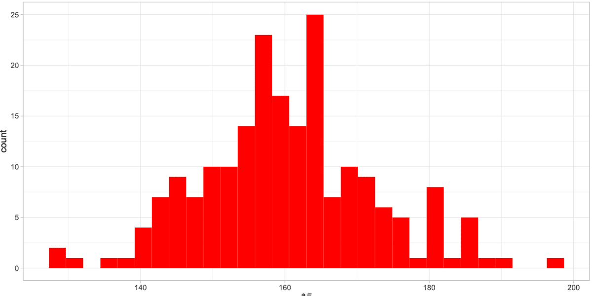
alpha : 塗りつぶしの色を薄くする
ggplot()+
  geom_histogram(aes(x = 身長), color = "black", fill = "red", alpha = 0.5, bins = 30, data = dat)+
  theme_light() #+
  #theme_light(base_family = "HiraginoSans-W3") #macで日本語を使う場合はフォントの指定が必要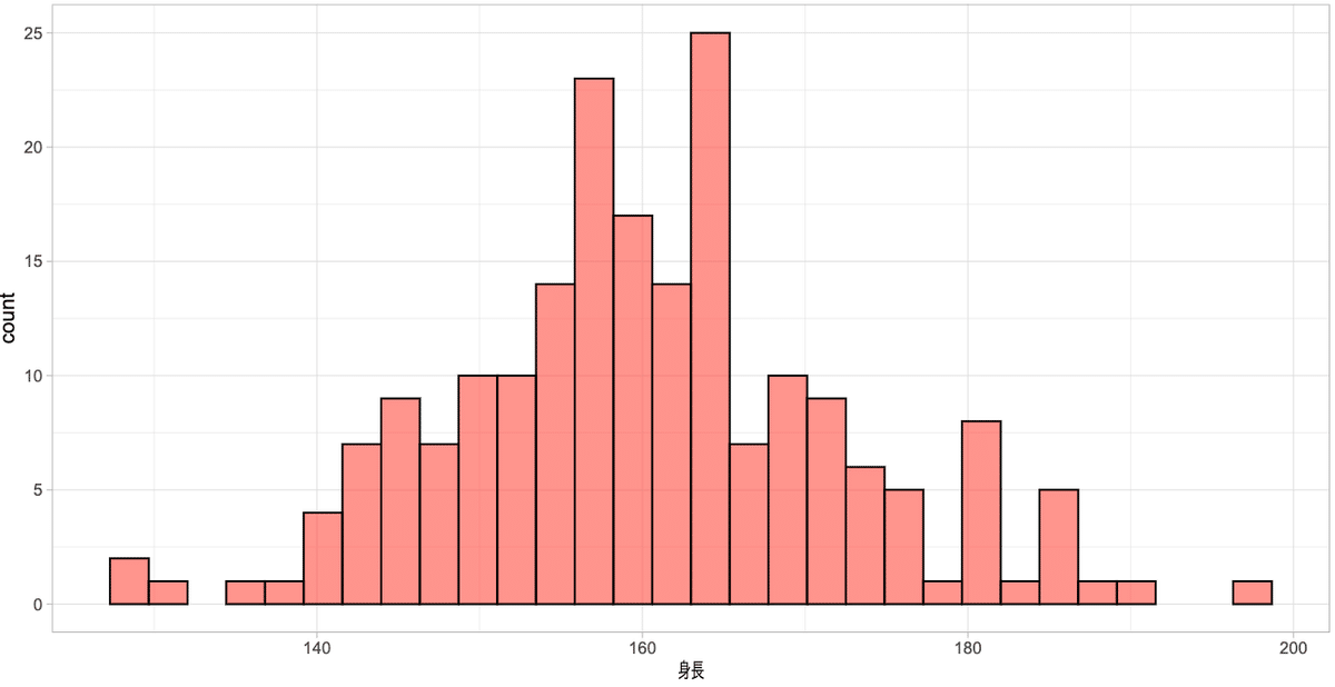
グループごとで色分けする
グループごとに色分けするときはaes()の中にfill = グループの列名を入れます。fillでグループ分けするときはpositionを指定する必要があります。
position = "stack" 重ねずに積み上げる
ggplot()+
  geom_histogram(aes(x = 身長, fill = 性別), bins = 30, position = "stack", alpha = 0.7,  data = dat)+
  theme_light() #+
  #theme_light(base_family = "HiraginoSans-W3") #macで日本語を使う場合はフォントの指定が必要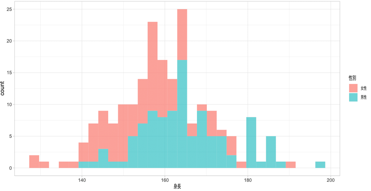
position = "nudge" 色を重ねる
色を重ねるときはalpha = で透過率を上げるないと重なった部分が確認できません。そのためalphaは必須です。
ggplot()+
  geom_histogram(aes(x = 身長, fill = 性別), bins = 30, position = "nudge", alpha = 0.7,  data = dat)+
  theme_light() #+
  #theme_light(base_family = "HiraginoSans-W3") #macで日本語を使う場合はフォントの指定が必要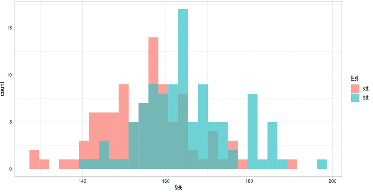
応用編(グループ毎に別のグラフにする)
グループ毎にグラフを作るときは主に①facet_grid、②facet_wrapの2つがありますが今回はfacet_gridを紹介します。
facet_grid(縦 ~ 横)という表記をします。指定がない箇所は . を入れます。
# 縦に並べる
ggplot()+
  geom_histogram(aes(x = 身長, fill = 性別), bins = 30, position = "nudge", alpha = 1,  data = dat)+
  facet_grid(性別 ~ .)+
  theme_light() +
  ggtitle("縦に並べる") +
  #theme_light(base_family = "HiraginoSans-W3") #macで日本語を使う場合はフォントの指定が必要

# 横に並べる
ggplot() +
  geom_histogram(aes(x = 身長, fill = 性別), bins = 30, position = "nudge", alpha = 1,  data = dat)+
  facet_grid(. ~ 性別)+
  theme_light() +
  ggtitle("横に並べる")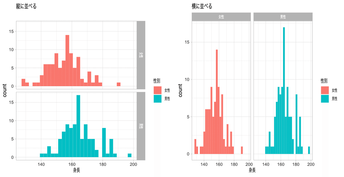
縦に並べるか横に並べるかですが、次の考え方が参考になります。
水平方向の変化を見るグラフは垂直方向
垂直方向の変化を見るグラフは水平方向
今回のヒストグラムは水平方向の変化なので縦に並べる方が比較しやすいことがわかります。このようにどの用に配置するかも分析する上では重要な視点になります。
まとめ
ちなみに最初のデータは男性と女性の2つの分布が重なっていることが原因だとわかります。ちなみにこのデータは男性が173±10cm(130人)、女性が157cm±5cm(70人)を組み合わせたデータでした。
統計になれないとExcelで表を作り平均と標準偏差だけ計算して比較したくなりますが、分析する前に分布を確認する習慣のきっかけになれば幸いです。
ここから先に記事はありません(投げ銭用として設定しています。書籍や勉強会代用にさせていただきます。)
ここから先は
¥ 300
この記事が気に入ったらチップで応援してみませんか?