
Flexboxの使い方

Flexboxの基本
Flexboxとは
Flexbox(Flexible Box Layout Module)とは,親要素に指示を記述することで,複数の子要素についてさまざまなレイアウトの調整をまとめて行うことができるものです。
Flexboxで出来ること
横並びにする
要素の順番を変える
スペースを自由に変える
レスポンシブ対応にも便利
記述方法
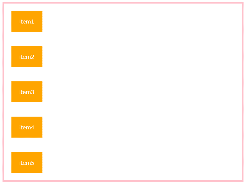
まずは,Flexboxを使わない場合を想定してみます。
HTML
<div class="container">
        <div class="item">item1</div>
        <div class="item">item2</div>
        <div class="item">item3</div>
        <div class="item">item4</div>
        <div class="item">item5</div>
</div>
CSS
.container {
border: solid 5px pink;
}
.item {
text-align: center;
width: 50px;
height: 20px;
padding : 3%;
margin : 3%;
background-color: orange;
color: white;
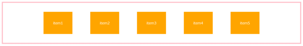
}そうすると、以下のように縦並びになります。

これを横並びにしたり,並び順を変えたりするために,Flexboxを使います。
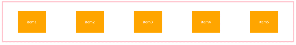
Flexboxを適用したい項目の親要素に「display: flex;」を加えます。
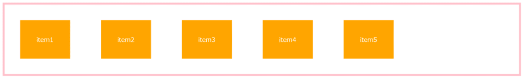
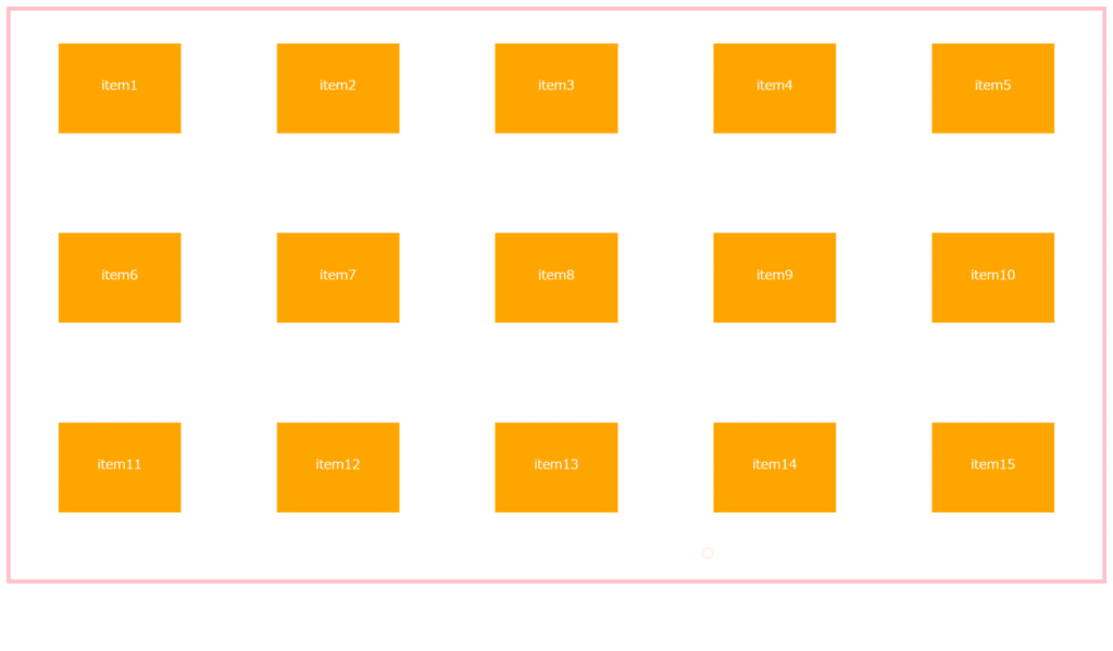
すると,以上のように要素がすべて横並びになりました。
この状態で,様々なプロパティを追加してみましょう。
親要素に使用できるプロパティ
親要素(container)に使用できるプロパティは下記の通りです。
flex-direction
子要素(item)の並ぶ方向を指定するflex-wrap
子要素(item)の折り返しを指定するflex-flow
子要素(item)の並ぶ方向と折り返しをまとめて指定するjustify-content
子要素(item)の水平方向の位置を指定するalign-items
子要素(item)の垂直方向の位置を指定するalign-content
子要素(item)の複数行ある時の垂直方向の位置を指定する
flex-direction 子要素の並ぶ方向を指定
row(初期値)・・・子要素を左から右に配置 →

row-reverse・・・子要素を右から左に配置 ←

column・・・子要素を上から下に配置 ↓
(PCサイズでは横並びに,スマホサイズでは縦並びにしたい時などに使います)
column-reverse … 子要素を下から上に配置 ↑

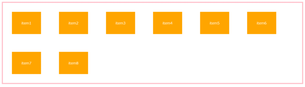
flex-wrap 子要素の折り返しを指定
nowrap(初期値)… 子要素を折り返さず,一行に並べる

wrap … 子要素を折り返し,上から下へ複数行に並べる
wrap-reverse … 子要素を折り返し,下から上へ複数行に並べる

flex-flow 子要素の並ぶ方向と折り返しを指定
flex-flow は,flex-direction と flex-wrap をまとめて設定できます。
flex-flowの使用例
.container {
  display: flex;
  flex-flow: row-reverse wrap;
}
justify-content 水平方向の位置を指定
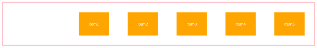
flex-start(初期値)… 要素を左揃えで配置 |←

flex-end … 要素を右揃えで配置 →|
center … 要素を中央揃えで配置 |↔|
space-between … 両端の要素を両端に配置し,残りは均等に間隔をあけて配置

space-around … 両端の子要素も含め,均等に間隔をあけて配置
align-items 垂直方向の位置を指定
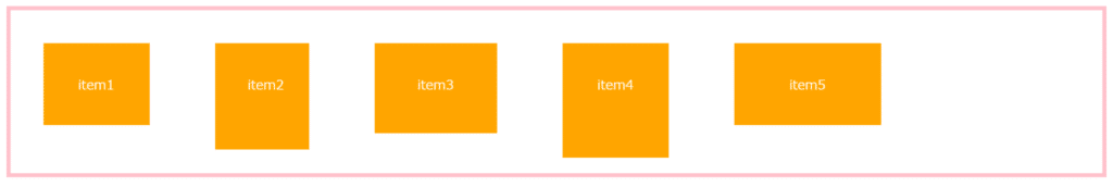
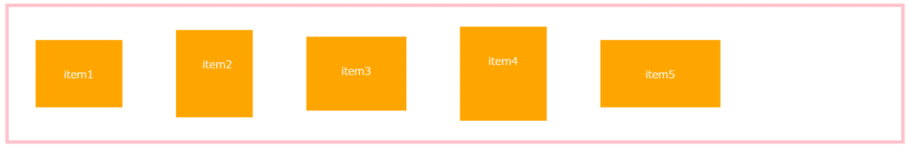
stretch(初期値)… 親要素の高さ,またはコンテンツの一番多い子要素の高さに合わせて広げて配置
flex-start … 親要素の開始位置から配置し,上揃えに配置

flex-end … 親要素の終点から配置し,下揃えに配置

center … 上下左右中央揃えに配置
baseline … ベースラインで揃えて配置

align-content 複数行ある時の垂直方向の位置を指定
stretch(初期値)… 親要素の高さに合わせて広げて配置
flex-start … 親要素の開始位置から配置し,上揃えに配置
flex-end … 親要素の終点から配置し,下揃えに配置
center … 上下左右中央揃えに配置

space-between … 最初と最後の子要素を上下の端に配置し,残りの要素は均等に間隔をあけて配置
space-around … 上下端にある子要素も含め、均等に間隔をあけて配置

子要素に使用できるプロパティ
子要素(item)に使用できるプロパティは下記の通りです。
order 子要素の並び順を指定
flex-grow 子要素の伸び率を指定
flex-shrink 子要素の縮み率を指定
flex-basis 子要素のベースの幅を指定
flex 子要素の伸び率や縮み率,ベースの幅をまとめて指定
align-self 子要素の垂直方向の位置を指定
あまり使用しないため,今回は省略します。
Flexboxを使う時の注意点
古いバージョンのブラウザでは動作しない可能性がある
Can I Useによると,Flexboxは基本的にどのブラウザも最新バージョンでは対応しています。(2021年9月現在)

一部のブラウザで古いバージョンだとFlexboxが動作しないという問題はありますが、いずれも現在ではほとんど使われていないため、基本的にはほとんどのブラウザで問題なく動作します。
vertical-alignは使用できない
垂直方向の位置を指定するvertical-alignは,Flexboxでは使用できません。
垂直方向の位置を指定するには,すべての子要素に対する場合は親要素にalign-itemsを,個々の子要素に対するの場合は子要素にalign-selfを指定して設定しましょう。
Flexboxが楽しく学べるサイト

Flexbox Froggyは,Flexboxを使ってカエルを蓮の葉に乗せるゲームです。初めてFlexboxを使うという人は、Flexbox Froggyを使えば,実際にコードを書きながら効率良くFlexboxの使い方を学習することができるでしょう。
Flexbox Froggy - CSS flexbox学習ゲーム
まとめ
今回は,Flexboxの使い方についてまとめました。
私がよく使うものは以下の5つです。
flex-direction: column;
flex-wrap: wrap;
justify-content: center;
justify-content: space-between;
align-items: center;
この記事が皆さんのお役に立てると幸いです。