Data Analyze ~Airline satisfanction~

本記事では、データ分析講座3か月受講後の初めてのデータ分析を実施する
未経験からデータ分析を学ぶ一人の人間の「始め一歩作」である。
※間違いや至らない点についてはご容赦ください…。
今回は飛行機利用者の満足度にどの項目が影響しているのか分析していく。
目次
環境
使用アプリ:Chrome
使用言語:Python
使用サイト:Kaggle
使用データ
Airline passenger satisfaction (from Kaggle)
データ分析
データの取得
import pandas as pd
import numpy as np
import matplotlib.pyplot as plt
import seaborn as sns
from sklearn.model_selection import train_test_split
from sklearn.preprocessing import LabelEncoder
from sklearn import preprocessing

#Downloaded the dataset from where kaggle have served
test = pd.read_csv('/kaggle/input/airline-passanger-satisfaction/test.csv')
train = pd.read_csv('/kaggle/input/airline-passanger-satisfaction/train.csv')
2つのデータセットを一つにまとめる
#combine together train.csv with test.csv
all_df = pd.concat([test,train],axis=0).reset_index(drop=True)
all_df['Test_Flag']=0
all_df.loc[test.shape[0]:,'Test_Flag']=1
print(f'Test:{test.shape}\n')
display(test.head())
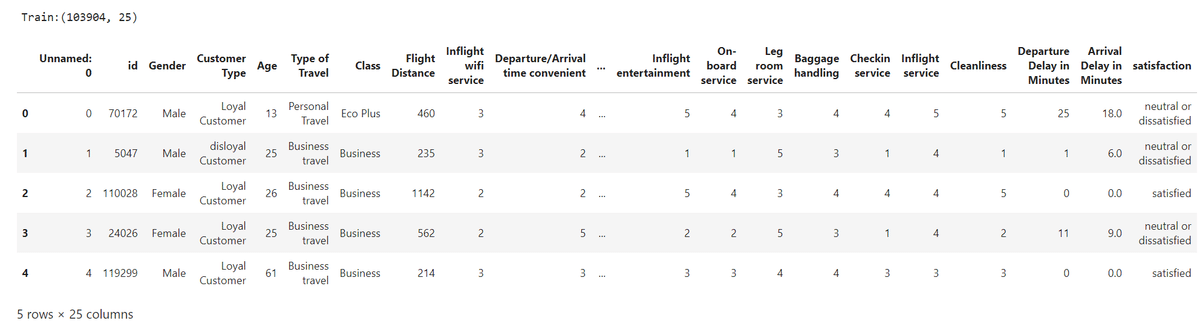
print(f'Train:{train.shape}\n')
display(train.head())
#print(f'Train_data_type:{train.dtypes}\n')
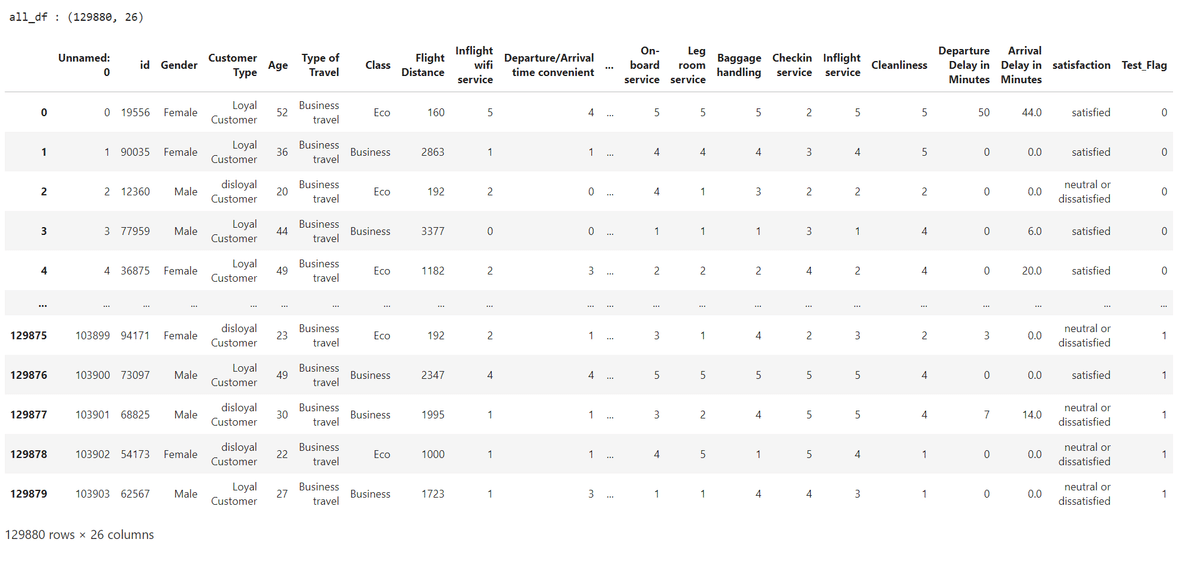
print(f'all_df : {all_df.shape}\n')
display(all_df)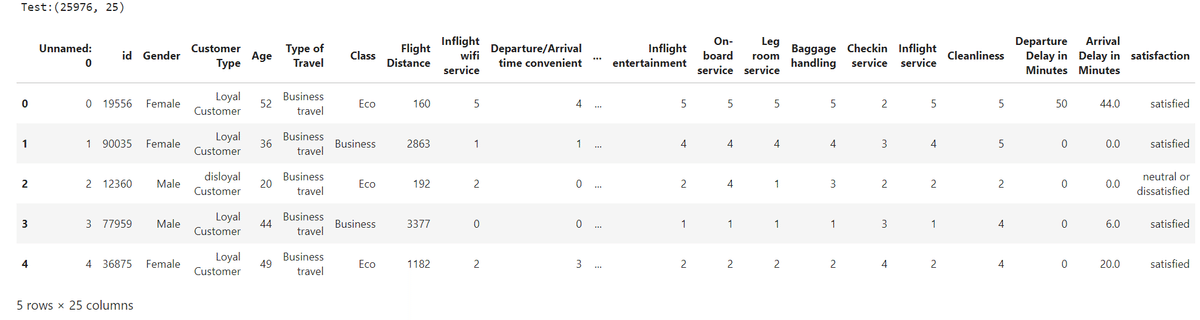
上2つのデータセットを行方向へ結合しall_dfに格納する
情報の確認
all_df.info()all_dfの中身を確認し不必要な列を選定

不必要なデータの削除と欠損値の補完
#delete unnesessary columns from both datasets(Unnamed: 0,id)
all_df = all_df.drop(['Unnamed: 0','id'],axis=1)

#Find "NaN" sell in all_df Dataset
display(all_df.describe())
print(all_df.isnull().sum())
#fill the blanck for Arrival Delay in Minutes
all_df['Arrival Delay in Minutes']=all_df['Arrival Delay in Minutes'].fillna(all_df['Arrival Delay in Minutes'].median())
print(all_df.isnull().sum())
all_df.head()all_df内で、'Unnamed: 0'と'id'に関しては今回のデータ分析内容と関係がないため、本データセットから取り除く。
次にデータセット内に欠損地が存在するか調べる

Arrival Delay in Minutesの列に393つの欠損値が存在することが分かる。
そこで、欠損値の代わりに中央値を入力しすべてのデータセルに情報が入力されている状態にする。
次に、データタイプの変換を実施する。
#change data type to category from object
categorical_indexes = [0, 1, 3, 4]+list(range(6, 20)) + [22]
# DataFrameの指定された列をカテゴリ型に変換する
for idx in categorical_indexes:
    all_df[all_df.columns[idx]] =  all_df[all_df.columns[idx]].astype('category')

all_df.info()
この後のデータ分析をスムーズに実施するため、データタイプがobjectの列に対して、category型に変換する処理を実施。

numericalなデータセットの情報と,categoricalなデータセット情報を参照
all_df.describe()
all_df.describe(include = ['category'])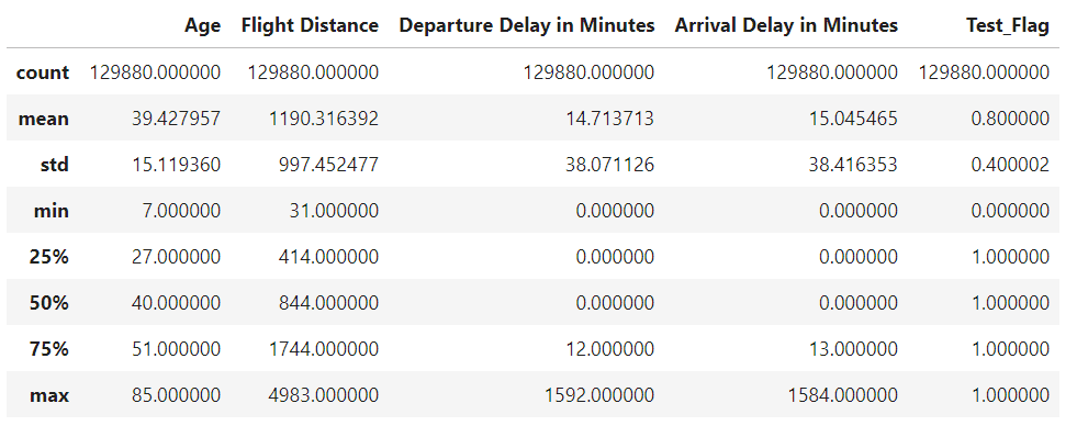

Data Visualization
plt.pie(all_df.satisfaction.value_counts(),labels = ['Neutral or Dissatisfied', 'Satisfied'],colors =sns.color_palette('YlGn'), autopct='%.f%%')
plt.legend(loc = 'upper right')
plt.show()

plt.pie(all_df.Class.value_counts(),labels =all_df.Class.value_counts().index,colors =sns.color_palette('YlGn'), autopct='%.f%%')
plt.legend(loc ='upper right')
plt.show()

plt.pie(all_df['Customer Type'].value_counts(),labels =all_df['Customer Type'].value_counts().index,colors =sns.color_palette('YlGn'), autopct='%.f%%')
plt.legend(loc ='upper right')
plt.show()

plt.pie(all_df['Type of Travel'].value_counts(),labels =all_df['Type of Travel'].value_counts().index,colors =sns.color_palette('YlGn'), autopct='%.f%%')
plt.legend(loc ='upper right')
plt.show()
satisfaction,Class,Customer Type,Type of Travelに焦点を当てて、
データを可視化。
傾向の分析を実施する。


判明したこと
全体的にdissatisfied/neautralの割合が多いこと
飛行機搭乗者の中の割合はBusinessが最も多く、次にEcoが続く
8割の顧客Loyal Customerである
7割の顧客はBusinessで利用していること
次に、各特徴量を満足度ごとにデータを可視化していく。
data_point = [
    'Inflight wifi service',
    'Departure/Arrival time convenient',
    'Ease of Online booking',
    'Gate location',
    'Food and drink',
    'Online boarding',
    'Seat comfort',
    'Inflight entertainment',
    'On-board service',
    'Leg room service',
    'Baggage handling',
    'Checkin service',
    'Inflight service',
    'Cleanliness'
    ]

print(len(data_point))

plt.figure(figsize = (20,30))

for i in range(len(data_point)):
    plt.subplot(5,3,i+1)
    plt.title(data_point[i])
    sns.countplot(x=all_df[data_point[i]],hue = all_df['satisfaction'])
plt.tight_layout()

データから判明すること
satisfactionと, 'Baggage handling', 'Ease of Online booking', 'Seat comfort', 'On-board service', 'Cleanlinessのポイントが高く,満足度も併せて高い
次にそれぞれの特徴量の相関関係を見ていく。
#make numerical data set
numerical_df = all_df.select_dtypes(
    include=['int64', 'float64']).drop(
    columns = ['Test_Flag'],errors = 'ignore')

# draw the heatmap
plt.figure(figsize =(35,25))
sns.heatmap(numerical_df.corr(), annot = True,square = True)
plt.show()

# make categorical data set いらない?
#categorical_df =[ c for c in all_df.collumns if all_df[c].dtype.name =='category']
categorical_df =all_df.select_dtypes(include='category')

def cross_tb(df, categorical_columns):
    result = {}
    for i in categorical_columns:
        result[i] = pd.crosstab(df[i], columns="count")
    return result

# cross_tb関数にall_dfを渡してクロス集計を実行
cross_tb_result = cross_tb(all_df, categorical_df.columns)
print(cross_tb_result)
可視化図とクロス集計から判明すること
'Departure Delay in Minutes' and 'Arrival Delay in Minutes'はマイナスの相関があること。
先ほどの図でも見た通り、Online bording ,flight entertainment,On board servise,seat comfortなど正の相関が高い
以上の結果から、以下特徴量がsatisfactionに影響を与える特徴量と推定する。
Ease of Online booking
Departure/Arrival time convenient
Seat comfort
On-board service
Cleanliness
Class (Economy has a higher proportion of satisfied customers)
Type of Travel (Return has a higher proportion of satisfied customers)
Departure Delay in Minutes (longer delays are associated with lower satisfaction ratings)
Arrival Delay in Minutes (longer delays are associated with lower satisfaction ratings)
次にどの特徴量が最も顧客満足度に影響を与えるか確認していく。
まず初めにRandom Forestを利用して確認していく。
まずデータスケーリングにてデータを一定化させる。
のちにTrainとTest data それぞれにわけていく。
from sklearn.preprocessing import StandardScaler

#split the data
X_data = all_df.drop(columns=['satisfaction', 'Test_Flag']).values
y_data = all_df['satisfaction'].values

#data scaling
scaler = StandardScaler()
X_data = scaler.fit_transform(X_data)

X_train,X_test,y_train,y_test = train_test_split(X_data,y_data,test_size=0.2,random_state=42)
print(f'X_train shape:{X_train.shape},y_train shape:{y_train.shape}')
print(f'X_test shape:{X_test.shape},y_test shape:{y_test.shape}')
import pandas as pd

# Convert X_train to a DataFrame
X_train_df = pd.DataFrame(X_train, columns=all_df.drop(columns=['satisfaction']).columns)

plt.figure(figsize=(10, 8))
plt.title('Feature Importance')
plt.bar(range(X_train_df.shape[1]), importance[indices], color='r', align='center')
plt.xticks(range(X_train_df.shape[1]), X_train_df.columns[indices].tolist(), rotation=90)
plt.xlim([-1, X_train_df.shape[1]])
plt.show()
ここからOnline bording、inflight with servise、Class,Type of travelが顧客満足度に大きく寄与していることが分かる。
反省点
時間がなく荒いデータ分析となってしまったが、満足度に影響する特徴量を調べることができた。
また今度は特徴量を利用した性能評価や、再度特徴量の再設定を実施し、精度を高めていきたい。