
日銀短観データ取得

日銀短観(全国企業短期経済観測調査)をはじめとする
主要時系列統計データ表・掲載データ一覧をグラフ化するツール。
下記で公開されているデータを取得する。

赤枠の部分が対象。詳細は「掲載データ一覧」(赤の破線)を参照。
グラフは下記のように出力される。(CSVデータを出力される(画面左))
ではツールの紹介です。
実行環境は、GoogleColabを想定しています。
0.ライブラリのインストール
pip install japanize_matplotlib1.プログラム
import pandas as pd
import japanize_matplotlib
import matplotlib.pyplot as plt
%matplotlib inline

url=[
'https://www.stat-search.boj.or.jp/ssi/mtshtml/bp01_m_1.html',
'https://www.stat-search.boj.or.jp/ssi/mtshtml/pr01_m_1.html',
'https://www.stat-search.boj.or.jp/ssi/mtshtml/ff_q_1.html',
'https://www.stat-search.boj.or.jp/ssi/mtshtml/bs02_m_1.html',
'https://www.stat-search.boj.or.jp/ssi/mtshtml/md11_m_1.html',
'https://www.stat-search.boj.or.jp/ssi/mtshtml/md13_m_1.html',
'https://www.stat-search.boj.or.jp/ssi/mtshtml/md01_m_1.html',
'https://www.stat-search.boj.or.jp/ssi/mtshtml/md02_m_1.html',
'https://www.stat-search.boj.or.jp/ssi/mtshtml/fm02_m_1.html',
'https://www.stat-search.boj.or.jp/ssi/mtshtml/fm08_m_1.html',
'https://www.stat-search.boj.or.jp/ssi/mtshtml/fm09_m_1.html',
'https://www.stat-search.boj.or.jp/ssi/mtshtml/ir01_m_1.html',
'https://www.stat-search.boj.or.jp/ssi/mtshtml/ir04_m_1.html',
'https://www.stat-search.boj.or.jp/ssi/mtshtml/co_q_1.html',
'https://www.stat-search.boj.or.jp/ssi/mtshtml/co_q_2.html',
'https://www.stat-search.boj.or.jp/ssi/mtshtml/co_q_3.html',
'https://www.stat-search.boj.or.jp/ssi/mtshtml/co_q_4.html',
'https://www.stat-search.boj.or.jp/ssi/mtshtml/co_q_5.html',
'https://www.stat-search.boj.or.jp/ssi/mtshtml/co_q_6.html',
'https://www.stat-search.boj.or.jp/ssi/mtshtml/co_q_7.html',
'https://www.stat-search.boj.or.jp/ssi/mtshtml/co_q_8.html'
]

df = pd.DataFrame()


for i in range(len(url)):
    # データ取得
    tbl=pd.read_html(url[i], header=[1], skiprows=(2,3,4,5,6), encoding="shift-jis")
    # データ取得(名称出力用)
    tbl2=pd.read_html(url[i], header=[0], skiprows=(2,3,4,5,6), encoding="shift-jis")

    # 0個目のテーブルを格納
    df_tmp = pd.DataFrame(tbl[0])
    # 日付をインデックスに指定
    df_tmp.rename(columns={'系列名称':'Date'},inplace=True)
    df_tmp = df_tmp.set_index(tbl[0].columns[0])

    # 日付のフォーマットを変換
    df_tmp.index = pd.to_datetime(df_tmp.index, format = '%Y-%m-%d').strftime('%Y-%m-%d')

    df_tmp = df_tmp.replace('ND',0)
    # df_tmp = df_tmp.replace('NaN',0)
    df_tmp = df_tmp.astype(float)

    # 名称出力、URL出力
    print(str(format(i,'02')) + "_" + tbl2[0].columns[1])
    print(url[i])

    # グラフ作成処理
    df_tmp.tail(100).plot(figsize=(12,4))
    plt.legend(bbox_to_anchor=(1.01, 1.0), loc='upper left')
    plt.show()

    # CSVファイル出力
    df_tmp.tail(100).to_csv(str(format(i,'02')) + "_" + tbl2[0].columns[1] + ".csv")
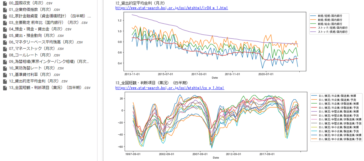
2.実行結果
下記のような感じで各種グラフが出力されます。


需要が折り返し、販売価格と仕入れ価格は上昇。
インフレが進んで、厳しい状況っぽいようにみえる。
何かの参考になれば幸いです。
では!
「缶コーヒー1杯、ご馳走してあげよう」という太っ腹な人は投げ銭を!
課金しなくても、参考になったら「ハートボタン、フォロー、リツイート」をお願いします。読まれる可能性があがるので、次の記事を書くやる気が出ます。
ここから先は
0字
¥ 100
この記事が気に入ったらチップで応援してみませんか?