Preattentive Attributes

データ可視化をするうえで、Preattentive Attributesが大事という話。
Preattentive Attributes : 目に見える特性
考えるより前に頭に入ってくる情報
Preattentive Attributesの10個の要素
向き, 幅, 長さ, 囲い, サイズ, 形状 : Form
色相, 彩度 : Colour
空間グループ, 位置 : 位置
Preattentive Attributes の強度は?

形状はちょっとわかりづらい


色の方が、サイズよりはわかりやすいか。
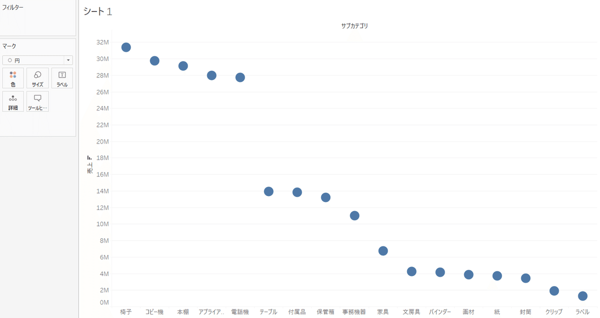
位置にする。位置にするとソートが可能になる。
位置にするとわかりやすい。
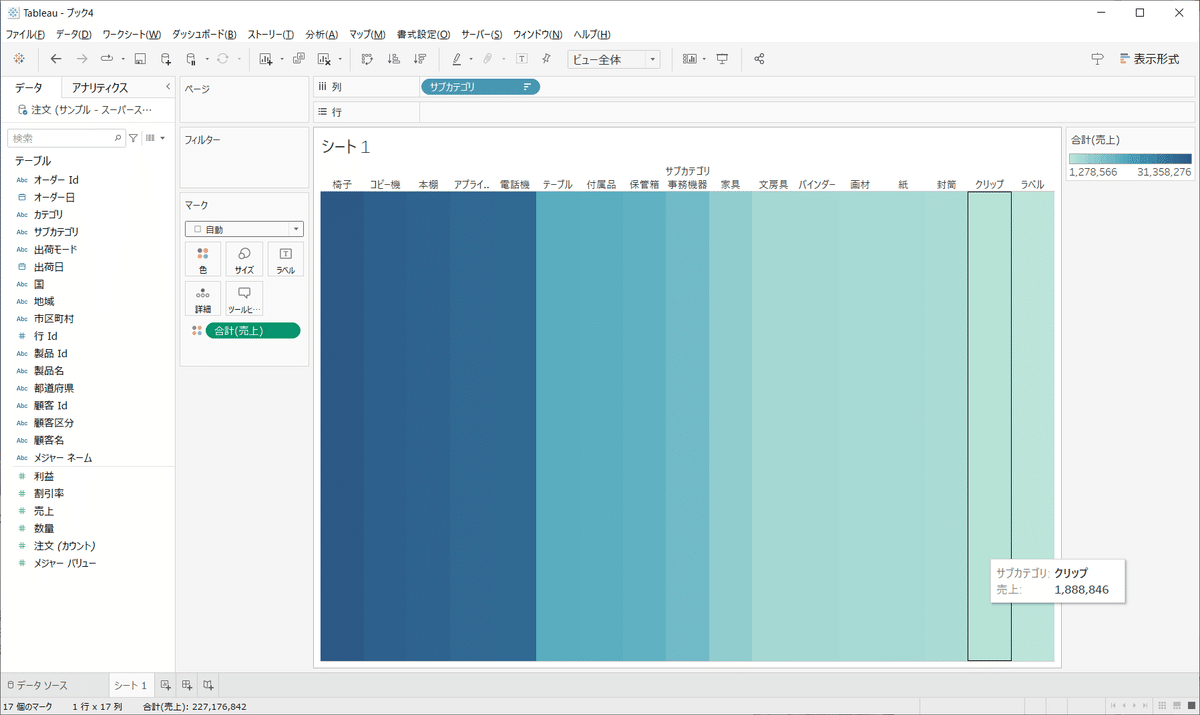
色でもわかるが、位置の方が詳細がわかる。サイズも同様。
形状は色より弱い。
位置 > 色 > サイズ > 形状
一番メインのものに Preattentive Attributesの強度の高いものをあてる。
サブに軽いものをあてる。
エリアが狭い場合は、Preattentive Attributesの強度の高いものにしても
何が何だかわからないこともある。その場合は 色 にしてみるとわかりやすくなる。(シチュエーションによって強度は変わる)