
Interrupted Time Series Analyses②

今回は、2017年2月にInternational Journal of Epidemiologyに公表されたITSのガイドを中心に解説をしてみようと思います。Stata®︎とRのコードがsupplemental fileに格納されているのでおすすめの論文の1つです。
この論文では、研究デザインについて説明し、どのような場合にITSが適切なデザイン選択となるかを検討します。
さらに、事前にインパクトモデルを提案するという、重要でありながらも省略されがちなステップについて説明しています。主要なセグメント回帰モデルを含む統計分析のアプローチを示しています。
最後に、時系列データの過分散、自己相関、季節的傾向の調整、時変交絡因子のコントロールなど、ITS分析に関連する主な方法論的問題について説明し、基本的なITSデザインを強化するために使用できる、より複雑なデザインの適応についても説明します。
CSVファイルをインポート
まずはCSV fileにデータをインポートします。
import delimited "
", varnames(1) clear 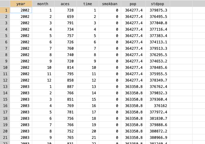
こんな感じでデータがインプットされているのが分かります。このデータセットには、以下の変数が含まれています:
・year = 年
・month = 月
・time = 研究開始からの経過時間
・aces = シチリア島における1か月あたりの急性冠動脈エピソードの数(アウトカム
・smokban = 喫煙禁止(介入)、介入前は0、介入後は1とコード化される
・pop = シチリア島の人口(単位:万人
・stdpop = 年齢標準化人口
データを確認する
データを調べることは重要な最初のステップです。介入前のトレンドを見ることで
傾向がどの程度安定しているか、線形モデルが適しているかどうか、季節トレンドがあるかどうかを示すことができます。
*ここでは、カウントをレートに変換し、介入前データの散布図を調べます。
gen rate = aces/stdpop*10^5
twoway (scatter rate time) if smokban==0, title("Sicily, 2002-2006") ytitle(Std rate x 10000) yscale(range(0 .)) ylabel(#5, labsize(small) angle(horizontal)) ///
xtick(0.5(12)60.5) xlabel(6"2002" 18"2003" 30"2004" 42"2005" 54"2006", noticks labsize(small)) xtitle(year)
介入前と介入後の要約統計を作成することも有効です。
*It is also useful to produce summary statistics for before and after the intervention
summ, detail
bysort smokban: summ aces
bysort smokban: summ rate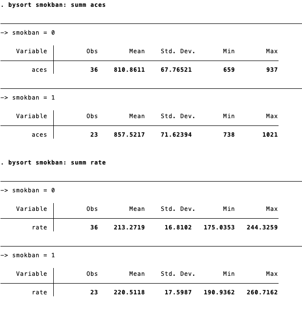
Poisson Regression Modelを使用する
次は、ステップチェンジモデルを選択し、また、カウントデータを使用しているため、ポアソンモデルを使用しています。
これを行うために、(ポアソン分布に従わないレートではなく)カウントデータを直接モデル化します。
次に、人口(対数変換)をオフセット変数として使用し、カウントをレートに変換します。オフセットには、標準化された人口をlog変換します。
*log transform the standardised population:
gen logstdpop = log(stdpop)


*Poisson with the outcome (aces), intervention (smokban) and time as well as the population offset offset
glm aces smokban time, family(poisson) link(log) offset(logstdpop) eform
モデルのプロットを作成するために、モデルに基づいて予測値を生成します。さらに、これを散布図と一緒にプロットします。
predict pred, nooffset

*This can then be plotted along with a scatter graph:
gen rate1 = aces/stdpop /*to put rate in same scale as count in model */
twoway (scatter rate1 time) (line pred time, lcolor(red)) , title("Sicily, 2002-2006") ///
ytitle(Std rate x 10000) yscale(range(0 .)) ylabel(#5, labsize(small) angle(horizontal)) ///
xtick(0.5(12)60.5) xlabel(6"2002" 18"2003" 30"2004" 42"2005" 54"2006", noticks labsize(small)) xtitle(year) ///
xline(36.5)
介入後の期間の介入(_b[smokban])効果を除去して反実仮想を生成します。プロットに反実仮想を追加した場合は以下の通りになります。

過剰分散(Overdispersion)を考慮する
上のモデルでは、過分散を考慮していません 。これを行うには、モデルに scale(x2) パラメータを追加します。
モデルに scale(x2) パラメータを追加することで、分散を平均と同じではなく比例させることができます。

glm aces smokban time, family(poisson) link(log) offset(logstdpop) scale(x2) eformモデルチェックと自己相関
残差を時間軸にプロットしてチェックします:
* (b) Model checking and autocorrelation
*Check the residuals by plotting against time
predict res, r
twoway (scatter res time)(lowess res time),yline(0)
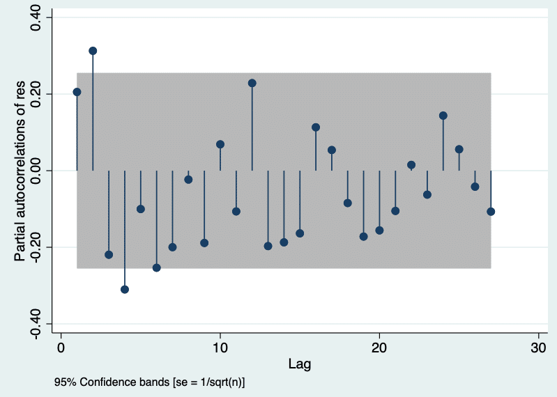
自己相関と部分自己相関関数を調べて、自己相関をさらにチェックする:
*Further check for autocorrelation by examining the autocorrelation and partial autocorrelation functions
tsset time
ac res
pac res, yw
季節性の調整
"circular "パッケージのインストールをします
時間を1年の時点数で割った度数変数を作成する必要があります(例:月は12)
さらに、sinとcosの数を指定します。
/* installation of the "circular" package. o find packages select Help > SJ and User-written Programs,
and click on search */
findit circular
*we need to create a degrees variable for time divided by the number of time points in a year (i.e. 12 for months)
gen degrees=(time/12)*360
*we then select the number of sine/cosine pairs to include:
fourier degrees, n(2)Poisson modelにsinとcosを組み入れます:
glm aces smokban cos* sin* time, family(poisson) link(log) offset(logstdpop) scale(x2) eform
そして、自己相関が予測されるかチェックをします:
*we can again check for autocorrelation
predict res2, r
twoway (scatter res2 time)(lowess res2 time),yline(0)
tsset time
ac res2
pac res2, yw

前回より軽減しているのが分かります。
predict pred2, nooffset
twoway (scatter rate1 time) (line pred2 time, lcolor(red)), title("Sicily, 2002-2006") ///
ytitle(Std rate x 10000) yscale(range(0 .)) ylabel(#5, labsize(small) angle(horizontal)) ///
xtick(0.5(12)60.5) xlabel(6"2002" 18"2003" 30"2004" 42"2005" 54"2006", noticks labsize(small)) xtitle(year) ///
xline(36.5)
季節性の変動を調整したモデルでの予測ラインは以下の通りです:

季節調整モデルでは、変化をグラフで明確に示すことが難しい場合があります。
そのため、すべての月が平均であるかのように直線をプロットして、「非季節性」トレンドを作成することも可能です。
egen avg_cos_1 = mean(cos_1)
egen avg_sin_1 = mean(sin_1)
egen avg_cos_2 = mean(cos_2)
egen avg_sin_2 = mean(sin_2)

drop cos* sin*

rename avg_cos_1 cos_1
rename avg_sin_1 sin_1
rename avg_cos_2 cos_2
rename avg_sin_2 sin_2


*this can then be added to the plot as a dashed line
predict pred3, nooffset

twoway (scatter rate1 time) (line pred2 time, lcolor(red)) (line pred3 time, lcolor(red) lpattern(dash)), title("Sicily, 2002-2006") ///
ytitle(Std rate x 10000) yscale(range(0 .)) ylabel(#5, labsize(small) angle(horizontal)) ///
xtick(0.5(12)60.5) xlabel(6"2002" 18"2003" 30"2004" 42"2005" 54"2006", noticks labsize(small)) xtitle(year) ///
xline(36.5)
Time × Interventionのinteraction termを入れる
前回のモデルは
log(y) = a + b1*time + b2*intervention + error + offset(logPop)
でした。これだと、傾き(slope)の違いが考慮されませんので、interaction termを入れます。
*generate interaction term between intervention and time centered at the time of intervention
gen inter_smokbantime = smokban*(time-36)


*restore fourier variables that were previously changed
drop cos* sin* degrees
gen degrees=(time/12)*360
fourier degrees, n(2)

*add the interaction term to the model
glm aces smokban inter_smokbantime cos* sin* time, family(poisson) link(log) offset(logstdpop) scale(x2) eform
interaction termを見ると、ほとんどslopeが変わらないのが分かりますね。
*plot seasonally adjusted model with deseasonalised trend**
predict pred4, nooffset

egen avg_cos_1 = mean(cos_1)
egen avg_sin_1 = mean(sin_1)
egen avg_cos_2 = mean(cos_2)
egen avg_sin_2 = mean(sin_2)
drop cos* sin*
rename avg_cos_1 cos_1
rename avg_sin_1 sin_1
rename avg_cos_2 cos_2
rename avg_sin_2 sin_2

predict pred5, nooffset

twoway (scatter rate1 time) (line pred4 time, lcolor(red)) (line pred5 time, lcolor(red) lpattern(dash)), title("Sicily, 2002-2006") ///
ytitle(Std rate x 10000) yscale(range(0 .)) ylabel(#5, labsize(small) angle(horizontal)) ///
xtick(0.5(12)60.5) xlabel(6"2002" 18"2003" 30"2004" 42"2005" 54"2006", noticks labsize(small)) xtitle(year) ///
xline(36.5)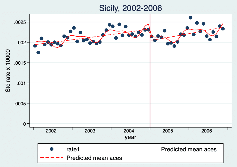
最後にプロットすると、上図のようになります。
やっぱりstataなどcode付きの論文は勉強になりますね。
いいなと思ったら応援しよう!
