[第6回] python-Highchartsを使ってみる

jupyter notebookとpythonを利用した分析講座となっております。
python-highcharts
ドリルダウンレポートを作成してみたく、jupyter notebookでpython-highchartsを使ってみます。
ラインチャート
from highcharts import Highchart

H = Highchart(width=300, height=300)
H.add_data_set([1, 2, 3])
H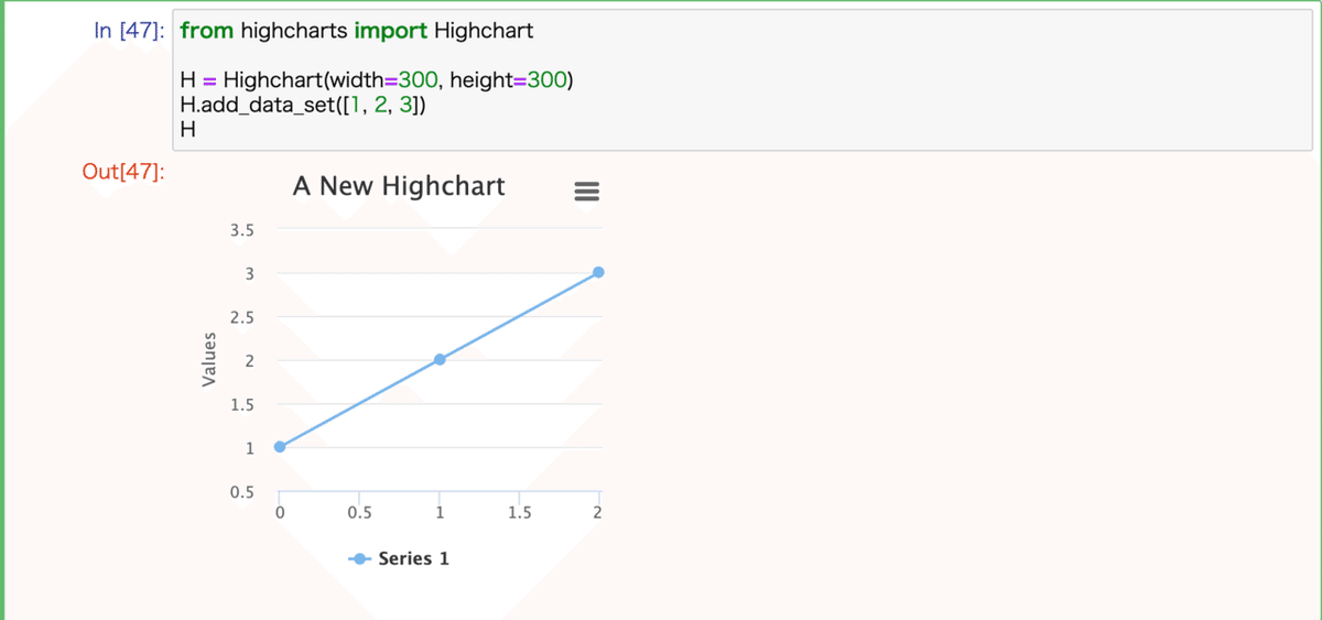
X軸、Y軸などの設定
from highcharts import Highchart

H = Highchart(width=300, height=300)
H.set_options('title', {'text': 'メインタイトル'})
H.set_options('subtitle', {'text': 'サブタイトル'})
H.set_options('xAxis', {'title': {'text': 'X軸'}})
H.set_options('yAxis', {'title': {'text': 'Y軸'}, 'lineWidth': 2})
H.add_data_set([1, 2, 3])
H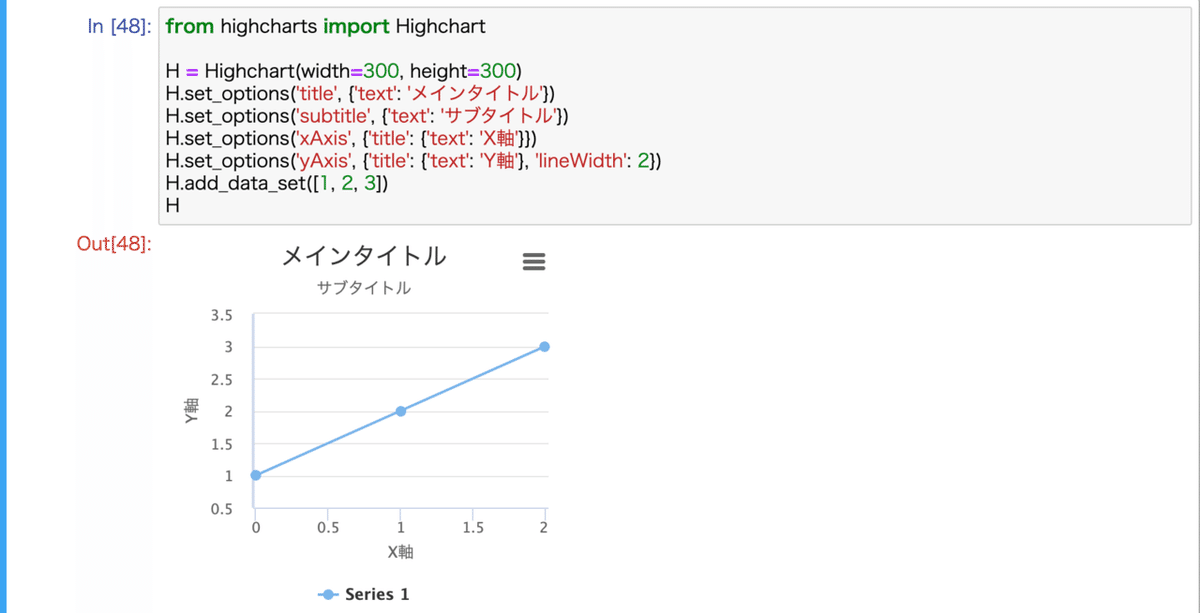
バーチャート+ラインチャート
from highcharts import Highchart

H = Highchart(width=300, height=400)
H.add_data_set([4, 5, 6], 'bar', 'data1')
H.add_data_set([3, 2, 5], 'line', 'data2')
H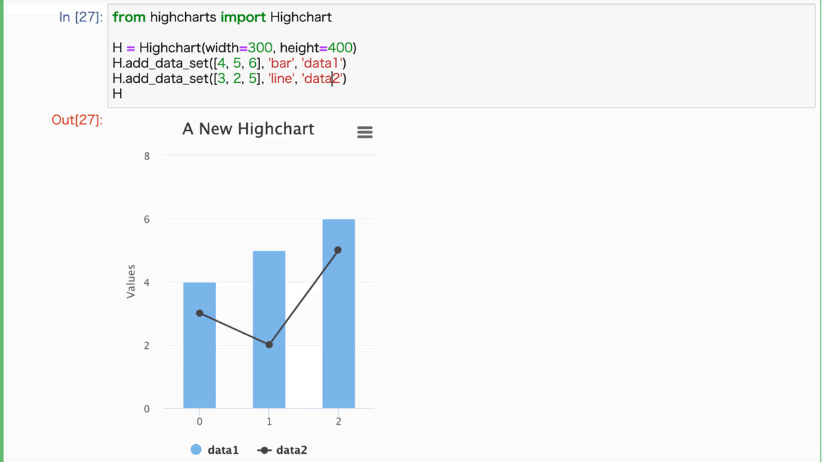
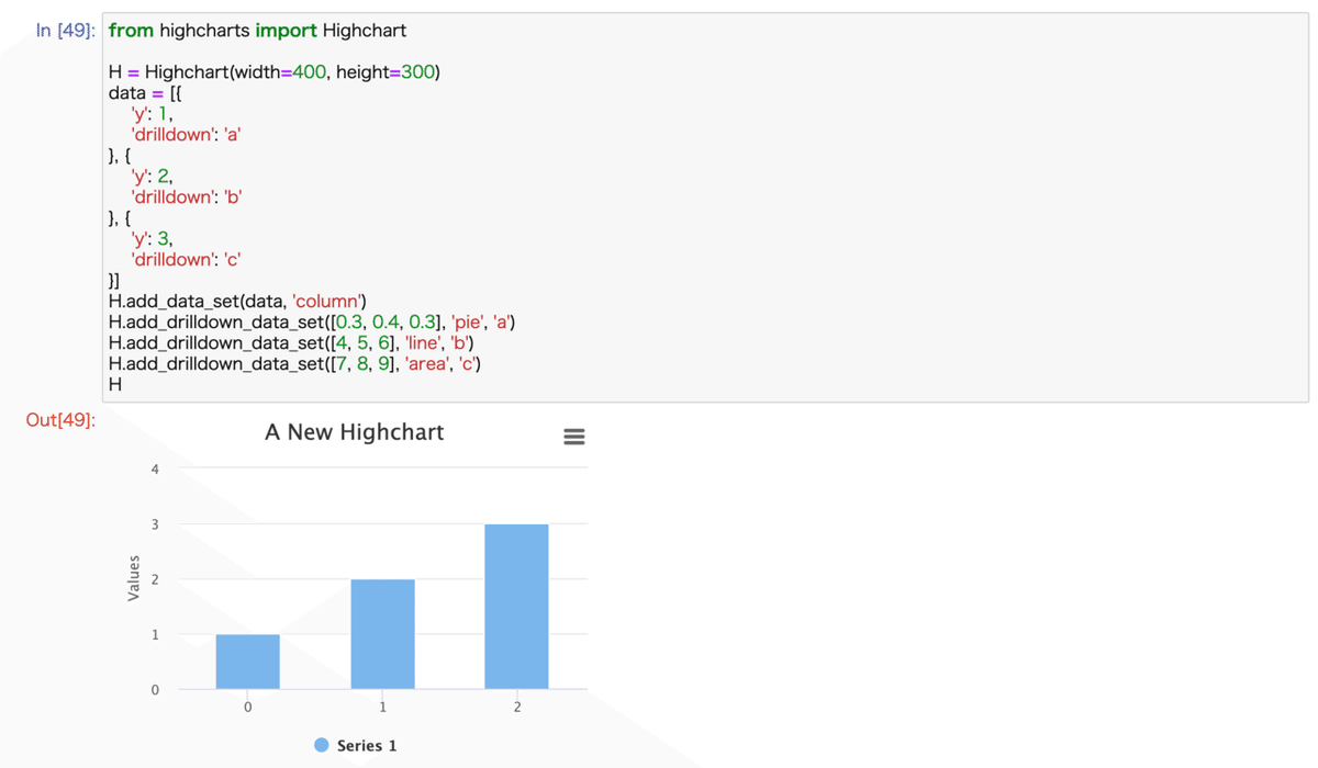
ドリルダウングラフ
※本来このように動くようですが私の環境では動きませんでした

from highcharts import Highchart

H = Highchart(width=400, height=300)
data = [{
   'y': 1,
   'drilldown': 'a'
}, {
   'y': 2,
   'drilldown': 'b'
}, {
   'y': 3,
   'drilldown': 'c'
}]
H.add_data_set(data, 'column')
H.add_drilldown_data_set([0.3, 0.4, 0.3], 'pie', 'a')
H.add_drilldown_data_set([4, 5, 6], 'line', 'b')
H.add_drilldown_data_set([7, 8, 9], 'area', 'c')
H