
Notion の関数機能でグラフを作る方法

こんにちは、チャベスと言います。
この記事では、Notion の関数機能でグラフを作る方法を説明します。今までは Notion でグラフを作るためには外部サービスを使わなければいけませんでしたが、Notion の関数機能を使えば簡易的なグラフを作ることができます。
Notion でグラフを作る方法
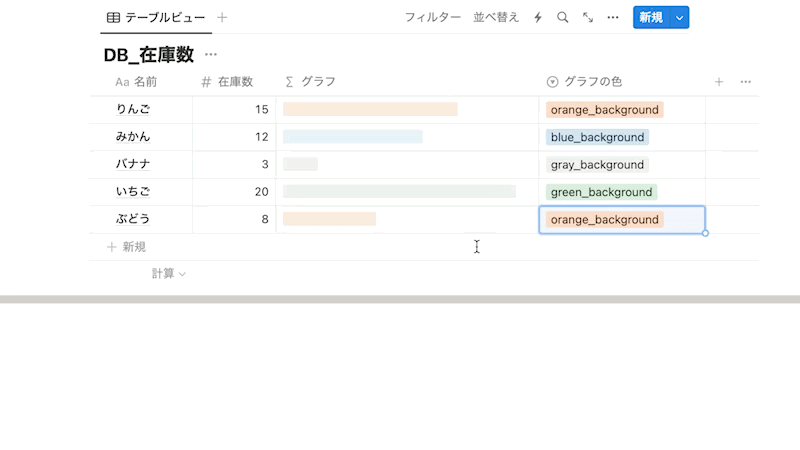
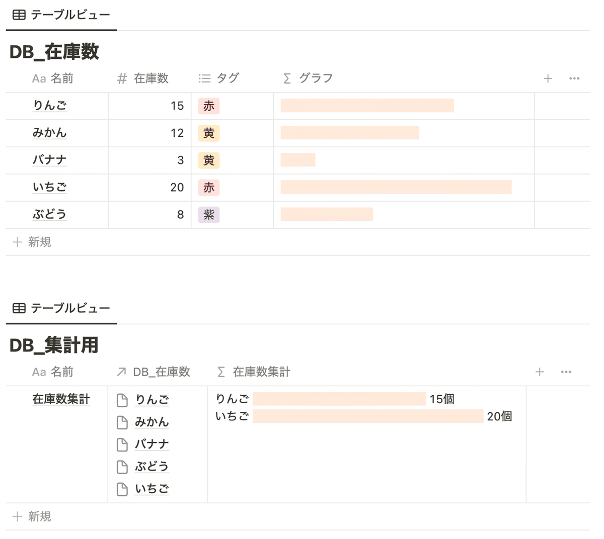
まずは、簡単なグラフを Notion で作ってみます。以下のように、在庫数をグラフ化してみます。
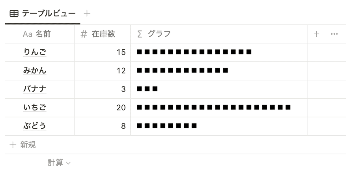
これは以下のようにrepeat関数を使うことで簡単に実現できます。
repeat("◾️", prop("在庫数"))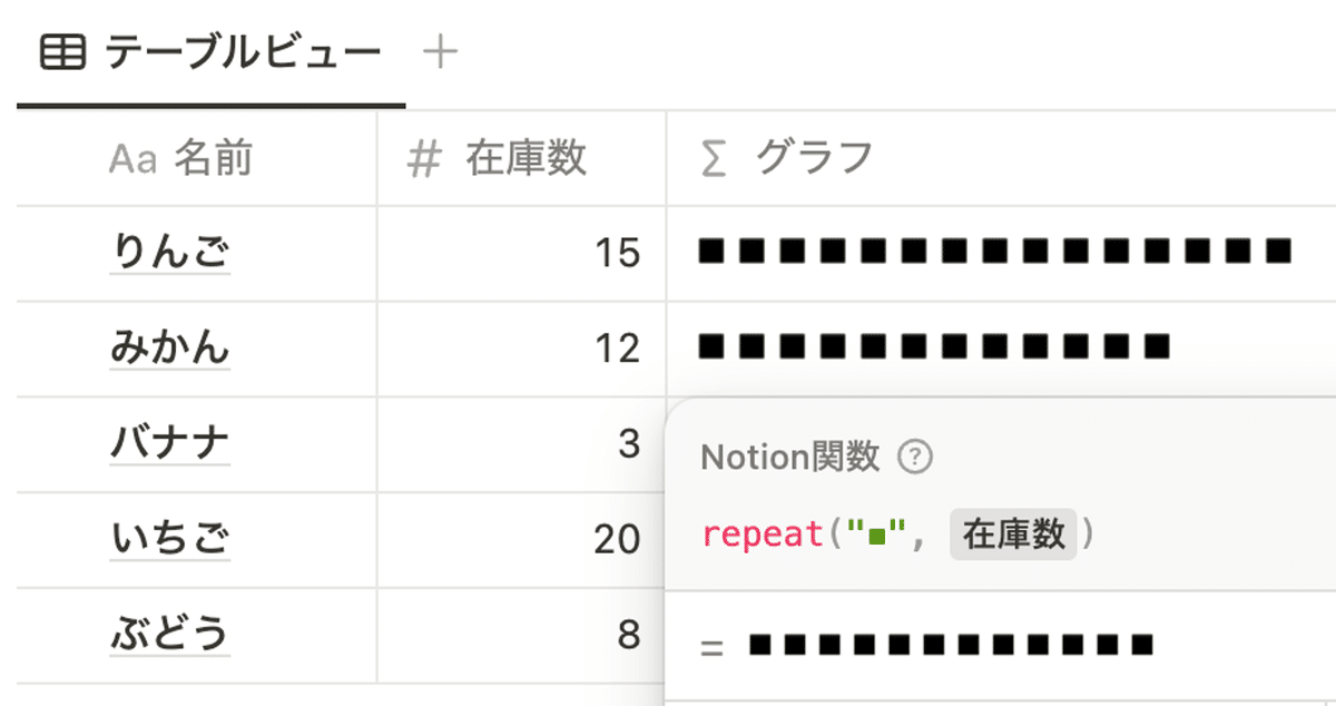
このグラフを style関数で見栄え良くしてみます。
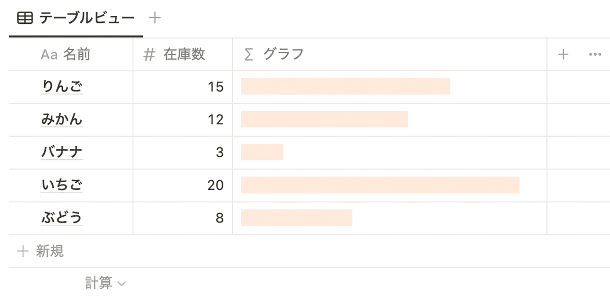
全角スペース” ”に背景色orange_backgroundをつけることでよりグラフっぽくすることができます。
repeat(style(" ", "orange_background"), prop("在庫数"))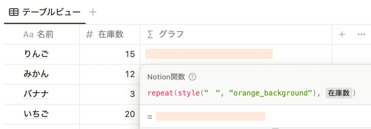
グラフの色はセレクトプロパティで変更可能
以下のように、グラフの色はセレクトプロパティで変更可能です。
まずは、セレクトプロパティで以下のように表示したい色を準備します。
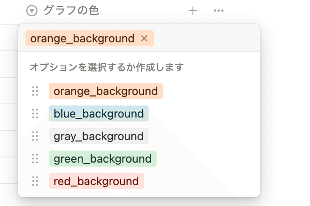
関数を以下のように修正することで、セレクトプロパティで選択した色がグラフに反映されます。

repeat(style(" ", prop("グラフの色")), prop("在庫数"))(ちなみに)関数を使わなくてもグラフは表示できる
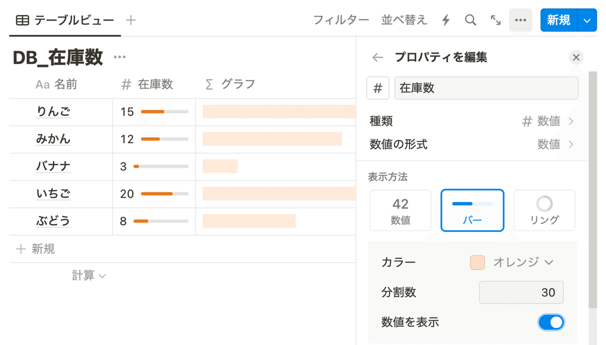
数値プロパティの「表示方法」で「バー」を選択すればグラフは表示できます。ただし、関数を使って表示したほうが見やすいかもしれません。
集計してグラフを一行に表示したい場合
データベースの内容を集計してグラフを表示したいは、集計用のデータベースを準備してリレーションを行うことで集計して表示できます。
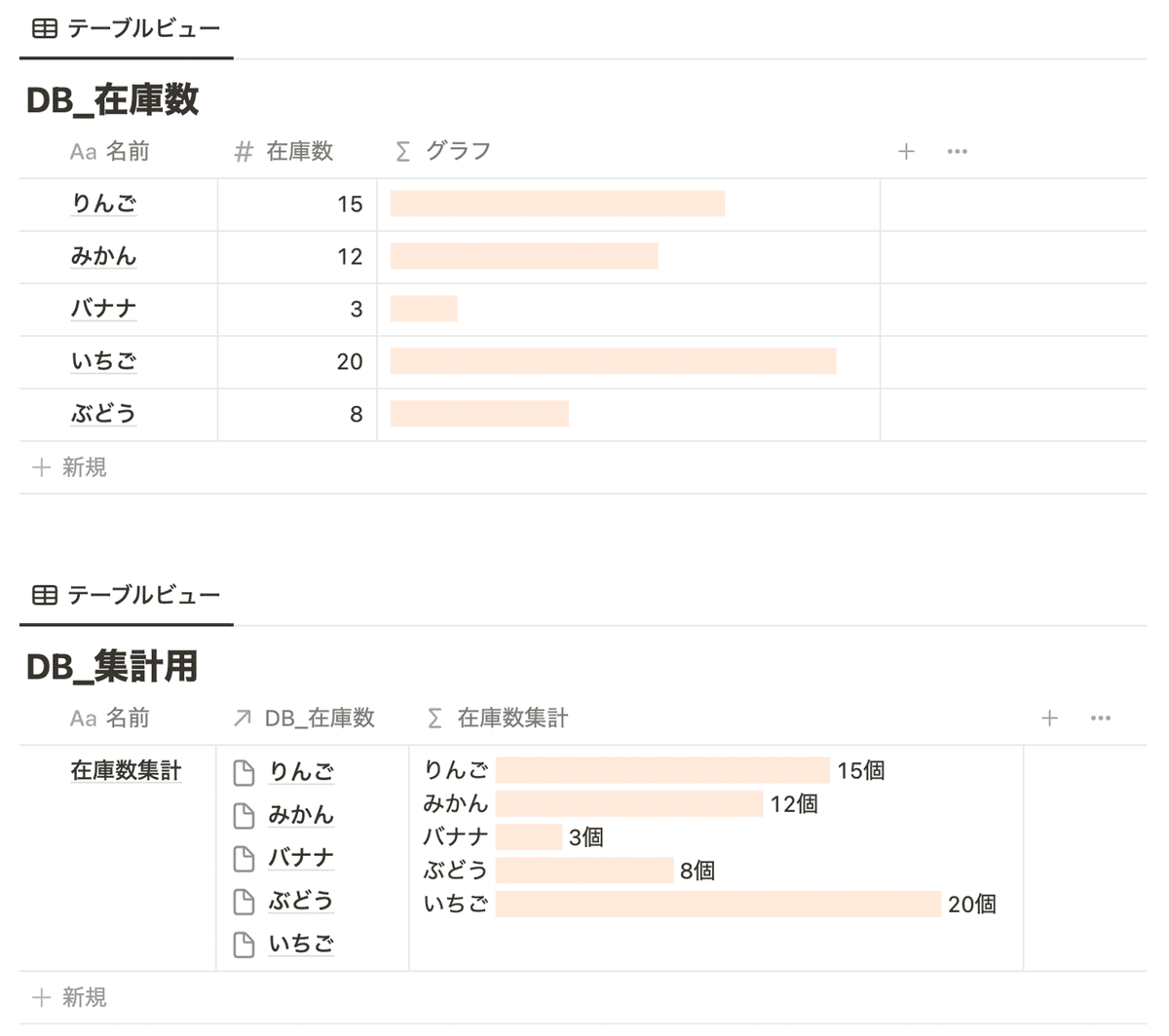
コードをは以下のようになります。グラフを作成する部分はrepeat(style(" ", "orange_background"), current.prop("在庫数"))の部分のみです。current.prop("名前")はグラフに項目名を、current.prop("在庫数") + "個"の部分で在庫数を表示しています。
prop("DB_在庫数")
  .map(
	    current.prop("名前") +
      " " +
      /* グラフ作成 */
      repeat(style(" ", "orange_background"), current.prop("在庫数")) +
      " " +
      current.prop("在庫数") +
      "個"
  )
  .join("\\n") /* 改行を追加 */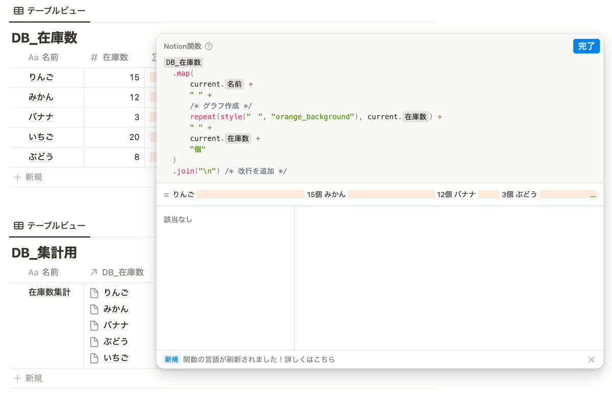
フィルタして集計したい場合
データベースにタグ(マルチセレクトプロパティ)があり、タグでフィルタをかけてグラフ化することもできます。今回は、タグが赤のデータのみを抽出しています。
コードはfilter()を使って以下のような書きます。
prop("DB_在庫数")
  .filter(current.prop("タグ").includes("赤"))
  .map(
    current.prop("名前") +
      " " +
      /* グラフ作成 */
      repeat(style(" ", "orange_background"), current.prop("在庫数")) +
      " " +
      current.prop("在庫数") +
      "個"
  )
  .join("\\n") /* 改行を追加 */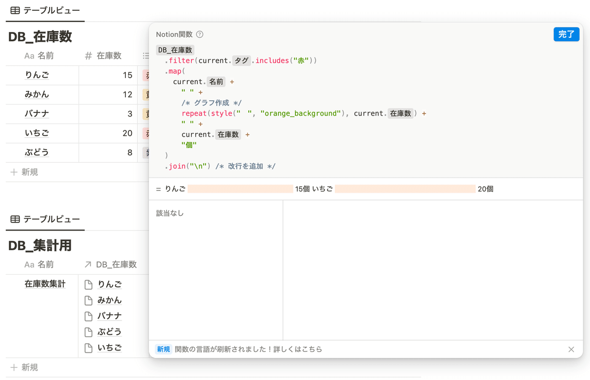
タスクにかけた時間を集計してグラフ化
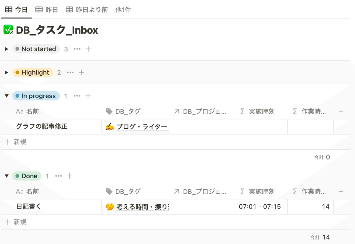
私は以下のように Notion でタスク管理をしており、タスクには全てタグをつけています。タスクにタグをつけておくことで、週ごとや月ごとにタグごとのタスクの時間を集計して「前の週はブログにいっぱい時間を使った」、「もうちょっと英語の勉強に時間を使いたい」のような振り返りを行なっています。
以前までは、以下の記事を参考に GAS で Notion API を使って 1日 に 1回、Notion に記録したタスクの内容をスプレッドシートにコピーしてスプレッドシートで集計していました。
しかし、関数機能を使うことで Notion 内で集計してグラフ化までできるようになりました。
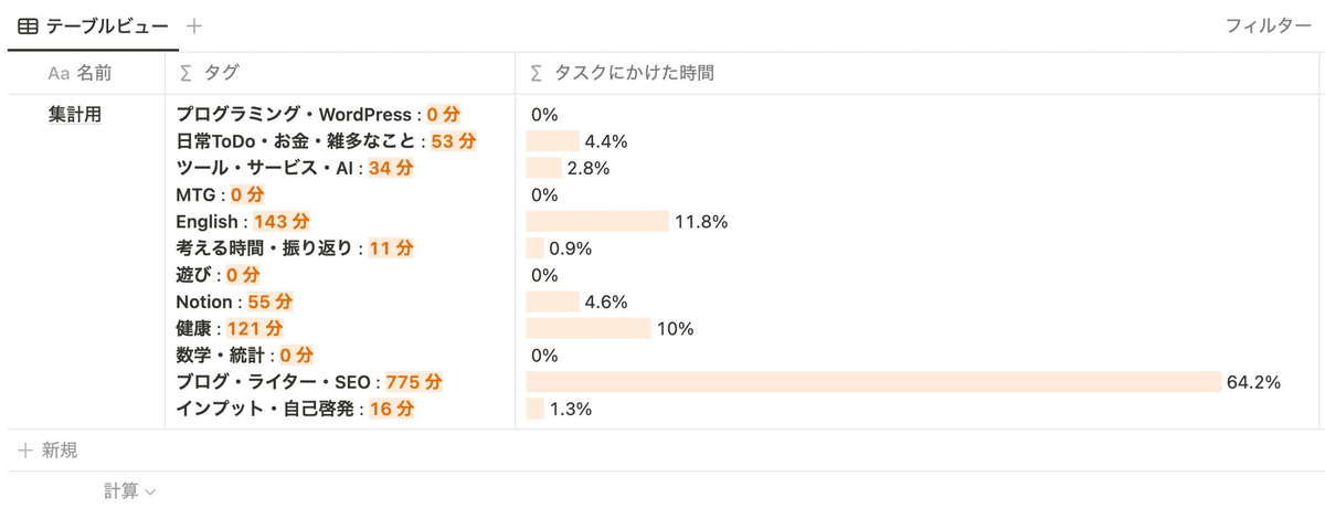
タグデータベースでタスクの合計時間や割合を算出する
まずは実際にタスクを記録する「DB_タスク_Inbox」とタグを管理する「DB_タグ」をリレーションしておきます。
① タスクを管理する「DB_タスク_Inbox」
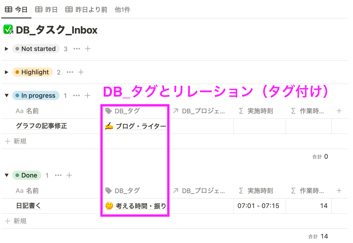
② タグを管理する「DB_タグ」
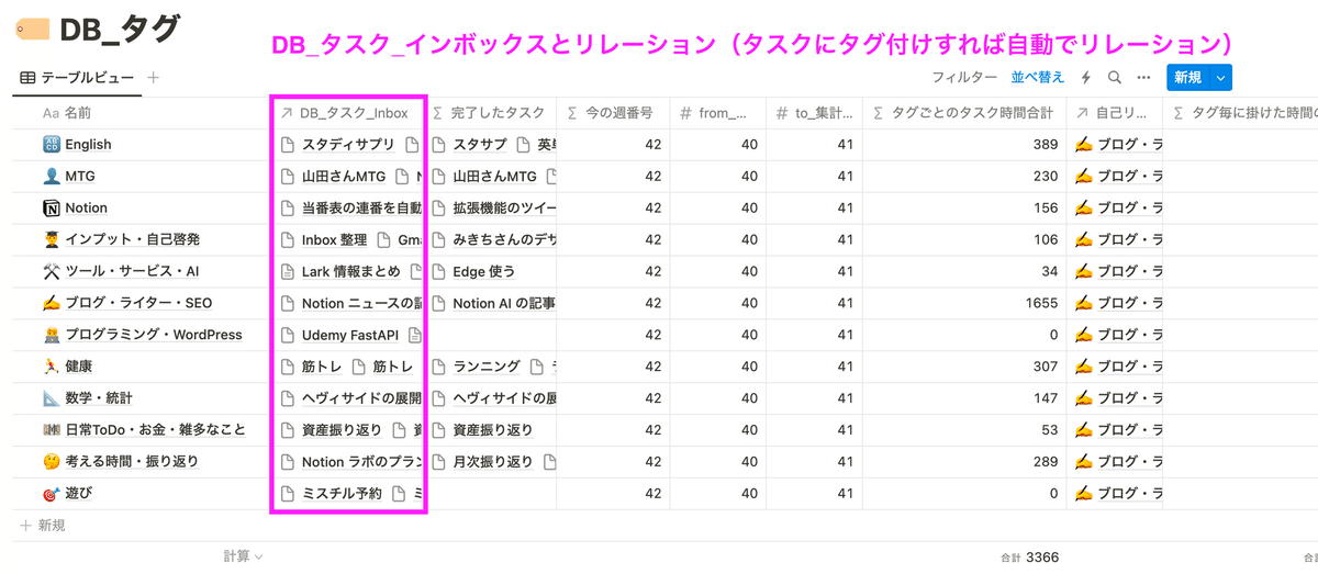
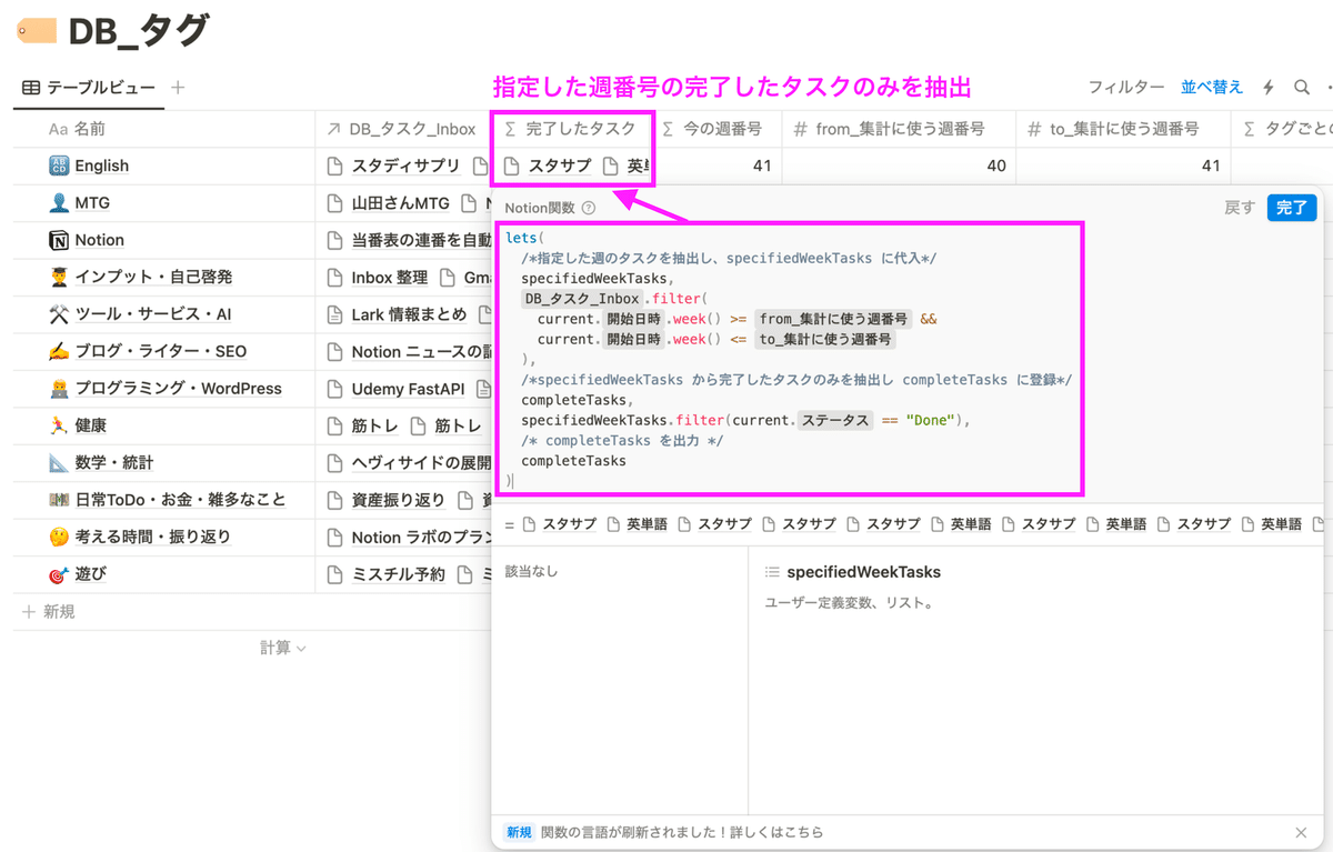
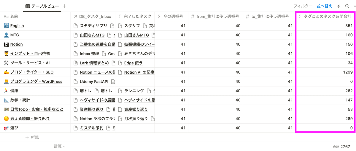
② の「DB_タグ」でタグごとにかけた時間や割合を集計しておきます。各タグごとに指定した週の完了したタスクのみを抽出します(上の画像では「DB_タグ」の「完了したタスク」プロパティ)。工夫した点として、集計する範囲を週番号で選べるようにしています。例えば上の画像の場合、「from_集計に使う週番号」プロパティと「to_集計に使う週番号」プロパティ(数字プロパティ)で 40 週目から 41 週目のタスクを集計するように設定しています。ちなみに今の週番号が何かをわかりやすくするために「今の週番号」を出力しています(集計には使っていません)。
以下は、今の週番号を出力する関数です。
week(now())「DB_タスク_Inbox」から完了したタスクのみをフィルタする関数は以下です。
lets(
  /*指定した週のタスクを抽出し、specifiedWeekTasks に代入*/
  specifiedWeekTasks,
  prop("DB_タスク_Inbox").filter(
    current.prop("開始日時").week() >= prop("from_集計に使う週番号") &&
    current.prop("開始日時").week() <= prop("to_集計に使う週番号")
  ),
  /*specifiedWeekTasks から完了したタスクのみを抽出し completeTasks に登録*/
  completeTasks,
  specifiedWeekTasks.filter(current.prop("ステータス") == "Done"),
  /* completeTasks を出力 */
  completeTasks
);
上記で抽出したタスクに対して、合計時間を「タグごとのタスク時間合計」プロパティで算出しています。
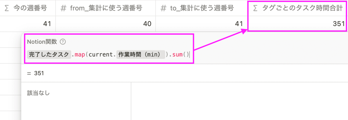
prop("完了したタスク").map(current.prop("作業時間(min)")).sum()これで指定した週の完了したタスクの合計時間を算出することができました。
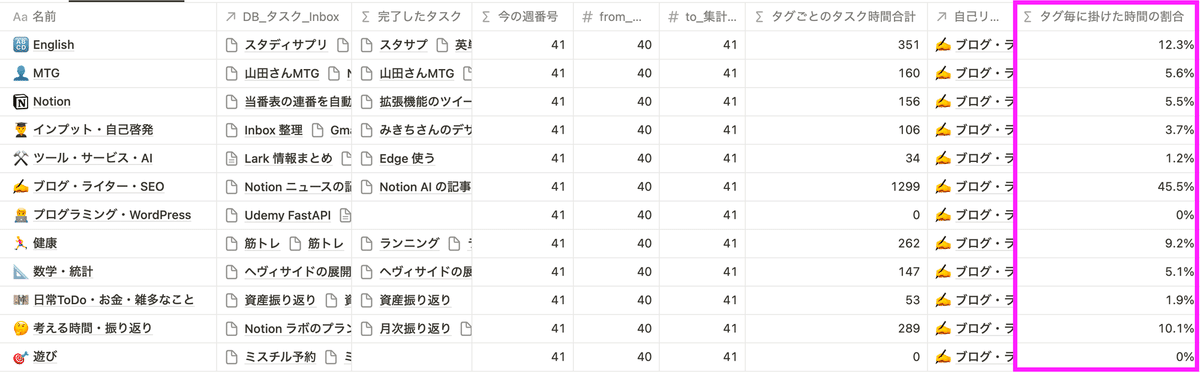
ついでにタグごとのタスクの時間がその週に行ったタスクすべての合計時間の何%なのかを計算しておきます。
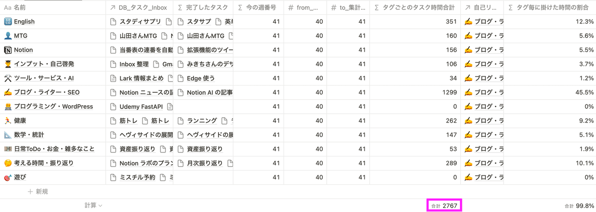
割合を出すためには、まず指定した週の完了したタスクの合計時間を算出しておく必要があります。つまり、列の合計値を算出するということです(以下の画像のピンクの部分の数字)。
列の合計値を算出する方法は以下の記事に記載しているので参考にしてみてください。
まずは、自分自身のデータベースとリレーション(自己リレーション)しておきます。
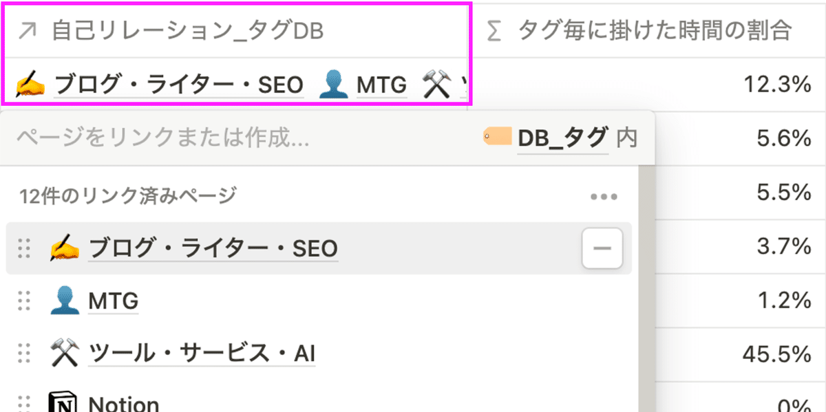
あとは、列の合計値を算出し、割合を計算します。
(
  (prop("タグごとのタスク時間合計") /
   prop("自己リレーション_タグDB").map(current.prop("タグごとのタスク時間合計")).sum())
   * 1000
).round() / 1000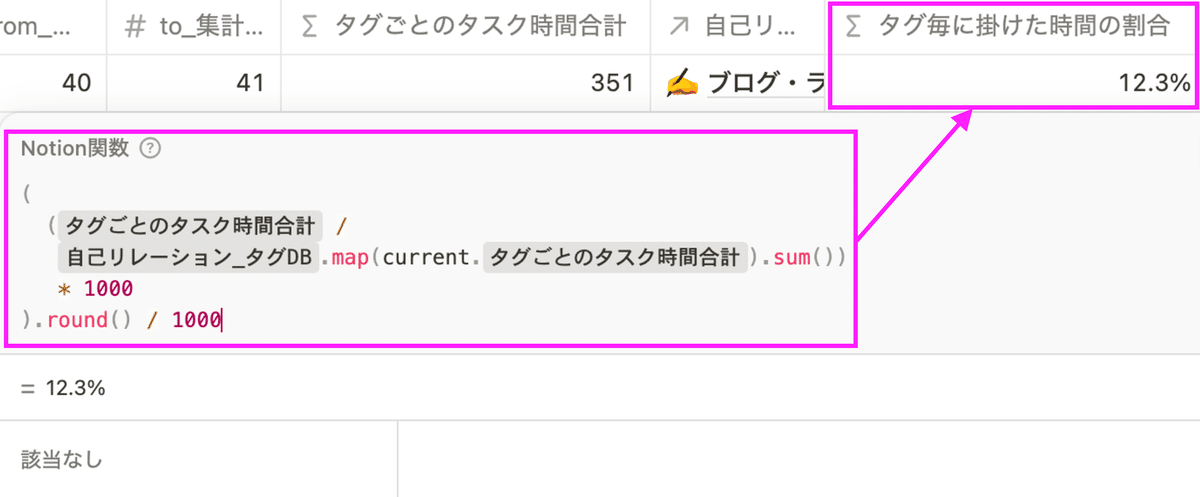
これで集計は完了です。
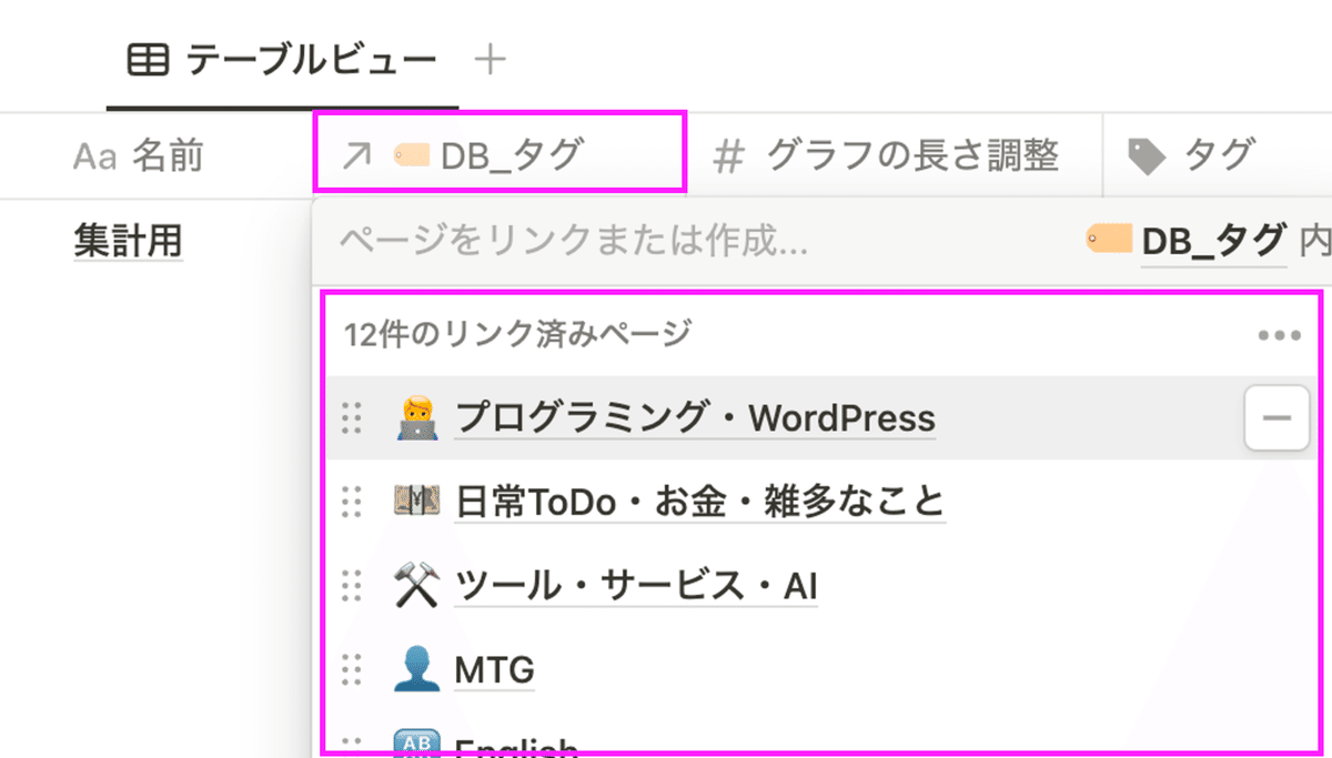
集計用 DB でグラフ表示する
グラフ表示するために「集計用 DB」を準備します。
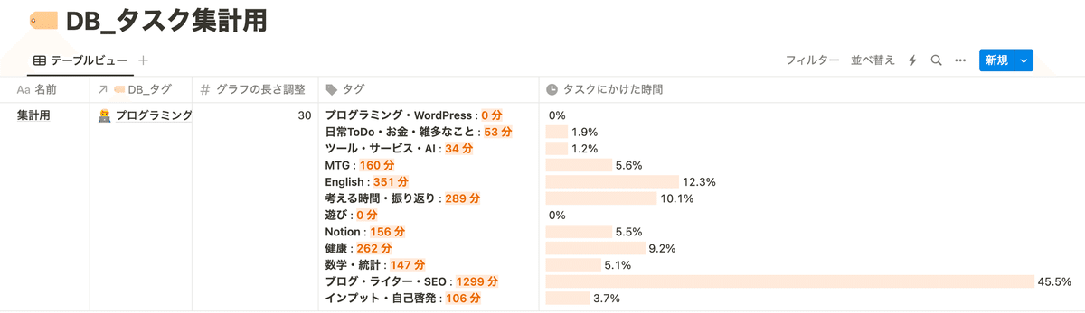
まずは、上記の「DB_タグ」のすべてのタグとリレーションしておきます。
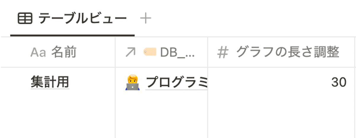
また、事前準備としてグラフ表示の大きさを調整する「グラフの長さ調整」プロパティを準備しておきます(数字プロパティ)。
まずは、以下のようにタグ名と時間を出力する関数プロパティを用意しておきます(「タグ」プロパティ)。
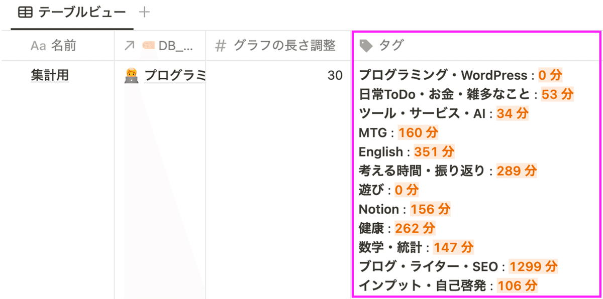
関数の内容は以下です。
prop("🏷️ DB_タグ")
  .map(
    style(current.prop("名前"), "b") +
      " : " +
      style(
        current.prop("タグごとのタスク時間合計") + " 分",
        "orange_background",
        "orange",
        "b"
      )
  )
  .join("\\n");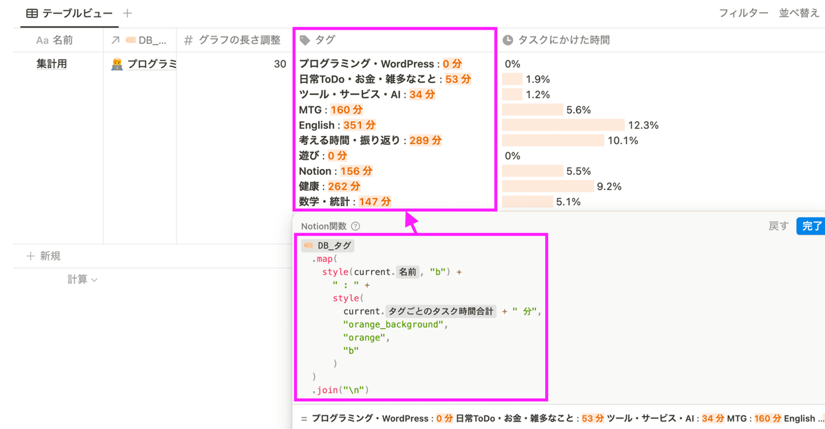
最後に、グラフを表示します。グラフを表示する関数は以下です。グラフの長さを調整したい場合は、「グラフの長さ調整」プロパティの数字を調整してください。
prop("🏷️ タグDB")
  .map(
    repeat(
      style(" ", "orange_background"),
      current.prop("タグごとのタスク時間合計") / prop("グラフの長さ調整")
    ) +
      " " +
      (current.prop("タグ毎に掛けた時間の割合") * 1000).round() / 10 +
      "%"
  )
  .join("\\n")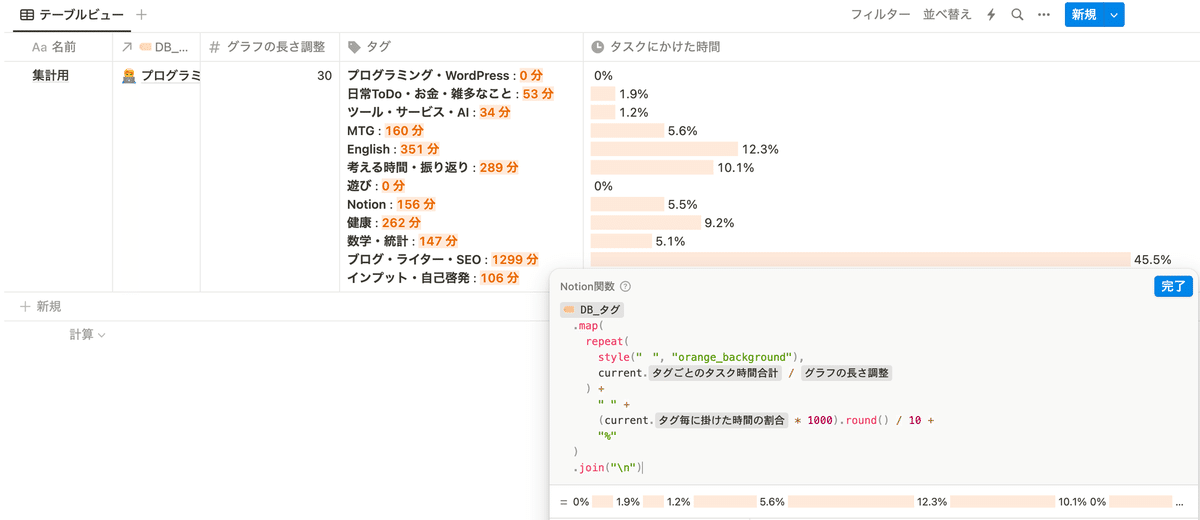
グラフを昇順や降順にソートしたい場合
特定のプロパティの数字に応じてグラフの並び順を昇順や降順にソートしたい場合は、ページのリレーションの並び順を変更する必要があります。リレーションのソート方法は、以下のページに詳しく書かれているので参考にしてみてください。
※ 2023年11月末にアップデートがあり、リレーションの並び替えは以前よりも簡単になっています。
【朗報】Notion関数2.0のsortが圧倒的に使いやすく
— 熊倉 佳彦|いとなみ|Notion公式アンバサダー&テクニカルコンサル (@yoshihiko_k) November 30, 2023
sort内でsort条件を指定出来るようになったので、色々書かなきゃいけなかったのが省略出来ますよ!
コードのbefore, afterはスレッドで! pic.twitter.com/EOpaLVlbRy
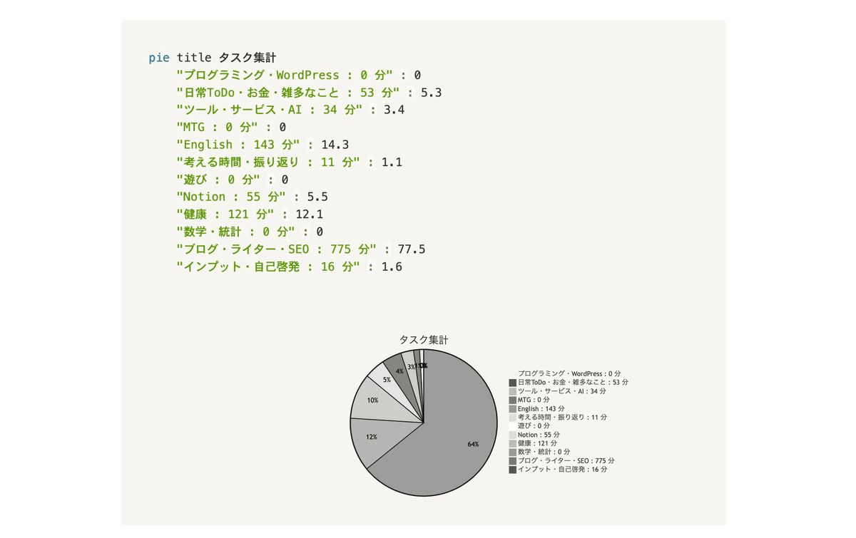
円グラフを Notion AI で出力する
関数でグラフを作成する場合は、棒グラフしか作成できませんが、Notion AI を使うことで簡単に円グラフを作成することができます。
まずは、「集計用 DB」で準備した「タグ」プロパティをコピーしてページ内の適当な場所(ブロック)に貼り付けます。そして、そのブロックを選択した状態で Notion AI を準備し、以下のプロンプトを指示します。
Mermaid で円グラフに変換して。
タイトルは「タスク集計」
パーセントで表示して。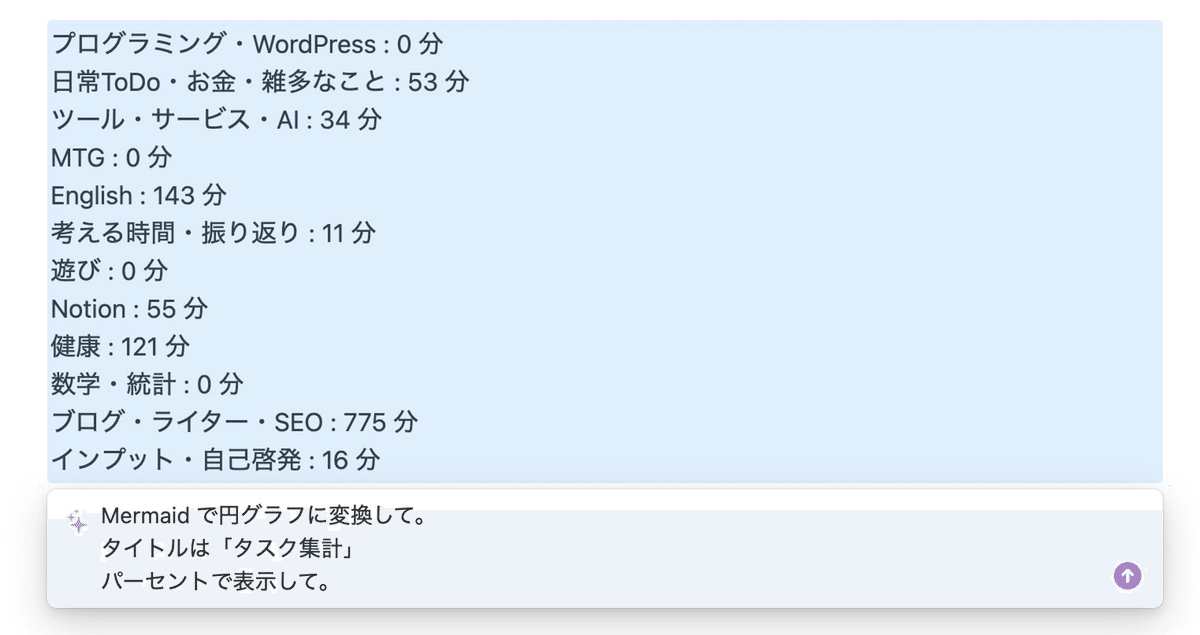
すると、以下のように簡単に円グラフを作成してくれます。
以下のツイートでは動画で円グラフを出力する様子を確認できますので、参考にしてみてください。
動画ではこんな感じ。 pic.twitter.com/AvfII94dj8
— チャベス (@ChabesuB) October 12, 2023
Notion AI はこのように便利な使い方がたくさんあります。以下の記事で Notion AI の詳しい使い方や活用例をまとめていますので、気になる方は参考にしてみてください。
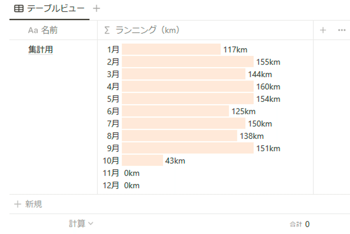
ランニングの距離を月毎に集計してグラフ化
以下のツイートでは、Notion に記録しているランニングをした距離を集計し、グラフ化しています。
Notion の日記 DB にランニングした距離を iPhone のショートカット経由で記録して、月ごとに距離を集計してグラフ化という流れをほぼ自動で Notion だけでできた!
— チャベス (@ChabesuB) October 8, 2023
毎日の日記で気持ちプロパティを入力したらオートメーション機能で集計用 DB に自動でリレーションして、関数機能で集計してグラフ化! pic.twitter.com/J1f02hhh3w
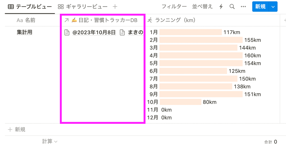
毎日「日記」データベースにランニングの距離を記録しています。
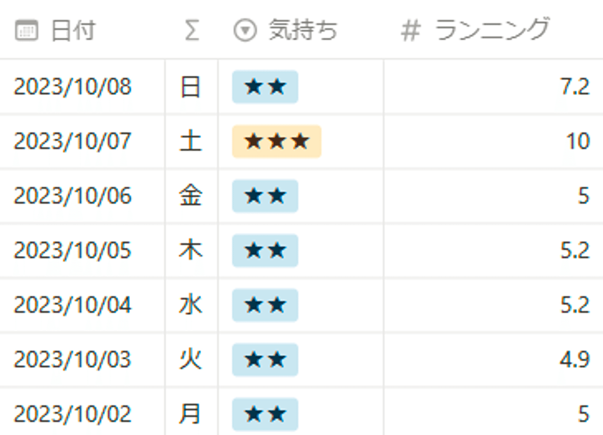
記録したランニングの距離を別途準備した「集計用 DB」で月毎に集計し、グラフで表示しています。
オートメーション機能でリレーションする
ランニングの距離を集計用 DB でグラフ化して表示するためには、「日記 DB」 と「集計用 DB」をリレーションする必要があります。必要なのは「集計用 DB」から「日記 DB」のデータを参照するための「集計用 DB」→ 「日記 DB」のリレーションのみです。集計のために毎日手動でリレーションすることもできますが、余計な手間を増やしたくないので今回はオートメーション機能を活用します。
オートメーションの内容としては以下となります。
「日記 DB」の「気持ち」プロパティを編集する
オートメーションが発火する
「集計用 DB」に自動で「気持ち」プロパティを編集したページのみリレーションされる
以下が実際に作成したオートメーションの内容です。
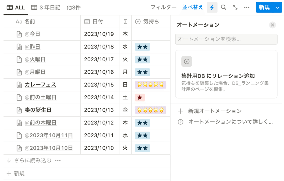
「気持ち」プロパティを編集すると、オートメーションが発火します。
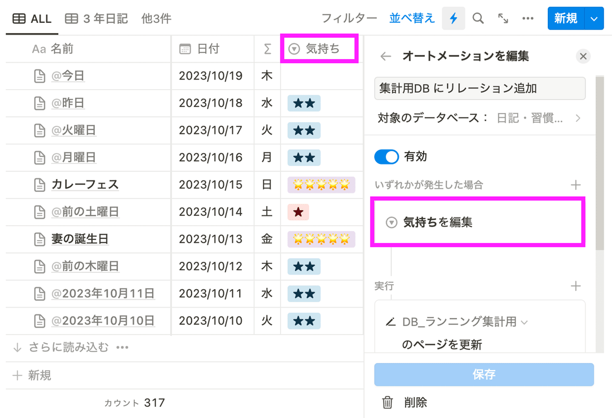
対象のデータベースは「集計用」DB とします。集計用のデータベースには 1ページしか作っていないので、フィルタは適当です。もし、1ページ以上作成している場合は、対象のページが選択されるようにフィルタを作成します。
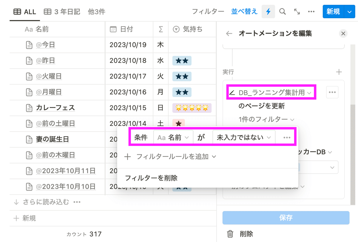
「集計用」DB のリレーションプロパティに、「気持ち」プロパティを編集したページを追加します。
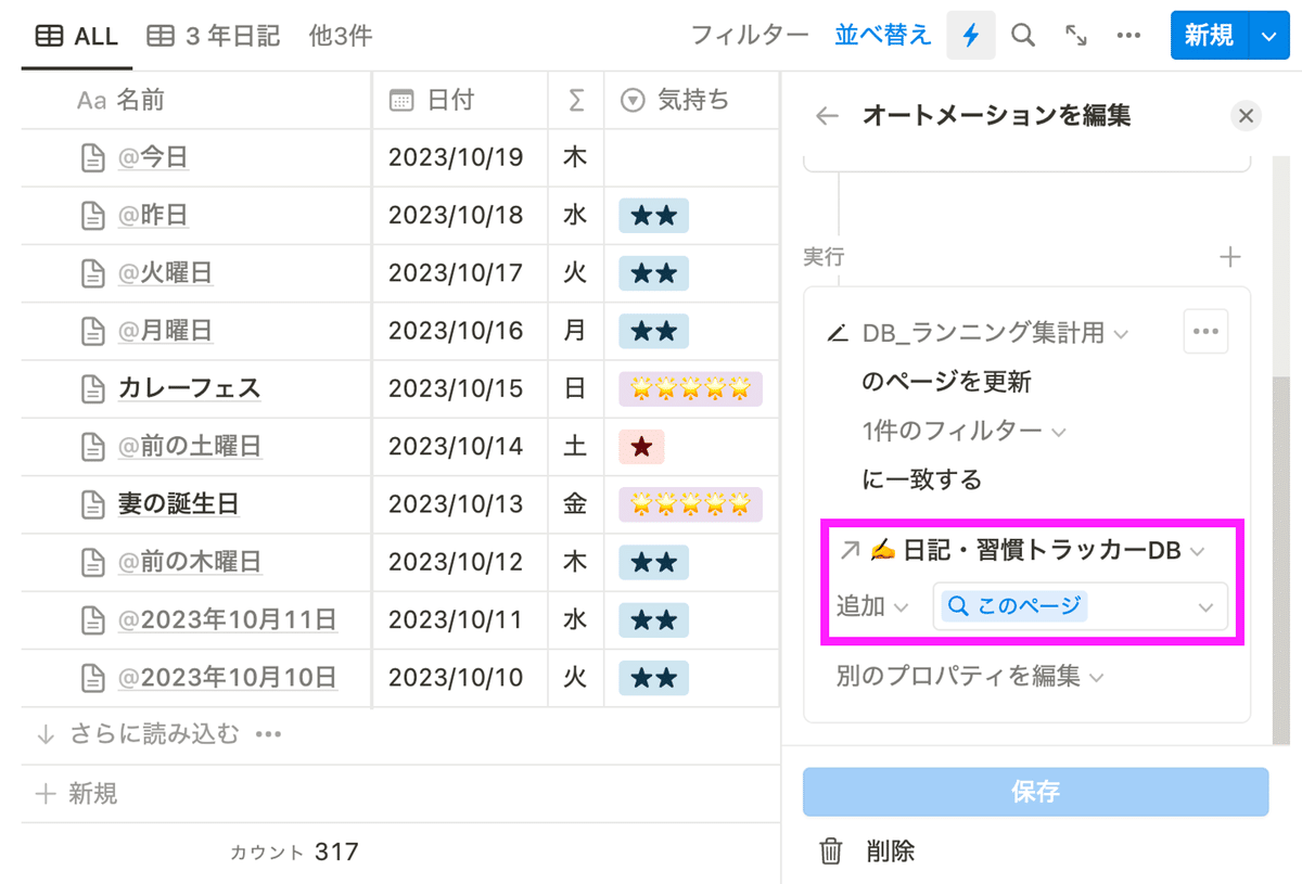
これで、オートメーションの完成です。
オートメーション機能について詳しく知りたい方は、以下の記事に詳しく書いていますので参考にしてみてください。
グラフを表示する関数
方法は上記で説明した「タスクにかけた時間を集計してグラフ化」よりもシンプルですが、各月のグラフを出すために愚直に関数を書いています。
lets(year, prop("✍️ 日記・習慣トラッカーDB").filter(current.prop("日付").year() == 2023),
		Jan, year.filter(current.prop("日付").month() == 1).map(current.prop("ランニング")).sum().round(),
		Feb, year.filter(current.prop("日付").month() == 2).map(current.prop("ランニング")).sum().round(),
		Mar, year.filter(current.prop("日付").month() == 3).map(current.prop("ランニング")).sum().round(),
		Apr, year.filter(current.prop("日付").month() == 4).map(current.prop("ランニング")).sum().round(),
		May, year.filter(current.prop("日付").month() == 5).map(current.prop("ランニング")).sum().round(),
		Jun, year.filter(current.prop("日付").month() == 6).map(current.prop("ランニング")).sum().round(),
		Jul, year.filter(current.prop("日付").month() == 7).map(current.prop("ランニング")).sum().round(),
		Aug, year.filter(current.prop("日付").month() == 8).map(current.prop("ランニング")).sum().round(),
		Sep, year.filter(current.prop("日付").month() == 9).map(current.prop("ランニング")).sum().round(),
		Oct, year.filter(current.prop("日付").month() == 10).map(current.prop("ランニング")).sum().round(),
		Nov, year.filter(current.prop("日付").month() == 11).map(current.prop("ランニング")).sum().round(),
		Dec, year.filter(current.prop("日付").month() == 12).map(current.prop("ランニング")).sum().round(),
		bar, style(" ", "orange_background") ,
		"  1月 " + repeat(bar, Jan / 10) + " " + Jan + "km" + "\\n" +
		"  2月 " + repeat(bar, Feb / 10) + " " + Feb + "km" + "\\n" +
		"  3月 " + repeat(bar, Mar / 10) + " " + Mar + "km" + "\\n" +
		"  4月 " + repeat(bar, Apr / 10) + " " + Apr + "km" + "\\n" +
		"  5月 " + repeat(bar, May / 10) + " " + May + "km" + "\\n" +
		"  6月 " + repeat(bar, Jun / 10) + " " + Jun + "km" + "\\n" +
		"  7月 " + repeat(bar, Jul / 10) + " " + Jul + "km" + "\\n" +
		"  8月 " + repeat(bar, Aug / 10) + " " + Aug + "km" + "\\n" +
		"  9月 " + repeat(bar, Sep / 10) + " " + Sep + "km" + "\\n" +
		"10月 " + repeat(bar, Oct / 10) + " " + Oct + "km" + "\\n" +
		"11月 " + repeat(bar, Nov / 10) + " " + Nov + "km" + "\\n" +
		"12月 " + repeat(bar, Dec / 10) + " " + Dec + "km"
)
上記だとわかりにくいですが、1月のみを抽出する関数をみてみるとわかりやすいと思います。これを 1 - 12月分準備しています。
lets(year, prop("✍️ 日記・習慣トラッカーDB").filter(current.prop("日付").year() == 2023),
		Jan, year.filter(current.prop("日付").month() == 1).map(current.prop("ランニング")).sum().round(),
		bar, style(" ", "orange_background") ,
		"  1月 " + repeat(bar, Jan / 10) + " " + Jan + "km" + "\\n" +
)
もっと関数は短くできるかもしれません。もしいい方法があれば教えてください🙏
【2023/10/24 追記】
@heytoumaro さんがすっきりとした関数に修正してくれました!
ありがとうございます!
lets(
  months,  [1, 2, 3, 4, 5, 6, 7, 8, 9, 10, 11, 12],
  year,  prop("✍️ 日記・習慣トラッカーDB").filter(current.prop("日付").year() == 2023),
  bar,  style(" ", "orange_background"),
  per,  10,

  months.map(
      lets(
        month, current,
        value, year.filter(current.prop("日付").month() == month).map(current.prop("ランニング")).sum().round(),
				monthToStr, month.length() == 1 ? "0" + month : month.format(),
        "  " + monthToStr + "月 " + repeat(bar, value / per) + " " + value + "km"
      )
    ).join("\\n")
)
おわりに
今回は、Notion でグラフを作成する方法を解説してみました。タスクの時間を集計して表示する方法やランニングの距離を集計して表示する方法は、色々な応用例があると思うので、皆さんの使い方に合った方法にカスタマイズしてみてください。
もし、わからないことがあればお気軽に X(@ChabesuB) の DM などでご連絡ください。