
ボックスプロットの補足(クラシックな書き方との比較)

前回、ggplot を使ったボックスプロットの書き方を紹介しました。実は、ボックスプロットを書くだけなら、ggplot を使わない方がシンプルです。しかしながら、 ggplot であれば、値に応じて色を変更したり、他のプロットと重ねたり、複雑な処理に対応しやすいので、これから学習される方には、 ggplot をお勧めします。
クラシックな書き方: boxplot()
前回も使用したデータの例は下記のような input_data です。
> input_data
# A tibble: 100 × 2
Sample1 Sample2
<dbl> <dbl>
1 9.68 9.07
2 10.1 9.50
3 9.59 10.8
4 12.0 10.1
5 12.2 8.70
6 10.8 9.77
7 9.90 8.08
8 11.1 11.7
9 13.1 10.9
10 11.6 9.09
# … with 90 more rows
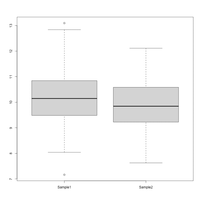
# ℹ Use `print(n = ...)` to see more rows従来のボックスプロットを書くには、 boxplot() 関数を使用します。データの並びを変更する必要はありません。
boxplot(input_data)下記のようなボックスプロットが表示されます。
ggplot2 で作成できるボックスプロットの例
ggplot2 を使って、ボックスプロットを作成する場合は、簡素なコードで色付けしたり、他の図と重ね合わせたりできます。詳細は改めて紹介します。
色付けしたボックスプロット

ボックスプロットに色付けした例
ドットプロットを重ねて表示
